CSS units are essential tools for web design, enabling designers to create responsive and scalable layouts. Among these units, “em” and “rem” are particularly useful for their flexibility and responsiveness.
This article will dive deep into the differences between “em” vs “rem,” providing practical insights and examples to help you choose the right unit for your projects.
Table of Contents
What are CSS Units?
CSS units are used to define the size of elements on a webpage. They come in various types, including absolute units like pixels (px) and relative units like em and rem. Relative units are particularly valuable in responsive design, as they scale based on the context, allowing for more fluid and adaptable layouts.
Understanding EM
Definition and Calculation: The “em” unit is relative to the font-size of its parent element. If the parent element has a font-size of 16px, 1em equals 16px.
Use Cases: “Em” is commonly used for font sizing, padding, margins, and widths. It is beneficial when you want elements to scale relative to their parent containers.
Pros and Cons:
- Pros: Flexible, allows for scaling within nested elements, useful for modular design.
- Cons: Can lead to unexpected results if not managed carefully, especially with deeply nested elements.
Understanding REM
Definition and Calculation: The “rem” unit is relative to the font-size of the root element (usually the html element). If the root font-size is 16px, 1rem equals 16px.
Use Cases: “Rem” is ideal for creating scalable layouts that maintain consistent sizing throughout different sections of a website.
Pros and Cons:
- Pros: Predictable, easier to manage for global scaling, simplifies responsive design.
- Cons: Less flexible for local adjustments within components.
Comparison: EM vs REM
Key Differences:
- Context: “Em” is context-sensitive, scaling based on its parent, while “rem” is context-insensitive, scaling based on the root element.
- Consistency: “Rem” offers more predictable sizing across the site, whereas “em” provides flexibility within nested structures.
When to Use:
- Use “em” for elements that should scale relative to their parent containers.
- Use “rem” for elements that should maintain consistent sizing across the entire webpage.
Impact on Accessibility and User Experience: Both units support responsive design, enhancing accessibility by allowing text to scale appropriately. However, “rem” can simplify the management of font sizes for a more uniform experience.
Practical Examples
To better understand how “em” and “rem” units work in CSS, let’s look at practical examples. These examples will illustrate how each unit is calculated and applied within HTML and CSS, helping you grasp their differences and appropriate use cases.
Example with EM:
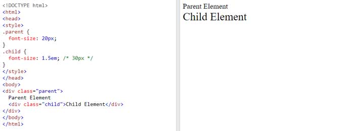
The “em” unit is relative to the font-size of its parent element. In the example below, the parent element has a font-size of 20px, making 1em equal to 20px. The child element has a font-size of 1.5em, which translates to 30px (1.5 times the parent’s font size).
.parent {
  font-size: 20px;
}
.child {
  font-size: 1.5em; /* 30px */
}
Explanation:
- The parent element sets the context with a font-size of 20px.
- The child element’s font-size is 1.5em, which is 1.5 times the parent’s font size, resulting in 30px.

Example with REM
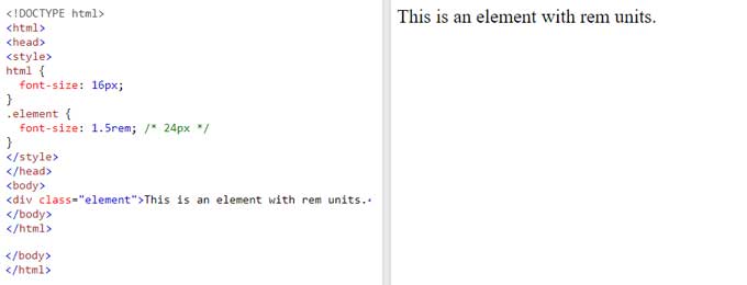
The “rem” unit is relative to the font-size of the root element (typically the html element). In this example, the root element has a font-size of 16px, so 1rem equals 16px. The element has a font-size of 1.5rem, translating to 24px.
html {
  font-size: 16px;
}
.element {
  font-size: 1.5rem; /* 24px */
Explanation:
- The root element sets the base font-size at 16px.
- The element’s font-size is 1.5rem, which is 1.5 times the root font size, resulting in 24px.

Best Practices
- Consistency: Use “rem” for global elements like body text and headings.
- Flexibility: Use “em” for components that need to scale with their parent.
- Avoid Pitfalls: Ensure you understand the inheritance of font sizes when using “em” to avoid unexpected scaling.
Conclusion
Understanding the differences between “em” and “rem” can significantly impact the scalability and responsiveness of your designs. By using these units appropriately, you can create more adaptable and user-friendly web experiences.
For an easy conversion between px and rem, check out our PX to REM Converter tool.


