


Want to create an impressive Divi timeline layout for your website?
Creating a Divi Timeline layout is an easy way to break up the look of your site with timelines. It’s a great tool for highlighting dates and milestones in history or within your company, as well as providing visitors with an easier way to navigate through content.
You can easily create this type of layout from scratch or with the help of a plugin.
With the right Divi timeline module, creating timeline layouts has never been easier! The best plugins allow you to quickly design beautiful layouts while keeping them dynamic and interactive – perfect for any online business!
These plugins will save you time when building your pages and make it fun to display information in an engaging and visually appealing manner.
Table of contents
- How to create a Divi timeline from scratch
- Divi timeline tutorials by Elegant Themes
- The best Divi plugins to create a timeline layout
How to create a Divi timeline from scratch
The Divi Theme doesn’t come with a timeline module but we can create one from scratch. I will guide you step-by-step on how to create a Divi timeline layout.
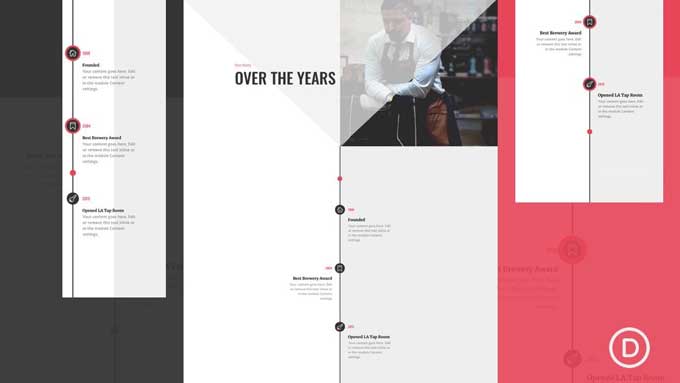
I have created a timeline layout in Divi with a scroll animation effect. You can view the demo here:
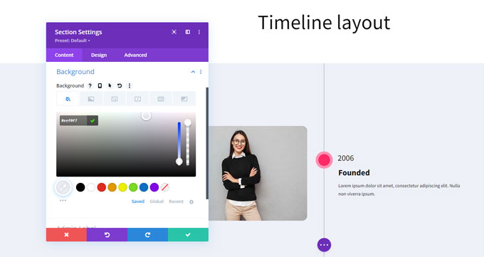
Step 1: Create a section
Enable the visual builder on any page and start by inserting a new section. Use the following settings for this section:
Content tab
- Background color: #eef0f7
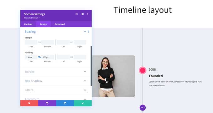
Design tab
Spacing:
- top and bottom padding 150px
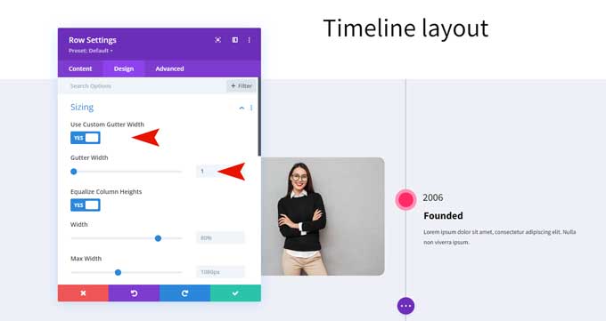
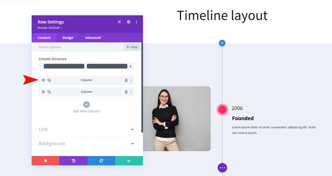
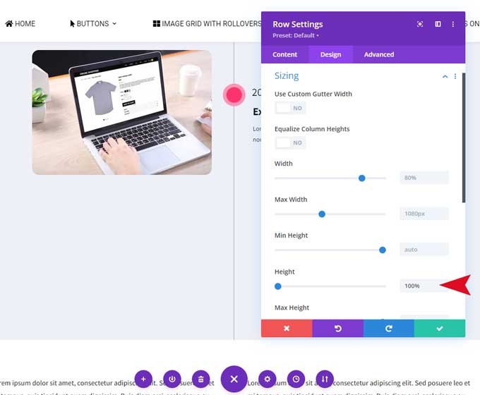
Step 2: Create a row
Place a 2-column row in the section and use the following settings for this row.
Design tab
Sizing
- Enable the use of custom gutter width.
- Set the custom gutter width to 1.
Spacing
- Set the top and bottom padding to 50px.

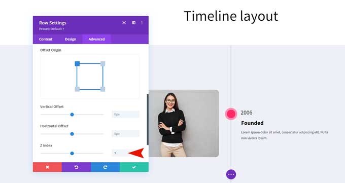
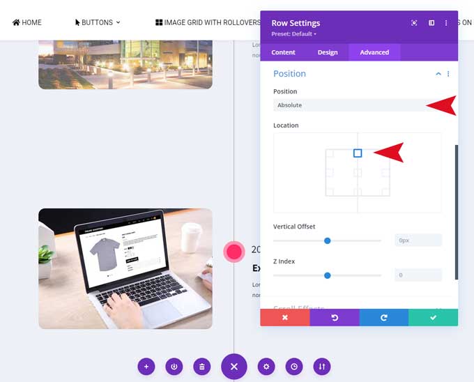
Advanced tab
Position
- Under position set the z-index to 1.
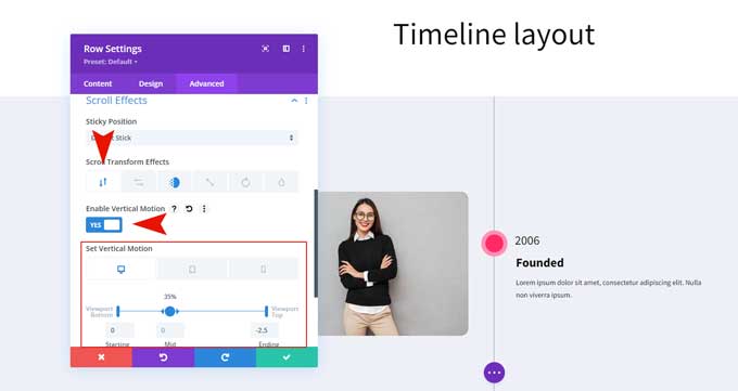
Scroll effects
- Enable vertical motion
- Set starting to 0
- Set mid to 0 and 35%
- Set end to -2.5
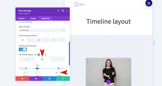
Switch to responsive tab > tablet
- Set the ending to 0%
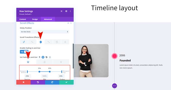
Switch to Fading in and out tab. Then back to the desktop tab. And use the following settings:
- Enabling Fading in and out
- Starting 25%
- Mid 100%
- Ending 25%
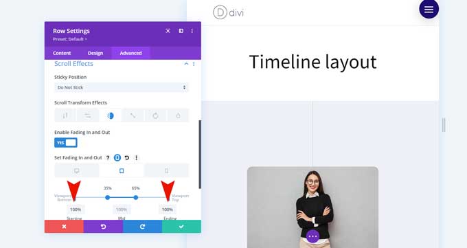
Switch to responsive tab > tablet
- Set the starting and ending to 100%.
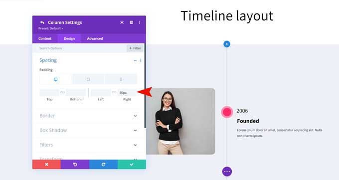
Step 3: First column
Open the first column of this row.
Go to the Design tab and set the right padding to 50px.
After that switch to the tablet and set the right padding to 0px.
Place an image module in the first column and place an image in the image tab.
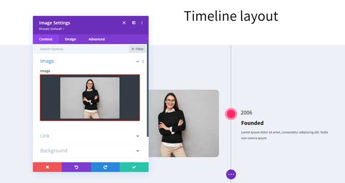
Then go over to the Design tab and set the alignment to Right.
Step 4: Second column
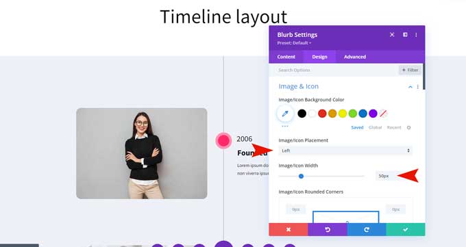
Place a blurb module in this column.
Content tab
- In the Title field place a year number.
- In the image field place an image (I used an image of 50x50px)
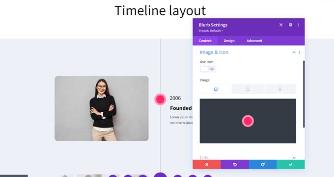
Design tab
Image & Icon
- Set the image placement to the left
- Set the image/icon width to 50px
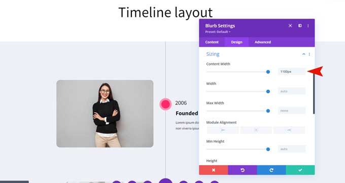
Sizing
- Set the blurb content width to 1100px
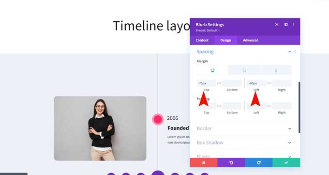
Spacing
- Set the spacing for the desktop to 75px top margin and -40px left margin.
- For tablet/mobile to 25px top padding and 0px left padding.
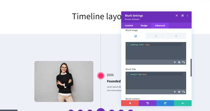
Advanced tab
Under custom CSS field > blurb image place this in it:
- Set padding-left to 15px
Under custom CSS field > blurb title place this in it:
- Set margin-top to 7px
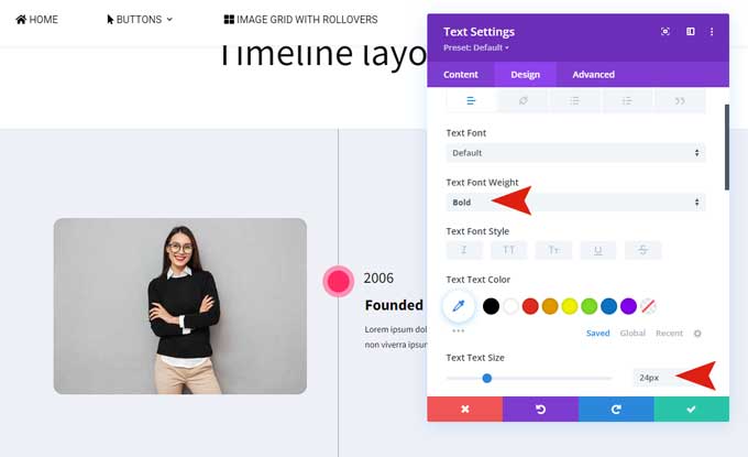
Place a text module under the blurb module.
This will be the title for your first timeline. You can use an h2 or h3 title if you like I went with just text.
In the Design tab, I use the following settings under Text.
- Text Font Weight: Bold
- Text Font Size: 24px
Spacing
- Set margin-left to 42px
- Set margin-left for tablet/mobile to 0px
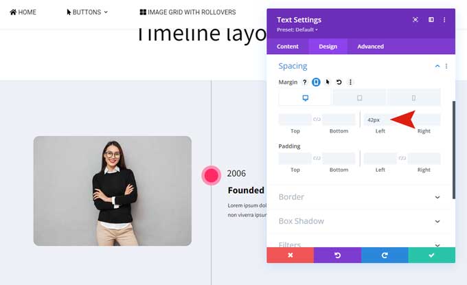
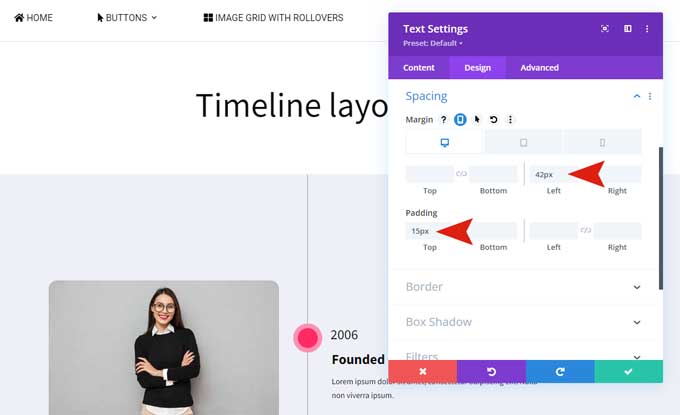
Place another text module under this one and place a text here.
Spacing
- Set margin-left: 42px
- Set margin-left for tablet/mobile 0px.
- Set padding-top: 15px.
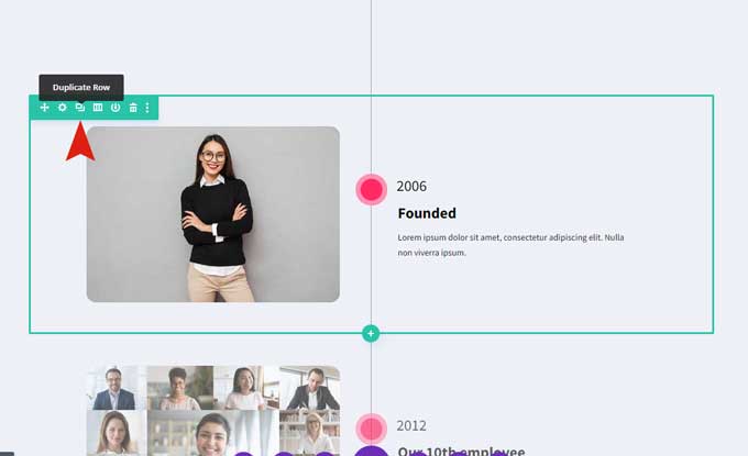
Step 5: Duplicate the row
From here you can duplicate the first row and change your content in the text modules.
You can make as many rows as you like.
Step 6: Add middle line
Create a new row at the bottom and choose a 1-column structure.
Design tab
Sizing
- Set the height to 100%
Spacing
- Set padding-top to 0px
- Set padding-bottom to 0px
Advanced tab
Visibility
- Disable on mobile and tablet
Position
- Set to absolute
- Set the position to top center
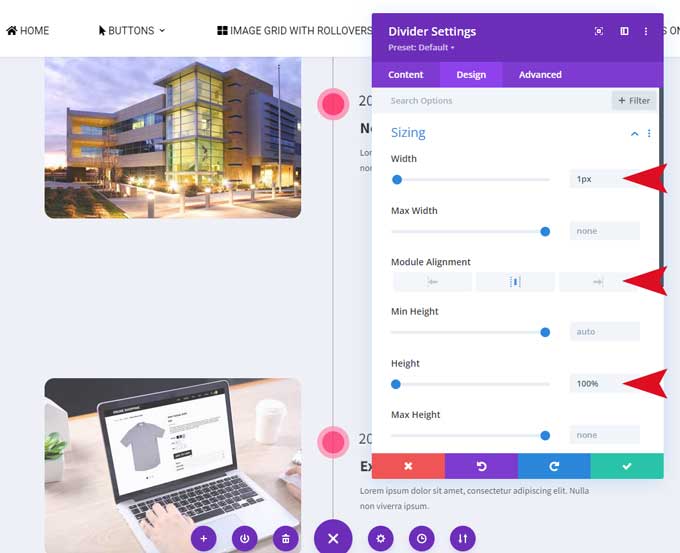
Place a Divider module in this row.
Content tab
Background
- Set the background color to #9e9e9e
Design tab
Sizing
- Set the width to 1px
- Set the module alignment to the center
- Set the height to 100%
Divi timeline tutorials by Elegant Themes
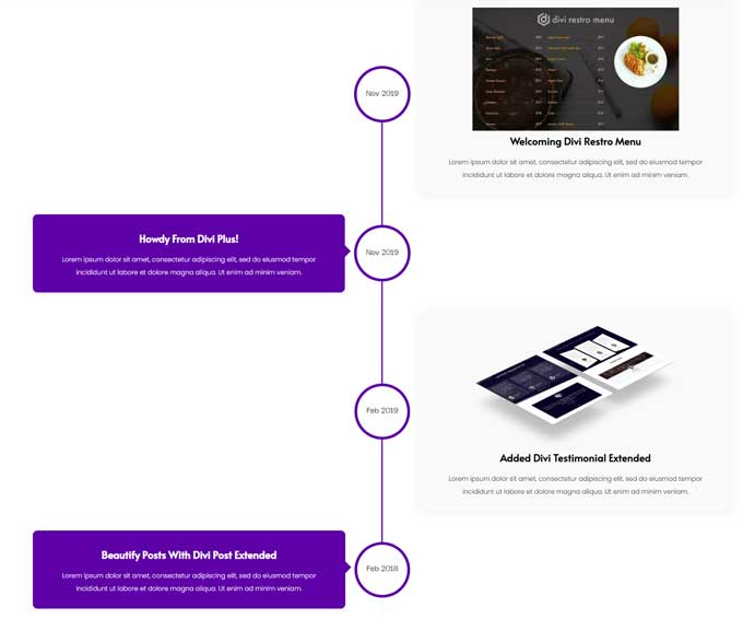
This Divi timeline layout is created by Elegant Themes and provides a simple, step-by-step guide to help you build the timeline design from the ground up.
As you scroll down the page, an eye-catching red dot follows along and highlights each icon as it moves through the process.
It’s designed to be mobile friendly too – so no matter which device you use, you can easily adjust the look and feel of your timeline to fit with your website’s branding and style.
The tutorial starts out with adding new elements to the page such as a row, section, or module; then adding background colors, animations, images, and icons.
After setting up the basic layout, you’ll want to add a unique touch that helps bring your timeline design to life – for example, by setting up an animation effect so that when you scroll down the page a red dot appears in sync with each step of your process.
Get started with this Divi timeline tutorial
Horizontal timeline
This is another tutorial by Elegant Themes for a horizontal timeline layout created with 3 blurb modules.
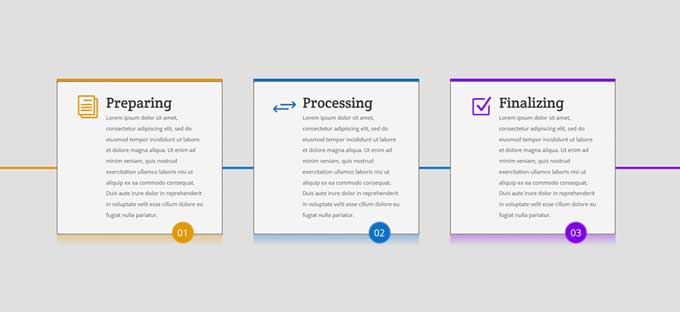
It is an easy and simple-to-follow tutorial to add a timeline to your Divi website. You can find this tutorial here.
The best Divi plugins to create a timeline layout
Divi Timeline modules make it easy to create beautiful, responsive timelines using the Divi Builder. These modules come with tons of extra design options for your timelines.
Take a look at some of the best Divi timeline layouts on the marketplace.
Divi Supreme Timeline Module
The Divi Supreme Content Timeline Module is an incredibly powerful and user-friendly tool that can be used to create dynamic timelines of your content with ease.
The Divi timeline module makes it easy for designers of any experience level to create compelling timelines with just a few clicks.
Thanks to its user-friendly interface, you can generate gorgeous visual timelines quickly and effortlessly.
The Divi timeline module also provides a number of advanced features. With the ability to add images, and videos, customize fonts and colors, as well as animate elements on the timeline – there is no limit to what you can do!
This makes it possible to craft an engaging story or timeline without needing any knowledge of coding or web design.
Divi Plus Timeline Module
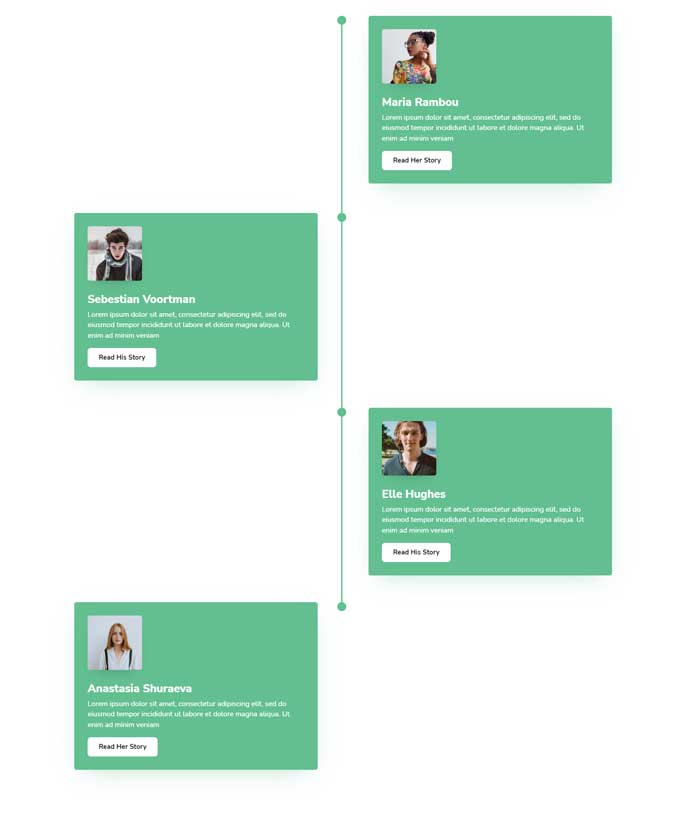
The Divi Plus Timeline module allows you to bring an eye-catching look to your website. It’s designed specifically for creating engaging vertical timelines that tell stories about businesses, careers, or lives.
With this module, you can easily show images, event dates, and other information in your Divi timeline without needing to know CSS or any complex coding.
No matter what type of story you’re trying to tell on your website, the Divi Plus Timeline module makes it easy to do so with visually appealing and professionally constructed timelines.
You can choose from several different styling options according to the look you want for the timeline.
You can adjust the font size and color of text elements such as headings and descriptions, as well as change the alignment of text elements like titles and subtitles.
You can also choose from several different background colors that will help ensure your timeline stands out from other content on the page.
Furthermore, if you need more control over your timeline’s appearance, you can also customize its individual elements using custom CSS code.
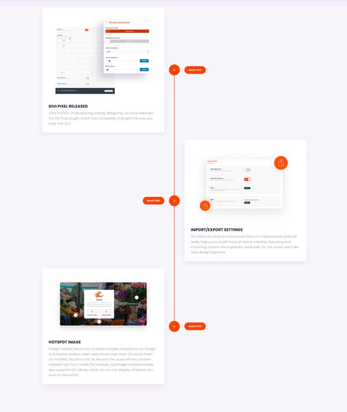
Divi Pixel plugin
It is important that websites are optimized to be viewed on mobile devices, and the Divi Pixel Timeline Module makes it easy to customize your timeline layout for any device.
This module has specific settings for desktop, tablet, and mobile users so that each element of the timeline can be adjusted to your specifications – this includes changes to the text, the line separator between events, and even icons.
With these settings, you can make sure that your timeline looks great on any device without compromising its functionality or readability.
In addition to these responsive settings, this Divi Timeline Module also provides plenty of additional options so you can customize it in order to create a beautiful timeline for your website.
You’ll have control over how many events appear at once on a timeline, how far apart those events are spaced out from each other, what type of transition is used when moving from event to event, whether or not icons should appear alongside each item in the timeline, as well as color and font customizations.
These features combine to give you full control over how your timeline looks so you can ensure it stands out amongst all of your other content.
Conclusion
Overall, creating a Divi timeline layout for your website is a great way to add some interactivity and visual interest to your site.
I hope you liked this step-by-step tutorial on how to create a Divi timeline, and if you have any questions just let me know in the comments below.

How did you create the divider line in the middle of the row?
This part is missing in the tutorial.
If I create another row beneath and place a divider module inside with 90deg rotation in overflows outside into my footer..
Thanks
Hi Kevin,
I forgot to add that in the tutorial, but I have added step 6 now with that center divider.
Thank you for this great tutorial. Could you assist with the creation of the middle line? It doesn’t extend to the bottom even though the row and module heights are 100%. The line also is behind the content boxes and can’t be seen. Thank you in advance for any help.
Hi Jasper,
Sure, could you send me a link to your website? You can also send it to info@markhendriksen.com if you want it private.