


The internet has come a long way since its early days.
Many of us can remember using websites that looked vastly different from what we see now.
These old websites may seem outdated and even clunky, but they hold an important place in our digital history.
In this article, we explore the rapidly changing digital landscape. It’s easy to overlook the many changes our favorite websites have gone through to become the internet giants they are today.
Yet, there’s a certain charm in revisiting these old websites of the past, a task made possible thanks to archival tools like the Wayback Machine.
YouTube: The Video-Sharing Pioneer
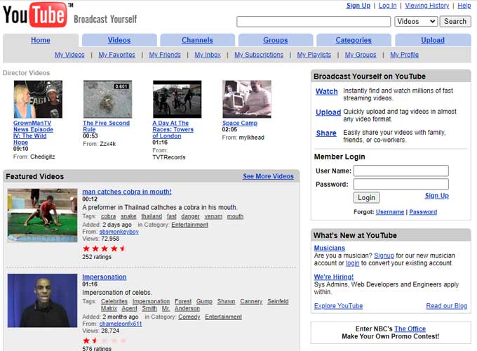
YouTube was launched in 2005 by Steve Chen, Chad Hurley, and Jawed Karim as a platform where users could easily upload and share video content.
Early design
The initial design of YouTube was simple and user-friendly, focusing on community and content discovery.
It featured a search bar prominently at the top, with videos displayed in a grid format below.
This layout, outlining the website’s core functionality, made it easy for users to browse, watch, and upload videos. The platform quickly evolved to include features like video ratings, comments, and subscriber channels, enhancing user interaction and content circulation.
Fun fact
YouTube’s first-ever video uploaded to the site was titled “Me at the Zoo” by co-founder Jawed Karim, which remains on the platform to this day.
YouTube’s rapid growth was propelled by the ease of sharing and viewing videos, eventually leading to its acquisition by Google in 2006 for $1.65 billion.
This acquisition further accelerated YouTube’s transformation into the dominant online video platform, influencing media consumption worldwide and giving rise to a new generation of content creators and influencers.
Target: Early E-Commerce Innovator
Target launched its website, Target.com, in the early 2000s to extend its retail presence into the online shopping space.
Early design
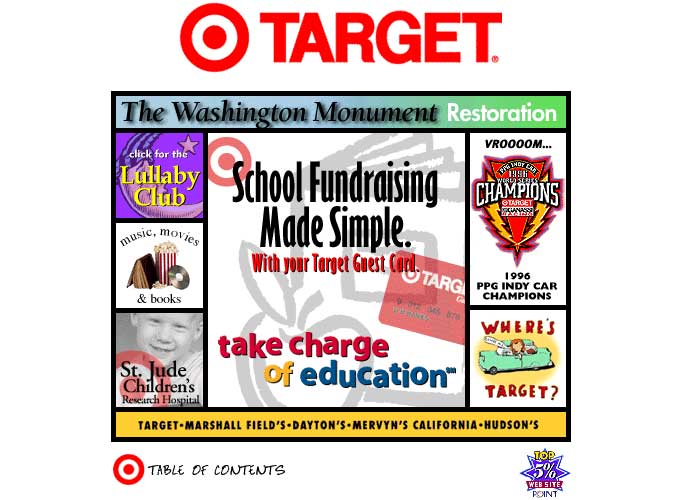
The homepage is quite busy, with many elements competing for the user’s attention.
This cluttered look was typical before the trend toward minimalist design took hold.
The presence of graphical buttons like “click for the Lullaby Club” and the icons for music, movies, and books indicate an interactive approach aiming to make the browsing experience engaging, if not a bit overwhelming by today’s standards.
Fun fact
Target was one of the first retail websites to integrate store inventory with online data, allowing customers to see product availability at their local stores on the website.
This feature significantly enhanced the shopping experience by providing customers with the option to buy online and pick up in-store, thereby combining the convenience of online shopping with the immediacy of physical retail.
This early adoption of what is now known as “omnichannel” retailing was a strategic move that has helped maintain Target’s reputation as a forward-thinking retailer.
Geocities: The Web Home for Everyman
GeoCities, founded in 1994 by David Bohnett and John Rezner, was an early web hosting service that evolved into a platform where users could create websites organized into themed “neighborhoods.” It democratized web content creation, allowing millions to publish personal and fan pages.
Acquired by Yahoo! in 1999 for about $3.57 billion, GeoCities’ popularity waned with the rise of sophisticated platforms and social media, leading to its closure in the U.S. in 2009.
Early design
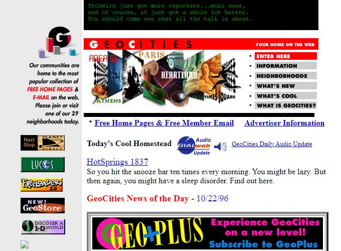
The design captures the essential features of early web aesthetics, marked by a visually busy layout, vibrant colors, and a diverse array of fonts.
Each section of content is tightly packed with text and images, a common design approach before usability studies became widespread that later encouraged more space and cleaner designs.
Fun fact
Geocities was once the third-most visited site on the web, illustrating its massive popularity and impact on early Internet culture. Despite its eventual shutdown in 2009, the spirit of Geocities lives on through various archives and tributes that seek to preserve its eclectic and vibrant content.
Aliweb: The Web’s First Search Engine
Aliweb (Archie Like Indexing for the WEB) was launched in November 1993 and is recognized as one of the first search engines for the World Wide Web, predating even the more famous engines like Yahoo! and Google.
Developed by Martijn Koster, Aliweb did not crawl the web itself but instead allowed website owners to submit pages they wanted to be indexed along with a description.
This approach meant that Aliweb worked more like a traditional directory rather than a full-text crawler-based search engine.
Early design
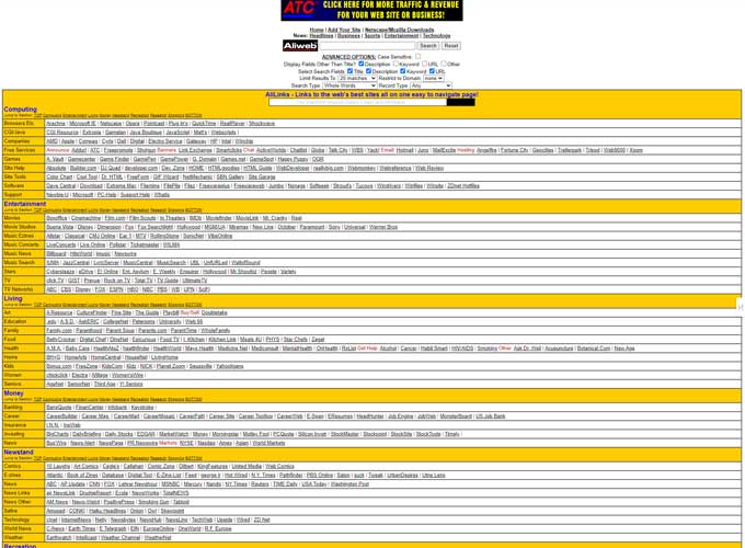
Its design was very minimalistic and text-based, reflecting the early web’s technical and user interface limitations.
Fun fact
Aliweb was announced in November 1993 at the first International WWW Conference in Geneva, Switzerland.
Despite its pioneering status, Aliweb did not gain the same traction or recognition as subsequent search engines because it relied heavily on webmasters to submit their own sites and manually update their listings.
This model was less scalable compared to the automated crawling technology that later engines would adopt. Nonetheless, Aliweb represents a significant milestone in the development of search engine technology, paving the way for the dynamic, algorithm-driven search platforms that would soon dominate the internet.
Netflix: A Sleekest Streaming Service
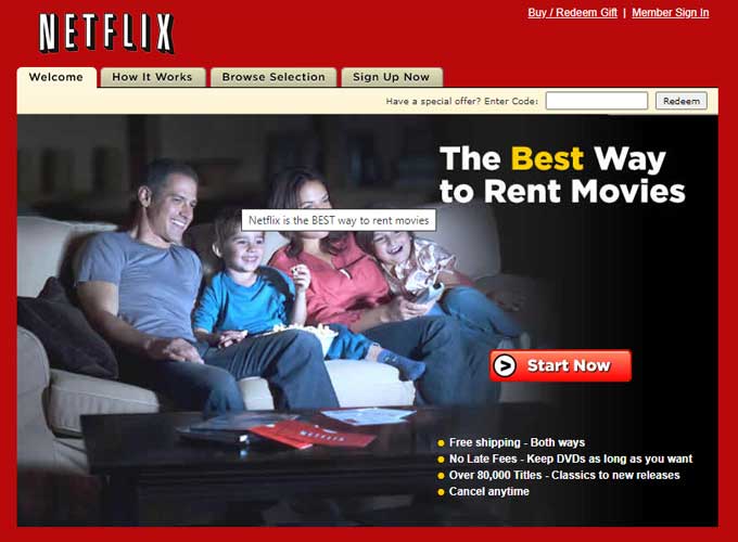
Netflixwas founded in 1997 by Reed Hastings and Marc Randolph in Scotts Valley, California. Initially, it started as a DVD rental service by mail, offering a novel no-late-fee model in contrast to traditional video rental stores.
The company launched its streaming service in 2007, allowing subscribers to watch thousands of TV shows and movies on-demand.
Early design
The layout is relatively clean and simple, with a strong visual hierarchy that leads the viewer’s eye to the key message: “The Best Way to Rent Movies.”
The use of a dark color scheme with red accents is in line with Netflix’s brand colors, and the use of gradients in the navigation bar and buttons reflects the design trends of that time.
The site features a classic marketing strategy with a list of bullet points highlighting the service’s benefits, such as “Free shipping,” “No Late Fees,” and a vast selection of titles.
This direct approach was typical for websites during this period, which often focused on clear, concise information delivery.
Fun fact
A fun fact about Netflix is that it transitioned to streaming video in 2007, revolutionizing not just its business model but also the entire entertainment industry.
This pivot was a huge gamble at the time but ultimately paved the way for the demise of video rental stores and the rise of online streaming as the dominant way people consume movies and TV shows today.
Netflix’s streaming service was initially a small add-on feature to its DVD rental service but quickly grew in popularity, leading the company to phase out its DVD services and focus primarily on streaming, which now serves millions of users globally.
Craigslist: The Classifieds Curve Breaker
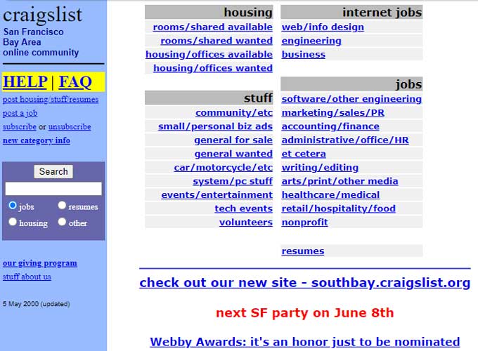
Craigslistwas founded in 1995 by Craig Newmark as a simple email distribution list to friends, featuring local events in the San Francisco Bay Area.
It quickly expanded to include other categories and became a web-based service in 1996.
Originally designed to serve only San Francisco, Craigslist spread to cities across the United States and eventually around the world, offering localized classified ads and forums.
Early design
The interface is extremely minimalistic, with sparse use of color, primarily blues, and purples, to categorize and highlight different sections and links.
Craigslist’s design reflects an emphasis on function over form, with a straightforward layout that presents a list of hyperlinks categorically arranged. This approach is highly practical, allowing users to quickly navigate to the desired section of the website.
One prominent feature is the absence of images or any complex graphics, which aligns with the website’s aim to maintain fast loading times and easy accessibility, even for users with slower internet connections, which were common at the time.
Fun fact
There are over 700 Craigslist sites in 70 countries. It is also the 33rd most visited website in the whole world!
Despite Craigslist’s minimalistic design and basic user interface, it has become one of the most popular websites in the world for classified ads.
It’s known for maintaining its simple layout and resisting changes and commercialization, including retaining its early web design aesthetic.
Craigslist has had a profound impact on how people buy and sell goods and services locally, fundamentally changing local commerce in many regions around the world.
Barnes & Noble: The Reader’s Retreat
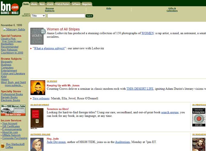
Barnes & Noble, primarily known for its large retail bookstores, launched its website, BN.com, in the late 1990s to extend its retail presence online.
Early design
The color scheme uses soft olive greens, beiges, and muted gold. These colors were typical for many websites during that period, aiming for a sophisticated or professional look.
The layout is organized into columns, with a main content area in the center and additional navigation options and features on the sides.
This structure resembles the layout of newspapers, reflecting an early approach to online content organization.
Navigation is primarily text-based with a column on the left side that provides a categorized menu, similar to many websites of that era before the widespread use of dropdown menus and hamburger icons.
The top navigation bar includes tabs that seem to be for different product categories, suggesting an early version of tabbed navigation which has evolved but is still in use today.
Fun fact
Barnes & Noble was one of the first major bookstore chains to compete with Amazon in the online book retail space.
In response to the growing popularity of eBooks, Barnes & Noble introduced the Nook in 2009, an eReader device that was integrated with BN.com for direct downloading of eBooks.
This move was aimed at capturing the rapidly growing market of digital reading, which allowed them to remain competitive in a rapidly changing retail landscape.
The Nook and its associated digital library were significant in helping Barnes & Noble transition from traditional bookselling to embracing the digital revolution in publishing.
PBS: The Public Service Champion
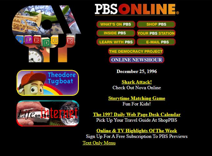
PBS, the online arm of the Public Broadcasting Service, was launched in 1995 to extend the educational content of PBS to digital audiences.
The website was designed to be a portal for both educational resources and entertainment, reflecting the public broadcaster’s mission to make high-quality content accessible to all.
Early design
The design is indicative of the time period, with a prominent use of black as the background color, creating a stark contrast for the colorful, text-based navigation buttons at the top of the page.
This color scheme allows the red and yellow buttons to stand out, guiding users to different parts of the site such as ‘SHOP PBS’, ‘YOUR PBS STATION’, and ‘E-MAIL PBS’.
This kind of bright, contrasting color use was typical of the era, intended to attract attention and make navigation elements clear.
Below the navigation is a collage-style arrangement of different elements representing various PBS shows and features, such as ‘Theodore Tugboat’ and ‘Life on the Internet’.
Adding graphics from actual programs aims to engage the site’s visitors by using familiar visuals from their broadcasting content.
In the center of the page is an update section with dated entries, featuring a red headline to signify urgency or importance.
This was a common practice to keep content appearing fresh and to promote new material or events.
The use of drop shadows on the text, another design trend of the time, adds a three-dimensional effect to the flat screen.
The overall layout is somewhat freeform compared to the grid layouts that would become more common with the advance of CSS for page styling.
Additionally, the presence of a ‘Text Only Menu’ acknowledges the era’s varying internet speeds and the need to accommodate users who might struggle with bandwidth limitations.
Fun fact
A fun fact about PBS.org is that during the late 1990s and early 2000s, it became a pioneer in offering full-length videos and detailed program information online, helping to set the standard for how TV networks presented themselves on the internet. This foresight allowed PBS to reach a broader audience digitally, complementing its broadcast services and enhancing its educational outreach.
BuzzFeed: The King of Virality
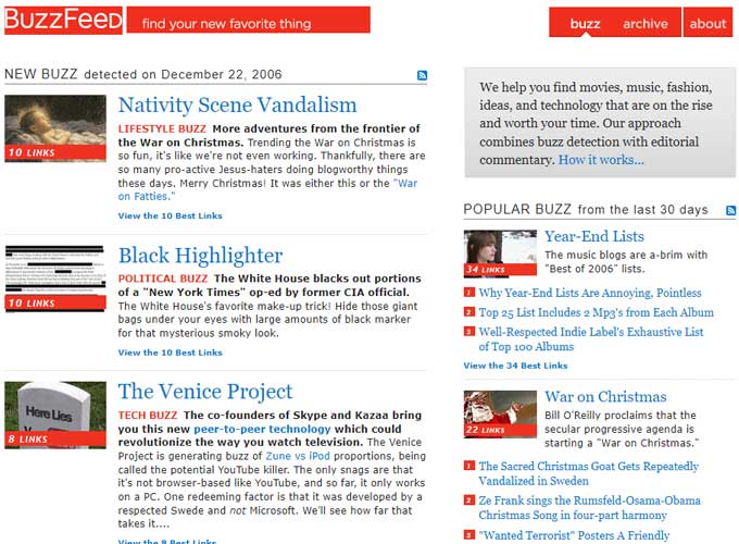
BuzzFeed was launched in 2006 by Jonah Peretti and John S. Johnson III, initially as a viral lab focusing on tracking viral content, before evolving into a massive news and entertainment company.
Early design
The design uses bright reds and light grays that allow for the headlines and navigation elements to pop against the white background. The use of red not only aligns with the BuzzFeed brand but also serves to capture user attention effectively.
Additionally, graphical elements like buttons and icons have a glossy, beveled appearance, characteristic of Web 2.0 aesthetic preferences for three-dimensional and skeuomorphic design cues.
The right column includes a ‘POPULAR BUZZ from the last 30 days’ section, which came before the advanced algorithms developed in later years that personalize content.
This early effort to highlight trending content shows the beginnings of BuzzFeed’s key appeal: the skill to swiftly find and spread viral content.
The top navigation is simple, offering options such as ‘buzz’, ‘archive’, and ‘about’, reflecting a less complex site structure. The tagline “find your new favorite thing” suggests an emphasis on discovery, inviting users to explore content that might appeal to their interests and tastes.
Fun fact
A fun fact about BuzzFeed is that it was one of the first major publishers to invest heavily in internet quizzes and “listicles,” articles presented in list format. This approach not only set trends for online content but also proved to be highly engaging and effective in attracting large volumes of web traffic. BuzzFeed’s ability to blend entertainment with serious journalism, using a style that appealed to a younger demographic, helped redefine modern media consumption habits.
Apple: The Design Legend
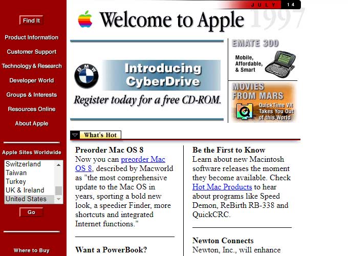
The official website of Apple. was launched in 1996, designed to provide information and support for its products and to serve as a direct sales channel.
Early design
The layout of the page is structured with a navigation sidebar on the left, using a bold, primary color scheme of red, blue, and white—colors that are strongly associated with the Apple brand. This sidebar provides a clear, text-based menu system that is indicative of the era’s preference for simplicity and functionality in web design.
The main content area on the right features a mix of typography and images. A prominent promotional graphic introduces ‘CyberDrive’, encouraging visitors to register for a free CD-ROM, which was a common marketing tool at the time. Below this are sections such as ‘What’s Hot’ and ‘Be the First to Know’, highlighting the latest news and products—a format still used in contemporary web design for featured content.
The design employs a variety of text styles, including different colors, sizes, and boldness, to create a visual hierarchy within the content. This was a time before the widespread adoption of web standards like Cascading Style Sheets (CSS), so such styling was often hard-coded with HTML.
Interestingly, the page incorporates both graphics and text to direct users, with graphical buttons complemented by text links. The ‘Welcome to Apple’ banner at the top serves as a branding element, which is consistent with Apple’s emphasis on brand identity.
Fun fact
A fun fact about Apple.com is that it was one of the first major corporate websites to use HTML5 video extensively, abandoning older technologies like Adobe Flash. This transition, which started around 2010, not only improved the aesthetics and performance of Apple.com but also influenced the broader web development community to adopt newer, more efficient standards for multimedia content.
MTV: Music’s Digital Age Icon
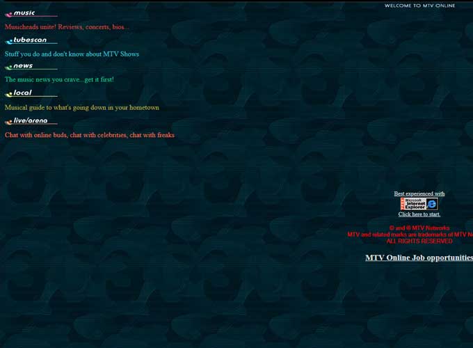
MTV revolutionized music consumption, offering everything from news to streamed music videos. Its immersive layout and use of multimedia represented a communal listening and viewing experience, where design wasn’t just about the visual but also about shaping user interaction and community.
MTV was launched in 1996 as the online counterpart to the MTV cable television network, known for revolutionizing the music industry with its music video format.
The website initially extended the MTV brand into the internet, featuring a vibrant and edgy design that mirrored the network’s focus on youth culture, music, and entertainment.
Early design
The home page is a very minimalistic and dark design, common in the early stages of web development. The background is a deep blue with a subtle, repetitive pattern that doesn’t detract from the content.
The site’s navigation is presented in a single column of white text on the left, making it stand out against the dark backdrop. This left-aligned, text-based navigation is indicative of the era’s web design, focusing on simplicity and ease of use.
There is a clear emphasis on the music aspect, with sections like ‘music’, ‘tube scan’, ‘news’, and ‘local’ suggesting that the website was an extension of their TV offerings. The option for ‘live/arena’, indicating online chat capabilities, shows early incorporation of interactive features.
The design is simple and practical., aimed at delivering content efficiently rather than providing a rich visual experience.
Fun fact
MTV.com was an early adopter of streaming video technology, reflecting its innovative approach to music and entertainment broadcasting. MTV began streaming select video content and exclusive interviews in the late 1990s, significantly ahead of the mainstream adoption of streaming media. This move put MTV on the map as a pioneer in embracing new tech for enjoying media.
Google: The Search Engine Sensation
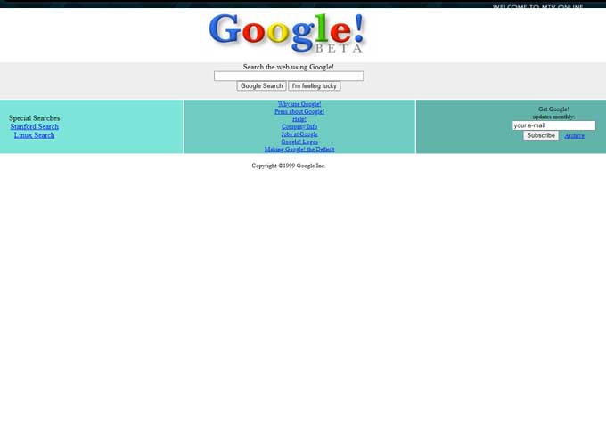
Google was launched in 1998, and created by Larry Page and Sergey Brin as a Ph.D. project at Stanford University.
Early design
The site’s design has always been famously minimalist, reflecting the company’s focus on user-friendly design and speed.
The homepage consists almost exclusively of the Google logo, a search box, and two buttons: “Google Search” and “I’m Feeling Lucky.” This simplicity and uncluttered approach facilitated quick loading times and focused user attention on search functionality, distinguishing Google from more complex and visually busy search engines of the time.
Fun fact
A fun fact about Google is that the “I’m Feeling Lucky” button, which costs the company millions in lost advertising revenue annually, directly takes users to the top search results, bypassing the search results page.
This feature was designed to highlight Google’s search efficiency and confidence in its search algorithm’s ability to deliver the right result on the first try. Despite its cost, the button has remained as a testament to Google’s early user-focused design philosophy.
Neopets: The Original Online Virtual Pet Community
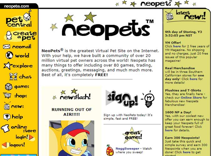
Neopets was launched in 1999 as an immersive virtual pet website where users could adopt and care for fantasy creatures in the world of Neopia.
The site was groundbreaking for integrating a vast, fictional universe with online games, a virtual economy, and a complex pet management system.
Early design
The home page reflects a vibrant and playful design aesthetic typical of the early 2000s. The color palette is bright and varied, with a strong use of primary colors—yellow, red, and blue—that appeal to its younger audience.
The site’s layout is dense, and packed with information, navigation links, and calls to action, which was a common trait before the minimalist design trends took hold.
Fun fact
Neopets originally started as an independent project by British college students Adam Powell and Donna Williams. The site quickly gained a cult following due to its engaging content and innovative use of an in-game currency system, Neopoints, which could be earned by playing games and participating in site activities. This model was pioneering at the time and set a precedent for many future online games that incorporate virtual economies and interactive storytelling.
Macy’s: The Style Stalwart
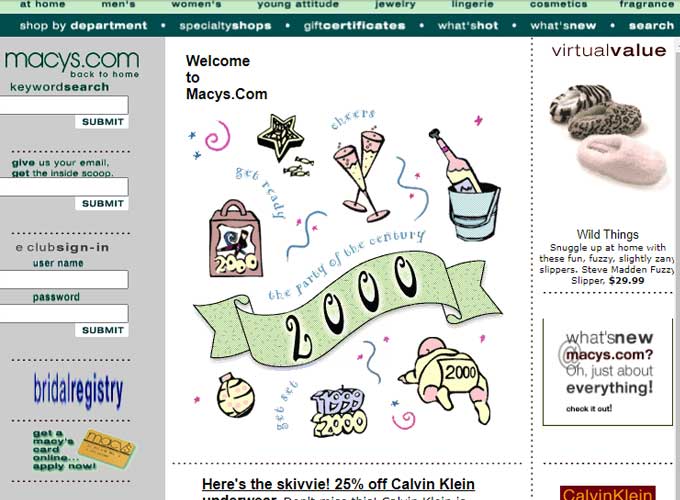
Macy’s, the digital storefront for the iconic American department store chain, was launched in 1997 to expand its retail offerings into the rapidly growing online market.
Early design
The overall design includes playful graphics, a mix of fonts, and a pastel color palette, which provides a soft and friendly user interface.
While the page is dense with information, it mirrors the in-store experience of department-store shopping by offering a variety of options and paths for the user to explore.
The layout is segmented into distinct sections, each with its own purpose, including a login area, navigation tabs, and promotional content.
Fun fact
A fun fact about Macy’s is that it was one of the first major department stores to offer online shopping, reflecting the company’s early recognition of the Internet’s potential to transform retail.
Macy’s pioneered several features that are now standard in online retail, including detailed product descriptions and images, customer reviews, and the ability to check the availability of items in nearby stores, enhancing the integration of online and brick-and-mortar shopping experiences.
Pepsi: The Multimedia Marketing Mecca
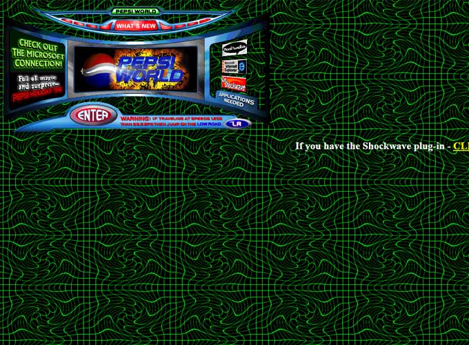
Pepsi was launched in the mid-1990s as part of PepsiCo’s efforts to establish an online presence for its flagship brand, Pepsi.
Early design
The background features an intense, neon green maze pattern against a black backdrop, which is attention-grabbing and reflective of the era’s penchant for vibrant, often busy, background designs.
The central feature area is a framed box with a futuristic look, containing the Pepsi World logo and a ‘What’s New’ section that appears to be promoting a new feature or product. The use of dark colors with neon highlights in this area is aligned with the overall website theme and resonates with the brand’s image of being modern and trendy.
The design elements on this Pepsi page Illustrate the experimental nature of early web design, with a focus on creating a visually appealing experience to keep visitors engaged. It suggests a specific period when brands were beginning to explore the potential of the web as a medium for rich, interactive branding experiences.
Fun fact
A fun fact about Pepsi is that it has historically been used as a platform for innovative marketing campaigns.
For instance, in the early 2000s, Pepsi used its website to host unique digital content and interactive games that tied into major promotional pushes, such as contests and sweepstakes.
This approach was part of Pepsi’s strategy to connect with a younger audience and use the internet as a means to boost brand loyalty and excitement around its products.
Mashable: The New Media Maverick
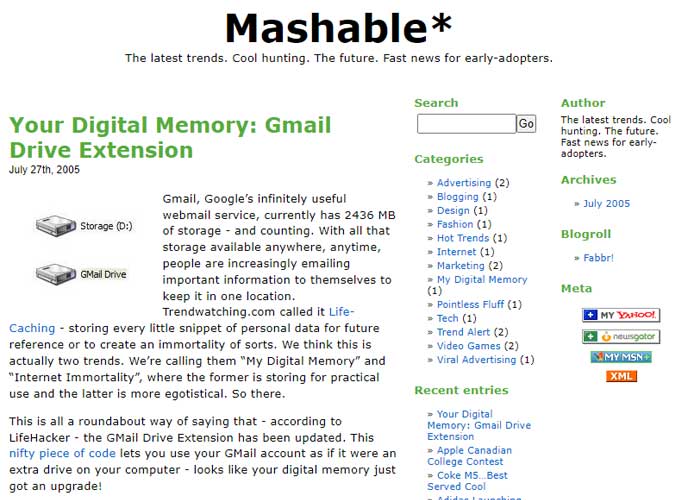
Mashable was launched in 2005 by Pete Cashmore from his home in Scotland. Initially, it was focused on up-and-coming social media and technology trends, providing insights and commentary that appealed to tech enthusiasts and early adopters.
Early design
The design is clean and content-focused, with clear, straightforward typography and a monochromatic color scheme accented with blue links—a style that emphasizes readability and function over graphical flair.
The presence of a blogroll and recent entries section further reinforces the blog’s role as a part of a wider community of content creators, sharing links to other relevant sites and recent posts to engage readers.
Fun fact
A fun fact about Mashable is that despite its global influence and readership, it began as a simple blog operated from Pete Cashmore’s bedroom.
Its founder was only 19 years old at the time of its inception. Mashable’s rapid growth is a testament to the power of the internet to enable a single individual to reach a global audience almost overnight.
This transformation from a small blog into a major media company illustrates the profound impact of digital media and the democratization of information sharing.
AOL: The Internet’s Welcome Mat
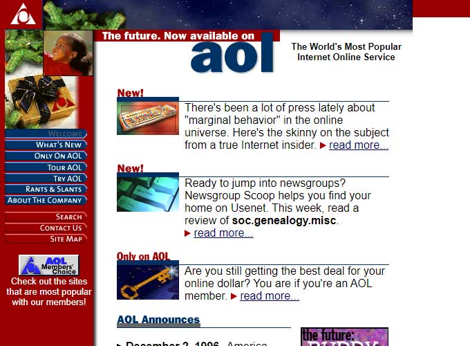
AOL (America Online) was launched in 1985 as an online service provider and portal, becoming one of the early pioneers in the Internet industry.
Its website, AOL.com, was an entry point to the Internet for many new users in the 1990s and early 2000s.
Early design
The page is segmented into different sections with a strong use of color, creating distinct areas for content and navigation.
The left side of the page has a deep blue sidebar adorned with the red AOL logo, and it includes navigation links such as ‘Welcome’, ‘What’s New’, ‘Search’, and ‘Contact Us’. This sidebar design reflects the era’s style of web layouts that typically used colorful, text-based menus for navigating sites.
In the main content area, each news item is marked with a ‘New!’ icon to draw attention, a tactic typical of the time to signify recently updated content. The use of bright colors like red and blue not only aligns with the AOL brand but also makes the callouts jump out against the white background.
Fun fact
AOL is known for its aggressive marketing campaign that included mailing free trial CDs to potential customers across the United States.
This campaign significantly contributed to AOL becoming a household name. At its peak, it is estimated that half of the CDs produced worldwide were for AOL’s free trials.
This not only illustrates the company’s dominance during the early days of the Internet but also marks a unique chapter in marketing history.
McDonald’s: The Fast Food Giant’s Digital Drive-Thru
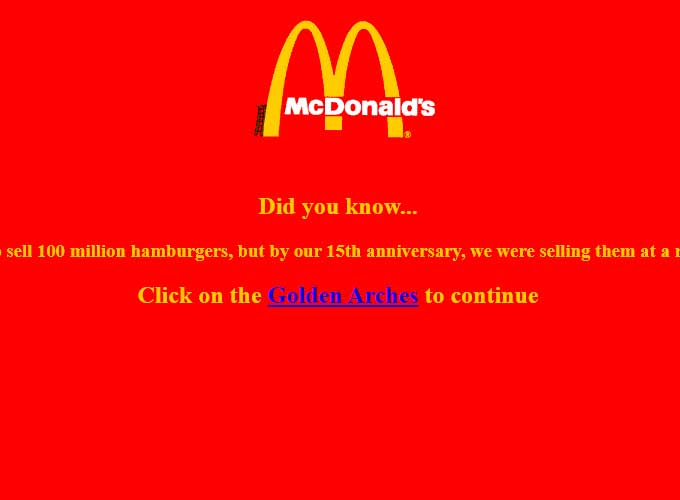
McDonald’s launched its website, McDonalds.com, in the mid-1990s as part of its strategy to boost its brand presence online for their customers.
Early design
The design is straightforward, featuring the golden arches logo centered at the top, immediately recognizable as McDonald’s branding.
Using a single background color with contrasting text color reflects the simple style of early web design, where pages were often not overloaded with images or multimedia content due to the slow internet speeds of the time.
The design prioritizes clarity, with a focus on the logo and the message to create an immediate brand association.
Overall, The design reflects a time when companies started to use the Internet for marketing, focusing on making their brands easily recognizable and keeping things simple.
Fun fact
Mcdonald’s was one of the first fast-food chains to offer a website that included a detailed restaurant locator, which was revolutionary at the time.
This tool not only helped customers find the nearest McDonald’s location but also provided directions and sometimes even local promotions.
This feature was particularly innovative during a time when online maps and GPS technology were not as advanced as they are today, showcasing McDonald’s early commitment to integrating technology with customer service.
Pinterest: The Visual Discovery Platform
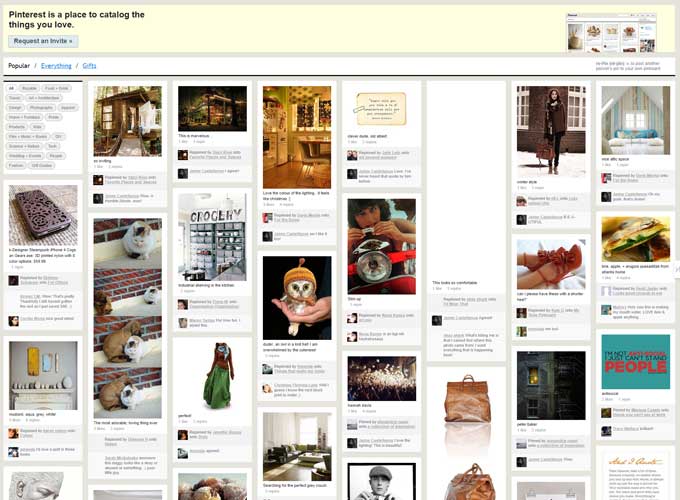
Pinterest was launched in March 2010 by Ben Silbermann, Paul Sciarra, and Evan Sharp, as a visual discovery engine designed to enable users to find inspiration for various interests and projects.
Early design
The site’s unique design centered around the concept of “pins” and “boards,” allowing users to pick out and share collections of images based on themes or interests.
The interface was notably clean and focused heavily on visual content, creating an intuitive user experience that encouraged browsing and discovery.
Pinterest’s grid layout was influential, inspiring similar designs across numerous other platforms and websites.
Fun fact
Pinterest was initially launched as an invitation-only site. This exclusivity created a sense of curiosity and demand around the platform.
Users needed an invitation from an existing member to join, which helped to grow the initial user base and ensured controlled growth, maintaining the quality of content and interaction on the platform as it scaled up.
This approach contributed significantly to its viral growth and the strong, engaged community that it boasts today.
NASA: The Sky Above Our Stars
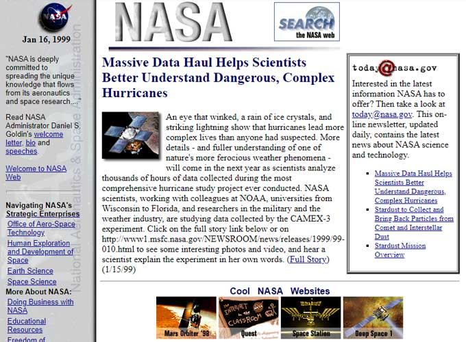
NASA’s official website, NASA.gov, was launched in the early 1990s to provide the public with access to extensive information about its various missions, scientific research, and technological advancements.
Early design
The page has a structured, table-based layout, divided into different sections for content and navigation—a common design pattern before the widespread adoption of CSS for layout.
The design incorporates a mix of text styles and blue hues, with some text set against a background color to draw attention. Decorative icons under the heading ‘Cool NASA Websites’ offer visual interest and a glimpse into other NASA-related sites.
Overall, the NASA home page is characteristic of the late ’90s web design, focusing on information hierarchy, user navigation, and the early integration of interactive elements, all presented in a layout that prioritizes functionality and content accessibility.
Fun fact
NASA was crucial in making space-related information more accessible to everyone. During significant events, such as the Mars Rover landings, the website provided live coverage and updates, allowing millions of people around the globe to watch history unfold in real time.
This not only helped educate the public about space exploration but also increased transparency and public involvement in NASA’s endeavors.
The site has won multiple awards for its educational value and its ability to engage the public in space science and exploration.
Reddit: The Forum of the Future
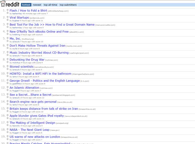
Reddit, launched in 2005 by Steve Huffman and Alexis Ohanian, is a social media platform that was originally designed as a simple, user-friendly site where users could submit links to content on the Internet.
Early design
The site’s initial design was a pretty minimalistic, text-based layout that prioritized functionality and ease of navigation, allowing users to quickly vote content up or down.
These votes would then determine the placement of posts on the site’s pages. Over time, Reddit has evolved to include thousands of subreddits, each dedicated to specific interests, hobbies, or discussions, maintaining its minimalist design but becoming one of the most versatile places on the web for community-driven content.
Fun fact
A fun fact about Reddit is that it started with a unique marketing tactic: the founders initially populated the site with content themselves, using a variety of fake accounts to give the appearance of an active user base.
This strategy helped in creating an engaging environment that encouraged new users to join and participate, and it kickstarted the site’s user-generated content model. Today, Reddit is known as “the front page of the Internet” because it’s good at bringing up trending content fast.
Wired: Connect to Tomorrow
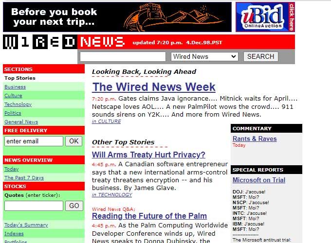
Wired, launched in 1996, is the digital counterpart to “Wired” magazine, a publication known for its focus on how emerging technologies affect culture, the economy, and politics.
Early design
The color scheme is bright and attention-grabbing, using reds, greens, and yellows, which make the different sections stand out and provide navigation—a practice common in web design at the time to draw the user’s eye to different areas of the site.
Overall, this Wired News webpage showcases a content-rich and vibrant design that aims to present a wealth of information in an organized and visually differentiated manner to engage its readers.
Fun fact
Wired was one of the first major publications to adopt a paywall, launching Wired Digital in 1994, which later evolved into the comprehensive site it is today.
This early move towards monetizing digital content was groundbreaking at the time and paved the way for many other publications to follow suit as the digital media landscape evolved.
Burger King: The Whopper’s Web Home
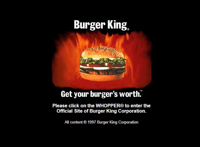
Burger King’s website, BK.com, was launched in the late 1990s as the digital platform for the global fast-food chain, known for its flame-grilled burgers.
Early design
The home page, presumably serving as a splash or entry page, was a common web design practice in the late 1990s. It features a very simple and stark design with a plain black background that makes the central image of a Whopper hamburger engulfed in flames stand out dramatically.
The Burger King logo is displayed above the image, using a minimalistic approach without any additional graphics or text to clutter the view. This highlights the branding effectively.
The design’s simplicity, with its focus on the product and brand, conveys a clear message and creates a memorable visual for the visitor. It’s a testament to the early days of the internet when website designs were often straightforward and aimed at quickly capturing the visitor’s attention with minimal distractions.
Fun fact
Burger King’s website has been used for several innovative marketing campaigns over the years. One notable campaign was the “Subservient Chicken” web campaign, which featured an interactive video where users could type commands that the chicken would follow.
Launched in 2004, this campaign was designed to promote the chain’s customizable sandwich and became a viral sensation, significantly boosting the site’s traffic and setting an example for interactive and viral marketing strategies in the fast-food industry.
TED Talks: Ideas Worth Spreading – and Designing
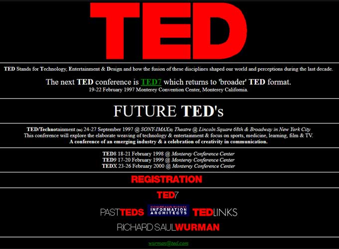
TED Talks, part of the broader TED (Technology, Entertainment, Design) organization, launched its website, TED.com, in 2006 to make talks from its conferences accessible to a global audience.
Early design
The design is symbolic of the late 1990s web aesthetic, featuring a large, bold ‘TED’ logo at the top against a black background, making a strong visual statement and ensuring instant brand recognition.
The webpage design is simple and direct, focusing on providing essential information about TED conferences and encouraging visitor action through prominent calls to registration. It reflects an era when websites served primarily as informational brochures rather than the dynamic, content-rich platforms they are today.
Fun fact
TED was initially started with just six talks as an experiment to test the concept of sharing TED content for free to a worldwide audience.
The overwhelmingly positive response led to the development of the site as a global platform, which now hosts thousands of talks and has subtitles in over 100 languages.
Yahoo: The Original Web Portal
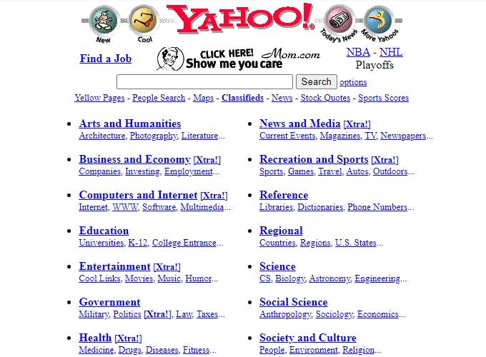
Yahoo! was launched in 1994 by Jerry Yang and David Filo as one of the first web directories, which eventually evolved into a fully developed web portal offering a variety of services including news, email, and a search engine.
Early design
The initial design of Yahoo!’s website was simple and organized, designed for easy navigation through its broad directory of websites.
It quickly became a popular starting point for internet users, featuring categories and subcategories of links to various websites, alongside services that were integrated into the Yahoo! platform.
Fun fact
A fun fact about Yahoo! is that it started as a hobby project by the founders when they were Ph.D. candidates at Stanford University.
The project was initially called “Jerry and David’s Guide to the World Wide Web” but was later renamed Yahoo!, an acronym for “Yet Another Hierarchical Officious Oracle.” This name humorously reflected the founders’ mission to provide a comprehensive directory to the web.
Over the years, Yahoo! grew to become one of the internet’s leading gateways, influencing how early users discovered and interacted with the web.
IMDb: The Trailers and Tributes Talisman
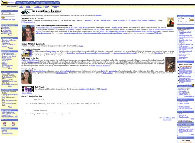
IMDb (Internet Movie Database) was launched in 1990 by Col Needham, a film enthusiast who wanted to create a comprehensive database of movie information.
Originally a downloadable database called “rec.arts.movies movie database,” it transitioned to a web-based service such as IMDb.com in 1993.
Early design
The layout is dense and packed with information, featuring a light-colored background and multiple columns filled with text links and small images, reflecting the web design trends of the time for content-heavy sites.
The IMDB page from this time is representative of an online directory or database, Aiming to offer detailed information through simple functionality and easy navigation, catering to users looking for specifics on movies, TV shows, and celebrities.
Fun fact
IMDb began as a hobby project by a group of friends who were members of an early internet newsgroup for discussing films.
The user-contributed nature of the site allowed it to amass a vast amount of data quickly.
IMDb’s user-friendly interface made it so popular that it was acquired by Amazon.com in 1998.
BBC: The Standard in Broadcasting
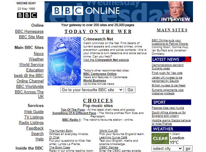
BBC, the online presence of the British Broadcasting Corporation, was launched in 1997 as an extension of the BBC’s extensive broadcasting services.
Early design
The late 1990s home page design featured a structured layout with a main navigation column on the left, a central content area, and a sidebar on the right.
The color palette features the BBC’s corporate colors of blue and white, creating a clean and professional look.
This BBC Online page showcases the practical and content-focused web design of the late ’90s, emphasizing easy access to diverse content with a straightforward, multi-column layout.
Fun fact
A fun fact about BBC.co.uk is that it was one of the first major news websites to provide constantly updated news coverage.
This approach to news delivery was revolutionary at the time and set the standard for other news organizations worldwide.
The White House Website: Digital Diplomacy
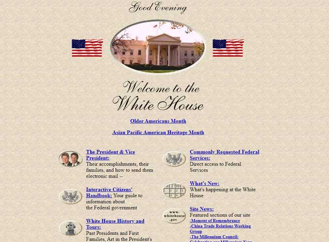
The White House website, WhiteHouse.gov, was launched in 1994 during the Clinton administration as an official digital presence for the executive branch of the United States government.
Early design
The design is simple and elegant, utilizing a central oval frame—echoing the design of the famous Oval Office—surrounded by a light textured background that gives it a parchment-like appearance.
The overall aesthetic is in keeping with the dignity and traditional aspects one might associate with the White House.
The home page design is all about being respectable and easy to use. It aims to give everyone easy access to presidential information and resources, while also encouraging people to get involved in civic activities.
Fun fact
A fun fact about WhiteHouse.gov is that it included a virtual tour of the White House, which was one of the first of its kind for such a prestigious government institution.
This feature allowed users from around the world to explore the White House from their computers, offering a unique educational tool, and promoting openness and accessibility to the iconic building.
AskJeeves: Asked and Answered
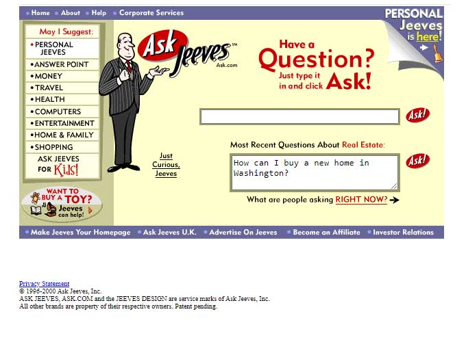
Ask Jeeves, launched in 1996, was a pioneering search engine known for its unique approach to internet queries, allowing users to ask questions in natural language rather than typing keywords.
Early design
The website featured a friendly butler character named “Jeeves” as its mascot, who ‘helped’ users find answers to their questions.
The design of Ask Jeeves was user-friendly and approachable, reflecting its aim to make the search experience more personable and less intimidating than other search engines at the time.
Fun fact
A fun fact about Ask Jeeves is that it was one of the first search engines to use a question-answer format, which came before the AI-driven natural language processing capabilities seen in today’s search technologies.
The character of Jeeves was based on the fictional valet from P.G. Wodehouse’s novels, symbolizing thoughtfulness and reliability.
Although Jeeves retired from the site in 2006 as part of a rebranding to simply “Ask.com,” the original concept of answering user questions directly had a lasting impact on the development of search engine interfaces and functions.
W3: The Web Standards Defender
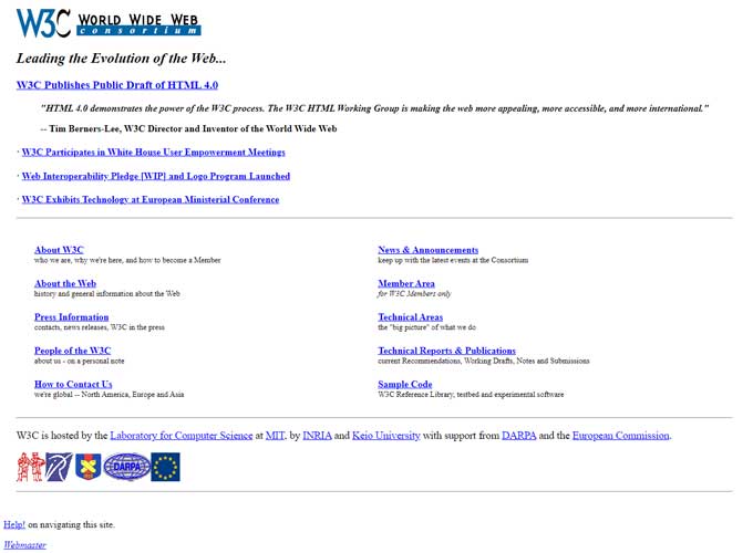
W3, the official website of the World Wide Web Consortium (W3C), was launched in 1994. The W3C, led by Tim Berners-Lee, the inventor of the World Wide Web, is an international community that develops open standards to ensure the long-term growth of the Web.
Early design
The design of W3.org has always been practical and straightforward, focusing on providing information and resources related to web standards such as HTML, CSS, and XML.
Fun fact
W3 has been instrumental in the making and backing up of web standards that have shaped the internet as we know it today.
For example, W3C’s endorsement of HTML5 was a significant milestone in web development, marking a major evolution in how content and multimedia are handled across the web.
The organization’s ongoing work continues to influence the development of the web, ensuring that it remains a universal, open platform for innovation and collaboration.
Lays: The Crunch of Creativity
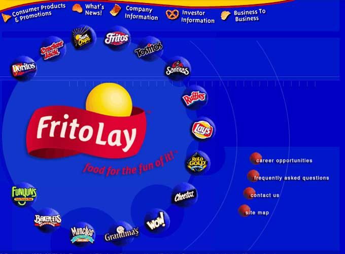
Lays, the official website for Lay’s potato chips, a brand owned by PepsiCo, was launched in the late 1990s to market its diverse range of potato chip flavors and engage directly with consumers.
Early design
The design uses the strong and familiar branding of Frito-Lay and its snack products.
Centered in the image is the Frito-Lay logo with the tagline “Food for the fun of it!” against a vibrant blue background. This central positioning of the logo, coupled with the tagline, emphasizes the brand’s association with enjoyment and snacking.
Around the logo are floating product icons for Doritos, Fritos, Tostitos, and more, which act as interactive elements likely leading to individual product pages or related marketing content.
At that time, the trend of using product packaging as navigation aids aimed to offer an engaging and visually appealing user experience.
Fun fact
Lays has been used to host several innovative marketing campaigns, including the “Do Us a Flavor” contest, which invited customers to submit their own ideas for new potato chip flavors.
This contest not only generated significant consumer interaction with the brand but also brought forward unique flavor ideas from different parts of the world, some of which were turned into actual products.
Tumblr: The Creative’s Canvas
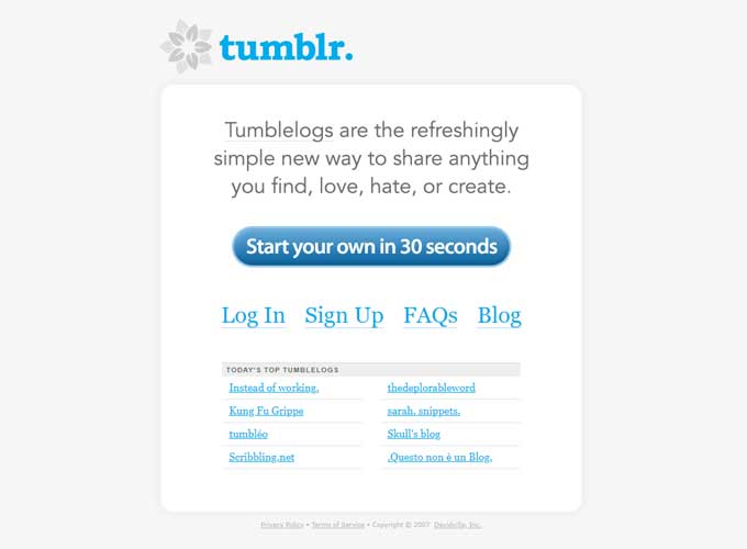
Tumblr, launched in 2007 by David Karp, is a microblogging platform that allows users to post multimedia and other content to a short-form blog.
It quickly distinguished itself with its user-friendly interface and the ability to customize blog themes extensively, which appealed to a diverse and creative user base.
Early design
The site features a clean, uncluttered layout with a lot of white space, which emphasizes the content and the call to action.
Central to the page is the Tumblr logo, which is followed by a succinct and engaging tagline that clearly states the purpose of the platform: “Tumblr lets you effortlessly share anything.” This direct and informal language reflects the casual and personal nature of the platform.
The design’s simplicity, with its focus on ease of use and rapid engagement, is representative of a shift in web design towards more user-friendly interfaces that encourage interaction without overwhelming the user with excessive information or choices.
Fun fact
Tumblr pioneered several internet culture phenomena, including the widespread use of GIFs in personal blogging.
Tumblr helped build a lively community that quickly adopted and spread “fandom” culture online. It encouraged active discussions and content creation about TV shows, movies, and comics.
Walmart: The Mass Merchandiser’s Masterpiece
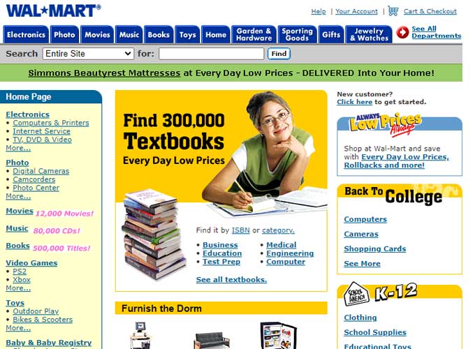
Walmart was launched in 2000 as the online retail arm of Walmart, the world’s largest company by revenue and a leading retailer.
Early design
The layout is full of different elements, showing how the trend at the time was to make the most of the available screen space.
The design uses bright colors, especially the brand’s signature blue and yellow, and varies fonts and sizes to clearly separate different sections and offers.
The use of banners and sidebars full of links was common at the time, reflecting the early phases of online consumer behavior where the visibility of options was prioritized.
Fun fact
Walmart was one of the pioneers in offering Site-to-Store shipping, a service introduced in 2007, which allowed customers to order products online and pick them up at their local Walmart store for free.
Got Milk? Got a Memorable Website
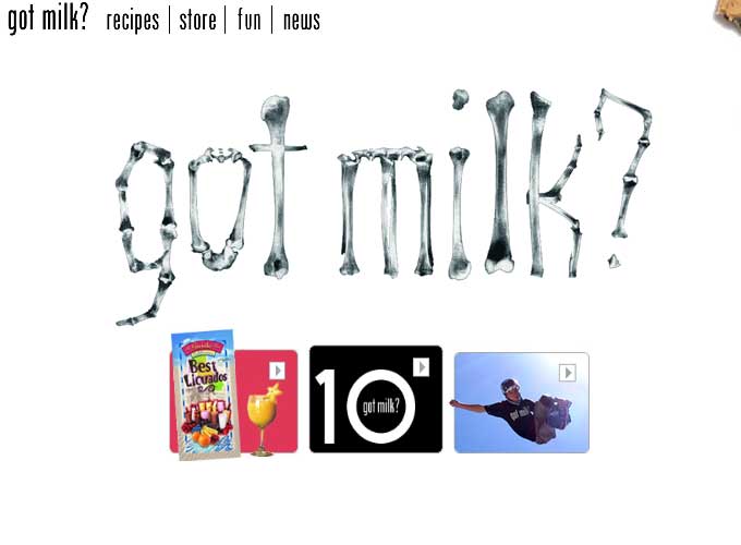
The “Got Milk?” website was part of a broader advertising campaign created in 1993 by the California Milk Processor Board to encourage the consumption of cow’s milk.
The campaign’s memorable tagline, “Got Milk?”, became famous through a series of print and television advertisements featuring celebrities with a milk mustache.
Early design
The website design is minimalist and uses a large, iconic “Got Milk?” logo in the center as a visual anchor. The logo’s distinctive typeface, created to look like milk spills, became synonymous with the campaign and is instantly recognizable.
The color scheme is very light and airy, with plenty of white space, which keeps the focus on the campaign’s famous logo and the photographic content. This design reflects the campaign’s focus on cleanliness and simplicity, which matches the nature of the product (milk) being advertised.
Fun fact
A fun fact about the “Got Milk?” campaign is that it significantly boosted milk sales in California during its early run and became one of the most famous commodity brand campaigns in the United States.
The campaign’s success led to its adoption by milk processors and dairy farmers across the nation. It also left a lasting cultural impact, with the phrase “Got Milk?” becoming embedded in popular culture, often parodied and referenced in various other media contexts.
Space: Reaching Out to Infinity
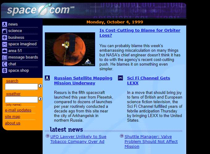
Space was launched in 1999 as a news website dedicated to coverage of astronomy, space exploration, and related sciences.
The site aims to serve space enthusiasts by offering the latest news, in-depth articles, and insights from field experts.
Early design
The page layout stands out because of its bold colors. It features a dark blue background that makes the other colors stand out more. Bright, contrasting colors like orange are used for headlines and sections to grab attention, a popular design tactic.
The design reflects the late 1990s website style, featuring a busy layout, gradients, and a focus on delivering lots of information to the user all at once.
Fun fact
Space became a go-to source for live coverage of significant space events, such as rocket launches, meteor showers, and planetary transits.
The website often features live streams and real-time updates during these events, bringing the excitement of space exploration directly to its audience’s screens.
Sephora’s Beauty in E-Commerce
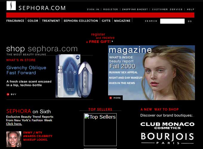
Sephora was launched in the late 1990s as the online arm of the French multinational retailer of personal care and beauty products, Sephora.
The website was designed to echo the brand’s chic, innovative, and customer-friendly in-store experience.
Early design
The Sephora website showcases web design trends from the late 1990s and early 2000s. Its design features many visual elements, like high-quality images of beauty products, which makes sense for a cosmetics and beauty retailer.
The website uses a color scheme of black, red, and white, matching the Sephora brand, which gives it a sophisticated and elegant look.
This Sephora website shows a time when online shopping was getting better at providing a great user experience, similar to the brand’s sophisticated and expert in-store vibe.
Fun fact
Sephora was one of the pioneers in integrating technology into the beauty shopping experience.
The “Virtual Artist” tool, introduced in 2016, uses facial recognition technology to enable customers to see how makeup products look on their own face before making a purchase.
This innovative use of technology not only boosts customer satisfaction by reducing the uncertainty of online shopping but also positioned Sephora as a leader in digital beauty retail.
Coca-Cola’s Digital Fizz
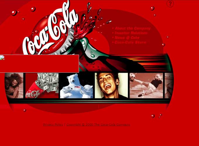
Coca-Cola’s website, launched in the mid-1990s, reflects the brand’s global presence and iconic status in the beverage industry.
Early design
The page features a bright red color that immediately brings to mind the Coca-Cola brand, with the logo in its classic script font clearly displayed at the top. This design is instantly recognizable and helps to strengthen the brand’s identity.
The background displays a lively splash of Coca-Cola, highlighting the drink’s refreshing nature. This type of vibrant, action-focused imagery was often used on early websites to capture the product’s essence.
This Coca-Cola webpage’s design is a classic example of early 2000s web design, emphasizing bold brand visuals, straightforward navigation, and a layout aimed at grabbing the consumer’s attention with eye-catching graphics that represent the brand’s image.
Fun fact
Coca-Cola played a significant role in some of Coca-Cola’s most innovative campaigns.
For instance, the “Share a Coke” campaign, which personalized bottles with people’s names, was heavily promoted through the website where users could order customized bottles online.
This campaign significantly boosted online engagement and connected digital content with physical product experiences, demonstrating Coca-Cola’s adeptness at integrating online initiatives with its global brand strategy.
Harvard: Academia’s Artistry
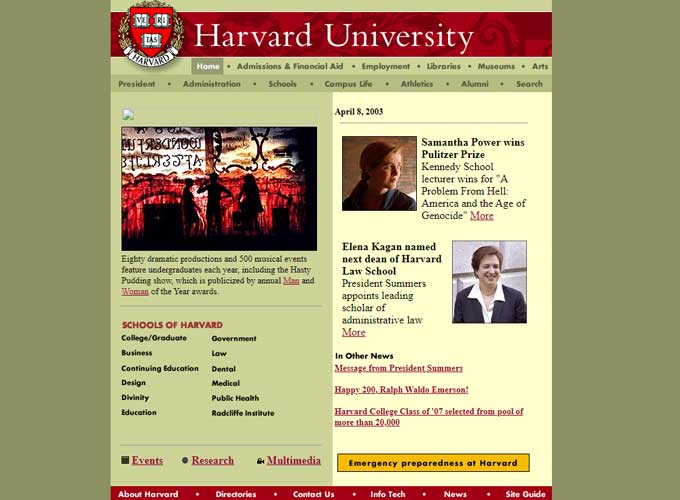
Harvard University’s official website, Harvard.edu, was established in the early 1990s as a digital portal for one of the oldest and most prestigious universities in the United States.
Early design
The design reflects early 2000s web styles, focusing on delivering information using a multi-column layout.
The website uses a color scheme of crimson, gold, and olive green, matching the university’s colors. This gives the site a classic and distinguished appearance.
The design trends focus on an organized layout, content emphasis, and easy navigation to serve the future and current students, faculty, alumni, and visitors effectively.
Fun fact
Harvard.edu hosts a wide range of online resources that extend beyond the campus to a global audience, including free online courses, public lectures, and a rich digital library.
One notable initiative is the Harvard Online Learning portal, which provides access to free and paid courses from Harvard to learners across the world, making the university’s extensive resources available to anyone with internet access.
Skype’s Connection Through Pixels
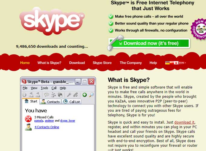
Skype was launched in 2003 by Niklas Zennström and Janus Friis as a pioneering peer-to-peer voice-over-IP service, allowing users to make voice and video calls over the internet for free.
Early design
The design highlights the service’s free internet telephony feature. It’s a mid-2000s design, using bright colors and a mix of graphics and text to clearly show its features and benefits.
This design looks a lot like the early tech product sites, focusing on getting new users by clearly explaining the benefits of the product and offering easy-to-follow, visually clear navigation.
Fun fact
A fun fact about Skype is that it was one of the first mainstream tools to offer end-to-end encrypted voice and video communication, which contributed significantly to its adoption by both private individuals and businesses.
Moreover, the name “Skype” originates from the abbreviation “Sky peer-to-peer,” which reflects its original concept of connecting users across the world through the ‘sky’ of the internet.
eBay’s Bazaar on the Browser
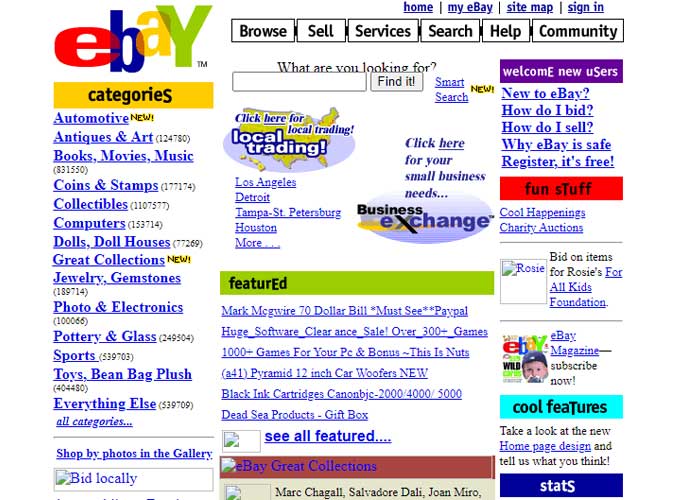
eBay was launched in 1995 by Pierre Omidyar as one of the first online auction and shopping websites where people could buy and sell a wide variety of goods and services worldwide.
Early design
The layout is colorful and filled with text, using bright colors and different fonts typical of websites before modern web design standards became common.
The eBay logo is prominently placed at the top left, with the search bar and main navigation tabs for ‘Browse’, ‘Sell’, ‘Services’, ‘Search’, ‘Help’, and ‘Community’ directly across the top.
This aligns with the website’s function as an online marketplace, making it easy for users to navigate to the most important sections.
Fun fact
eBay has seen its fair share of unusual items up for auction, including a grilled cheese sandwich that appeared to have the image of the Virgin Mary toasted into it. This sandwich sold for $28,000 in 2004, highlighting the incredible range of what people will buy and sell on the platform.
Blockbuster’s Theater of the Mind
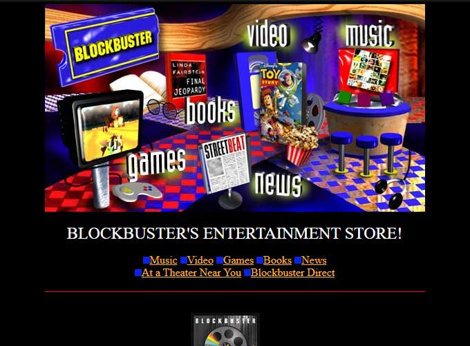
Blockbuster, once a dominant force in the video rental industry, launched its website, Blockbuster.com, in the mid-1990s to complement its brick-and-mortar operations.
The website was initially designed to promote store locations, movie releases, and rental options, providing a digital extension of the in-store experience.
Over time, as the Internet evolved, Blockbuster expanded to include online DVD and video game rentals, and mirroring services like Netflix with home delivery options.
The page is created to look like a physical Blockbuster store, using images of movies, music, and video games against a background that reminds you of the inside of their stores.
A navigational bar sits just below the central graphics, providing text links to ‘Music’, ‘Video’, ‘Games’, ‘Books’, ‘News’, as well as ‘At a Theater Near You’ and ‘Blockbuster Direct’. This straightforward text navigation offers an alternative to the more graphic-centric main interface.
The design’s use of shadow and lighting effects on the images aims to create depth and engagement, inviting the user to click through to find out more about each category. These kinds of visuals were cutting-edge at the time and sought to make the digital browsing experience as engaging as visiting a physical store.
The black background of the navigation bar creates a strong contrast with the bright colors used in the central design, drawing attention to the options available to the user.
Fun fact
A fun fact about Blockbuster is that in a move to counter rising competition from online streaming services, Blockbuster launched Blockbuster Online.
This service offered features like “Total Access,” which allowed customers to rent DVDs online with the option to exchange them for new ones in-store at no extra charge.
Despite this innovation, Blockbuster struggled to adapt to the rapidly changing market dominated by streaming services, which ultimately led to its decline. Nonetheless, Blockbuster’s efforts to transition from a physical rental model to an online service marked a significant chapter in the history of media consumption.
Weather’s Forecast of the Digital Future
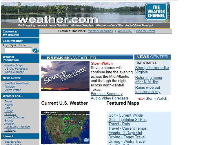
Weather, the official website of The Weather Channel, was launched in 1995 to provide comprehensive weather updates, forecasts, and weather-related news.
Easy design
The page uses a classic three-column layout that was typical at the time, aimed at providing quick access to a variety of information.
The design prioritizes function, making information easy to access. It features blue tones and weather-related visuals, like clouds in the header, matching the site’s theme.
The page header includes the Weather.com logo and a navigation bar for additional services like shopping, travel planning, and mobile weather, showing how weather websites are now offering more than just forecasts.
Fun fact
Weather.com was one of the first major websites to use interactive weather radar technology extensively, providing users with real-time access to weather patterns and events as they unfolded.
This not only set a standard for online weather forecasting but also helped millions of people stay informed and prepared for weather conditions. The popularity and reliability of Weather.com have made it one of the most frequented weather sites globally, known for its accurate reporting and effective presentation of complex meteorological data.
Dunkin’s Digital Doughnuts
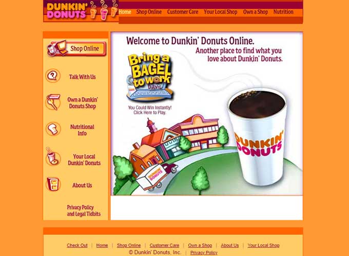
Dunkin‘, formerly known as Dunkin’ Donuts, launched its website, DunkinDonuts.com, in the early 2000s to complement its widespread coffee and baked goods franchise.
Early design
The layout is bright and colorful, with a playful and welcoming aesthetic, reflecting the brand’s image as a friendly and accessible coffee and baked goods chain.
The main content area features a promotional graphic encouraging visitors to “Bring a Bagel to Work”, incorporating both an illustration of a Dunkin’ Donuts location and an image of a coffee cup. This graphic likely serves as a clickable link, perhaps to a game or promotional offer, which is suggested by the text “You Could Win Instantly! Click Here to Play.”
The use of an orange and pink color scheme mirrors the brand’s iconic color palette, and the casual, conversational tone of the text “Another place to find what you love about Dunkin’ Donuts.” is inviting, aiming to replicate the warm in-store experience online.
Fun fact
Dunkin’s website was an early adopter of the mobile app and ordering technology in the quick-service restaurant industry.
This innovation allowed customers to order ahead and earn rewards, meeting the growing demand for speed and convenience from coffee and fast-food consumers.
Starbuck’s Sip of the Web
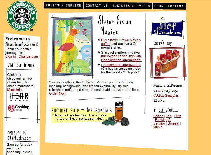
Starbucks launched its website, Starbucks.com, in the mid-1990s to extend its coffeehouse experience into the Internet.
Early design
The website uses a three-column layout popular in that era for organizing and presenting lots of information clearly.
On the left side, there’s a sidebar featuring the Starbucks logo and menu items that invite users to “Welcome to Starbucks.com!” and “Visit our friends”. This sidebar also includes a call to action for users to register at Starbucks.com, indicating an early emphasis on creating a customer account for a personalized experience.
The central column is the main content area, showcasing a feature about “Shade Grown Mexico” coffee. The use of colorful, illustrative graphics beside descriptive text is characteristic of web design from this time, aiming to be visually engaging while informing customers about products and initiatives, like environmental conservation efforts.
The right-hand column includes a smaller sidebar with additional navigation links for customer service, a store locator, and more. This area also highlights a product—the “CARE Sampler”—suggesting an e-commerce function of the site where customers can purchase items directly.
At the top of the page, a horizontal navigation bar links to sections such as ‘Customer Service’, ‘Contact Us’, ‘Business Services’, and ‘Store Locator’, which were standard features for ensuring easy navigation to essential information and services.
Fun fact
Starbucks was one of the first major retail websites to integrate a loyalty program with a mobile app, allowing customers to order ahead, pay, and earn rewards all from their smartphones.
Launched in 2009, the Starbucks mobile app quickly became one of the most successful examples of mobile payment in the retail sector, pioneering the integration of technology and retail to create a smooth and efficient customer experience.
AltaVista’s Stab at the Search Engine Supremacy
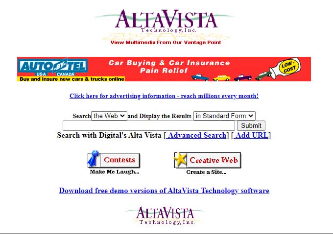
AltaVista was launched in 1995 by Digital Equipment Corporation and quickly became one of the most popular early search engines, renowned for its powerful and fast search technology.
Early design
The design of AltaVista’s website was straightforward and functional, focused primarily on the search bar. It stood out due to its ability to index a significant number of web pages and offer efficient search capabilities at a time when the web was rapidly expanding.
AltaVista also introduced several innovations in search technology, including natural language queries and advanced search options, which made it a favorite among early internet users.
Fun fact
A fun fact about AltaVista is that it was one of the first search engines to offer translations of web pages through its Babel Fish service, which could translate text between multiple languages.
This feature was a pioneering effort in making content on the web accessible to non-English speakers and set the stage for more advanced translation services that would become essential as the internet grew more global.
Bloomberg’s Financial News Unfurled
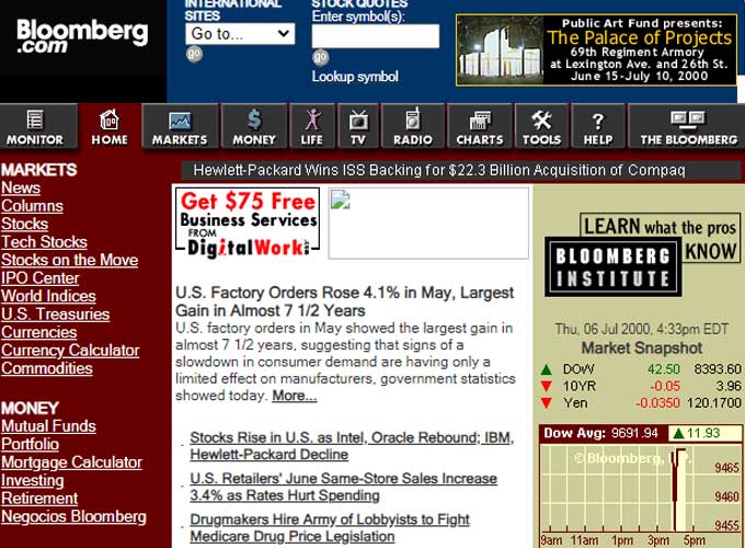
Bloomberg was launched in the mid-1990s as the online presence of Bloomberg L.P., a global financial data and media company founded by Michael Bloomberg.
The website was designed to provide financial professionals, investors, and the general public with access to real-time financial data, news, and analysis.
Early design
The layout is filled with various sections and widgets, offering a wide range of data and news articles for finance professionals and investors.
The top banner includes the Bloomberg logo, with a global navigation bar that offers access to different areas of the site such as ‘News’, ‘Markets’, ‘Charts’, and ‘The Bloomberg’. This is a typical setup for financial websites, where quick access to various types of information is crucial for users making timely decisions.
The page also features advertisements and promotional offers, indicative of the era’s web monetization strategies. In this case, a banner offering ‘$75 Free’ for business services suggests a partnership between Bloomberg and other service providers.
The color scheme uses reds and blacks on a white background, matching the Bloomberg brand. It’s meant to make important information and navigation easier to find.
Fun fact
Bloomberg was one of the first major financial news outlets to integrate a subscription model for its digital content, recognizing early on the value of high-quality, timely financial information in the digital age.
This approach has set a standard in the industry, with many other media outlets later adopting similar models to ensure revenue in the face of declining traditional advertising.
Microsoft’s Marquee of the Millennium
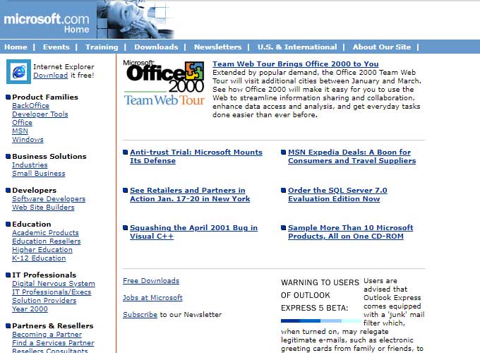
Microsoft’s official website, Microsoft.com, was launched in 1994, making it one of the earliest corporate websites in the tech industry.
It was designed to provide information about Microsoft’s wide range of products and services, including Windows operating systems, Office software, and later, hardware like Xbox and Surface devices.
Early design
The layout has a top navigation bar and two main columns, a design common for corporate websites at that time.
At the top, there’s a horizontal navigation bar with links to key sections like ‘Home’, ‘Events’, ‘Training’, ‘Downloads’, ‘Newsletters’, and sections for regional information. This design makes it easier to get to the many products and services Microsoft offers.
Highlighted in the center, there’s a promotion for Microsoft Office 2000, indicative of the period when Microsoft was heavily marketing its Office suite. The use of the Office product box and screenshot graphics helps to visually break up the text content and attract users’ attention.
The design incorporates the use of Microsoft’s brand colors, and the page is structured in a grid layout, which was a common approach before the widespread use of CSS for more complex designs.
Fun fact
Microsoft quickly rose to become one of the most visited sites on the internet following its launch. In the early days of the web, it served as a primary example of how a corporate website could boost brand visibility and customer engagement.
Interestingly, Microsoft was also one of the first major websites to actively experiment with multimedia content and interactive web technologies, showcasing the potential of the internet as a platform for more than just text-based information. This helped set the stage for the dynamic, media-rich websites that are standard today.
Slashdot’s Communities of Code
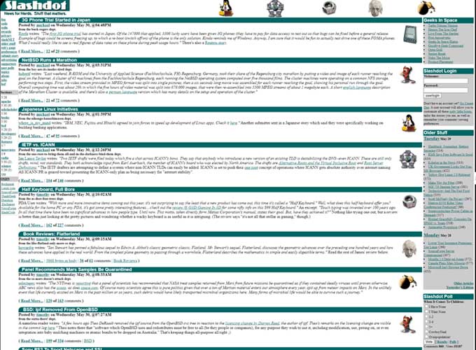
Slashdot, launched in 1997 by Rob Malda and Jeff Bates, is a technology-related news website that pioneered the concept of user-submitted and moderated content.
Known as “News for Nerds, Stuff that Matters,” Slashdot’s design was simple and text-heavy, focusing primarily on user discussions and comments.
The site featured a unique system where stories were submitted by the community and then moderated based on quality and relevance, effectively using the community to filter the vast amount of information available on the internet.
Early design
The design mirrors the early web’s practical, text-focused layouts, prioritizing content delivery above visual appeal.
The site uses a multi-column layout, with the main column in the center featuring a series of news articles.
Each article headline is accompanied by a brief summary, the number of comments, and associated topic icons—reflecting the community-driven aspect of Slashdot, where user comments are a significant feature.
The design uses a green color scheme to match Slashdot’s brand. It has a simple interface with small icons and tight text to show as much information as possible.
Fun fact
A fun fact about Slashdot is that it was notorious for the “Slashdot effect,” a phenomenon where a website mentioned on Slashdot would experience such a significant increase in traffic that it could become temporarily unreachable.
This occurred because Slashdot’s highly engaged and tech-savvy audience would flood the linked sites, showcasing the power and influence of the community-driven platform. The “Slashdot effect” was seen as a badge of honor among tech enthusiasts and demonstrated the impact that digital communities could have in the early days of the internet.
The New York Times Envisioned Online
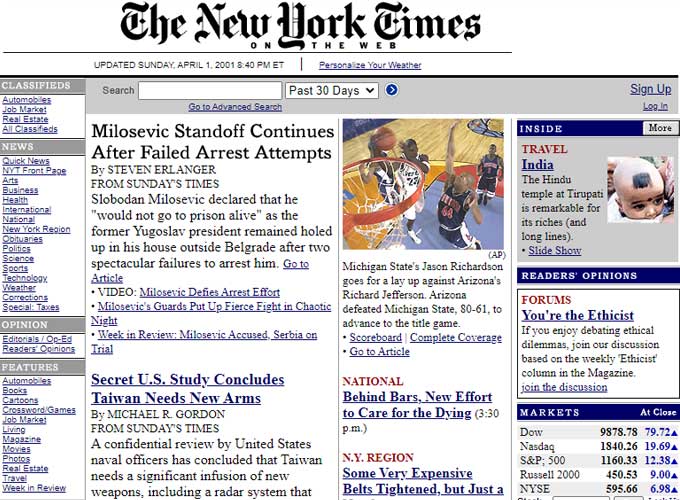
The New York Times website, NYTimes.com, was launched in 1996, extending the newspaper’s reach beyond its print origins to a global audience online.
Early design
The layout is dense and packed with information, typical of news websites at the time.
The website’s top part displays the newspaper’s name, The New York Times, in a classic font that’s easy to recognize, giving the site a serious feel similar to the print version. There’s also a banner that shows the date and time of the latest update, proving the site’s dedication to offering fresh news.
The center and right sections are focused on the day’s top news stories, featuring headlines, summaries, and images. This text-heavy style and blue links reflect the era’s web design, focusing on easy access to content.
The website features a blue, black, and white color scheme, matching the print newspaper. This gives it an authoritative and serious feel, fitting for a respected news outlet.
Fun fact
NYTimes was one of the first major newspapers to adopt a digital subscription model in 2011, which was a significant move in the publishing industry at a time when most content on the internet was free.
This decision marked a pivotal shift towards sustainable digital journalism by directly monetizing the web audience.
The success of this model has not only helped The New York Times to maintain its editorial independence and quality during an era of declining print revenues but also set a benchmark for other newspapers worldwide.
Amazon’s Forest of Fiber
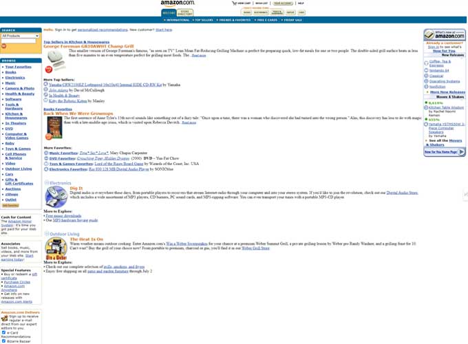
Amazon was launched in 1995 by Jeff Bezos as an online bookstore that aimed to offer more books than could be held by a physical store.
Early design
The design is practical, filled with information, and presents products and categories in an organized, though crowded, way.
On the left side of the page, there’s a vertical navigation bar with categories such as ‘Books’, ‘Electronics’, ‘Toys & Games’, and ‘Software’. This straightforward layout is a key feature of Amazon’s user interface, making it easy for customers to explore a wide range of products.
The middle part of the page focuses on suggesting products, especially books. For each item, there’s a small picture, the name, price, and customer rating. This layout gives a quick overview to help shoppers easily browse and make purchases.
The page top features Amazon’s unique logo and a search bar, both central elements from the start. It also greets users with personalized messages, showing Amazon’s initial steps towards using data to customize the shopping experience based on individual preferences.
On the right, you’ll find a sidebar featuring options like ‘Gift Ideas’, ‘Auctions’, and ‘zShops’. This shows how Amazon is already expanding beyond just selling books, even in its early days.
The page features a simple color scheme of blue and orange, reflecting Amazon’s brand identity. Its design focuses more on being functional and user-friendly, aiming to be accessible for a diverse audience.
Fun fact
A fun fact about Amazon is that its famous recommendation algorithm was one of the first of its kind, using customer purchase history and browsing habits to suggest other products they might like.
This innovative approach to personalization significantly influenced the e-commerce industry, setting a new standard for customer engagement and upselling techniques.
Amazon’s relentless focus on optimization and customer service has driven its growth from a niche online bookstore into a global e-commerce powerhouse.
Conclusion
In summary, looking at early web designs shows a major change in the way content is collected, displayed, and used online.
These websites, influential in their own way, highlight how the internet has evolved from a basic, text-heavy platform to a dynamic, user-focused space that prioritizes easy access, interaction, and customization.
Through the eyes of these pioneers, we see the beginning of digital transformation, laying the foundation for the immersive, interconnected web experiences we enjoy today.
Their impact goes beyond just the content they offer. It’s in their creative web design, how they engage with communities, and the way they’ve influenced e-commerce, turning the internet into a key place for information, buying and selling, and making connections all over the world.

i <3 this