


Bright and bold colors are often used in web design to create a sense of excitement, energy, and creativity.
They can also be used to grab attention and make a website stand out from the competition.
However, it is important to use bright and bold colors wisely, as they can also be overwhelming and distracting if used too much.
In this article, we are exploring how to use bright colors and bold design elements to create an eye-catching website.
Table of Contents
- How to use bright and bold colors effectively in web design
- Contrasting colors for maximum impact
- Understand the psychological effects of color
- Choosing the right color combinations
- Play with textures and gradients
- Smart use of background images to enhance your design
How to use bright and bold colors effectively in web design
Bright and bold colors can be a great way to add excitement and energy to your website design. However, it is important to use them effectively in order to avoid overwhelming your users. Here are a few tips:
- Use a limited color palette. Too many bright colors can be visually overwhelming. Instead, choose a few colors that work well together and use them throughout your website.
- Use color contrast. Bright colors work best when they are used in contrast with darker or more muted colors. This will help your colors stand out and grab attention.
- Use color to create a hierarchy. You can use color to guide users’ eyes to the most important elements of your website. For example, you could use a bright color for your call to action button to make it stand out from the rest of the page.
- Use color to create a mood or atmosphere. Color can be used to create a specific mood or atmosphere on your website. For example, if you want to create a sense of excitement, you could use bright, vibrant colors. If you want to create a sense of calm, you could use more muted colors.
- Test your colors with different audiences. What looks good to you may not look good to everyone else. It is important to test your colors with different audiences to make sure they are effective.
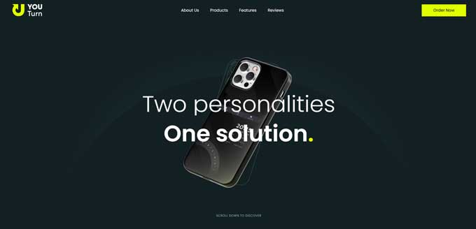
Here is an example of one of my own templates with bright and vivid colors and a bold font in the header. The hero header stands out with its bright purple accents.

Here’s another example for you: When you use a vibrant attention-grabbing color for a call-to-action button, it will easily catch your attention and draw your gaze toward it.
Contrasting colors for maximum impact
Contrasting colors can have a powerful visual impact on a website by grabbing attention, creating excitement, and aiding navigation.
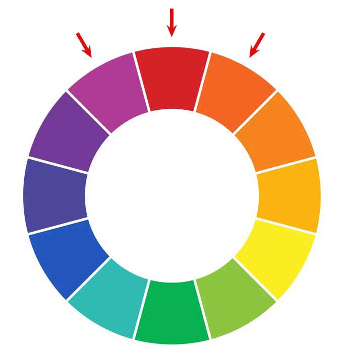
There are two main types of contrasting colors: complementary and analogous.
Complementary colors, like red and green or blue and orange, create a strong contrast that makes a bold statement and is perfect for call-to-action buttons and headers.
Complementary colors are positioned directly opposite each other on the color wheel. These contrasting colors can create a bold design with high contrast, making it stand out prominently.
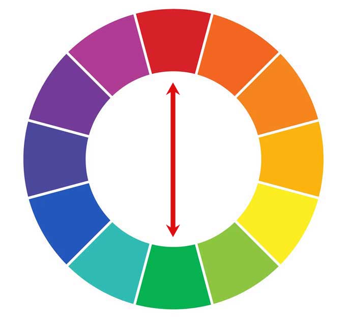
Analogous colors, such as blue, green, and turquoise, offer a more subtle contrast for background colors, text colors, and elements that blend with the overall design.
However, it’s important to use contrasting colors in moderation, limiting them to around 20% of the website.
The remaining 80% should consist of neutral colors to maintain a balanced design and avoid overwhelming the user.
Color contrast for accessibility
Color contrast goes beyond being purely aesthetic; it is a necessity, particularly when it comes to the web. When creating a website, it is crucial to prioritize accessibility and ensure that the information provided can be accessed by everyone.
One effective method to achieve this is by making sure the colors used in your web design show high contrast.
WCAG (Web Content Accessibility
WCAG 2.0 offers specific guidelines for ensuring appropriate color contrast between foreground and background elements, employing a ratio-based approach. This ratio varies depending on text size and weight.
Contrast, as per WCAG 2.0, is measured by assessing the perceived brightness difference between two colors, expressed as a ratio ranging from 1:1 (lowest contrast, such as white text on a white background) to 21:1 (highest contrast, such as black text on a white background or vice versa).
WCAG sets a minimum contrast ratio of 4.5:1, except for large text, logos, or intentionally low-contrast designs on the web. Measuring contrast requires hexadecimal color values of the applicable colors.
The above is perhaps a little bit complicated but it makes more sense by using this free contrast checker tool.
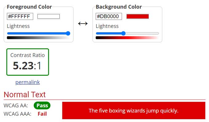
In the example below I have a red background with blue text. As you can see the text is hard to read, and the contrast ratio is 1.64:1 which is way below the recommended ratio of 4.5:1
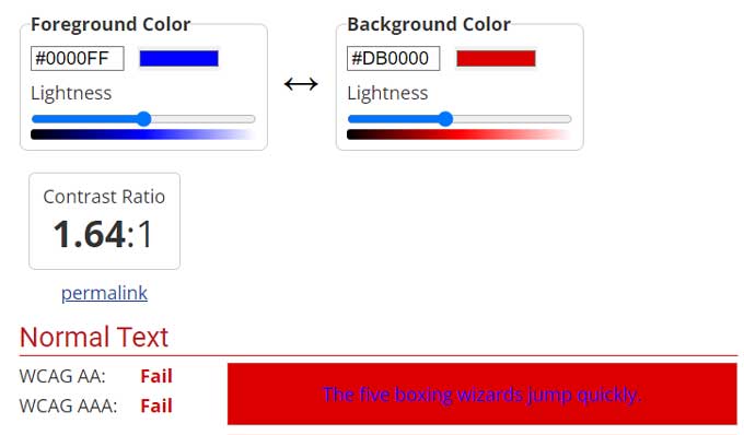
When I make the text white it is much better to read and it passes the recommended contrast ratio.
Understand the psychological effects of color
The field of color psychology explores how colors can impact human behavior and emotions. This fascinating and intricate area of study has significant applications in web design.
Colors have diverse psychological effects. For instance, red is often associated with excitement and passion, while blue evokes calmness and serenity. Green is often linked to growth and renewal, while yellow conveys happiness and optimism.
When selecting colors for your website, it is crucial to consider their psychological effects. The chosen colors should create the desired mood or atmosphere. For example, bright and vibrant colors like red or orange can instill a sense of excitement, while more muted colors like blue or green can promote a feeling of serenity.
It is also important to consider your target audience when choosing colors since different cultures and demographics ascribe different meanings to colors. In some cultures, red symbolizes good luck, while in others, it signifies danger.
Understanding the psychological impact of colors empowers you to create visually appealing and user-friendly websites. Colors can be utilized to grab attention, evoke excitement, and guide users through your site. When employed effectively, colors become a powerful tool in web design.
Here are some additional tips for comprehending the psychological effects of color:
Conduct thorough research: There is an abundance of information available on the psychological effects of color. Explore books, articles, and websites to enhance your knowledge in this area.
Some good articles are found here:
- https://99designs.com/blog/tips/how-color-impacts-emotions-and-behaviors/
- https://www.verywellmind.com/color-psychology-2795824
Test colors with different audiences: Once you have selected some colors for your website, test them with diverse audiences to observe their reactions. This ensures that the chosen colors will effectively resonate with your target audience.
Use color sparingly: Excessive use of color can overwhelm and distract users. Only utilize color where necessary to achieve the desired impact.
Maintain consistency in color choices: Once you have established a color palette for your website, stick with it. This creates a sense of harmony and coherence throughout your site.
Color psychology is a valuable tool that, when fully grasped, allows you to wield the power of color to craft visually appealing and engaging websites.
Choosing the right color combinations
When it comes to web design, selecting the right color combinations is crucial. The colors you choose can significantly impact the overall appearance and user experience of your website.
Here are a few key considerations to remember when choosing color combinations for your website:
Reflect your brand identity: Decide on the colors that represent your brand and evoke the desired emotions in your users.
Understand your target audience: Choose colors that will resonate with your target audience and ensure readability and comprehension.
Apply color theory: Familiarize yourself with color theory principles. Utilize complementary colors to create a striking visual contrast and employ analogous colors for a more harmonious and cohesive look.
Take advantage of a color wheel: Utilize a color wheel as a valuable tool to visualize and experiment with different color combinations.
Seek feedback: Share your chosen color combinations with friends, family, and colleagues to receive valuable feedback. This ensures that your color choices are effective and appealing.
Play with textures and gradients
Textures and gradients are fantastic ways to enhance the visual appeal and depth of your web design. Textures can bring a sense of realism and tactility, while gradients can add sophistication and elegance.
There is a wide variety of textures and gradients available for web design. When it comes to textures, you can use images, patterns, or even text. Gradients offer options like linear, radial, or angular variations.

I created the above gradient background using Divi Builder, my to-go tool for creating websites. If you’re interested in Divi, check out the available Divi discount codes.
Before choosing textures and gradients, consider the overall style and desired atmosphere of your website. For a modern and sleek feel, opt for simple geometric textures and linear gradients. For a more organic touch, go with natural textures and radial gradients.
Textures and gradients can also help create a hierarchy in your design. Use a textured background to draw attention to specific sections or employ a gradient to infuse movement and flow.
By experimenting with textures and gradients, you can craft a visually captivating and user-friendly web design. Here are a few additional tips:
Use textures sparingly, limiting them to one or two areas of your website to avoid overwhelming your audience.
Leverage gradients to add depth, making elements like buttons or text boxes appear as if floating above the page.
Create the desired mood or atmosphere using textures and gradients. For instance, a dark, textured background can evoke mystery or intrigue.
Test your textures and gradients with different audiences to ensure their effectiveness since personal preferences may vary.
Smart use of background images to enhance your design
Background images can enhance web design by adding visual interest, and depth, and setting the desired mood or atmosphere. However, it is crucial to use them wisely to avoid distractions and ensure a user-friendly experience.
Here are some tips for effectively using background images in web design:
- Choose relevant images that align with your website’s content.
- Opt for high-quality images to maintain clarity and avoid pixelation.
- Size the image appropriately, ensuring it doesn’t overpower other elements on the page.
- Strategically place the image to prevent obstruction of important content and navigation.
- Consider using repeating patterns for larger or detailed images to prevent overwhelming visuals.
- Use transparent backgrounds to integrate the image smoothly with other elements on your website.
Conclusion
In conclusion, bright and bold colors can be a powerful tool for web design.
When used effectively, they can create a sense of excitement, energy, and creativity.
They can also be used to grab attention and make a website stand out from the competition.
However, it is important to use bright and bold colors wisely, as they can also be overwhelming and distracting if used too much.
By following the tips in this article, you can use bright and bold colors effectively in your web design to create a visually appealing and user-friendly website.
