


Divi comes with a wide selection of column structures. However in some cases you want to create a custom column width. This is quite easy to do with just a little CSS.
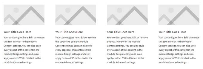
In my example I will change the column structure of this 4 column layout.
To this:
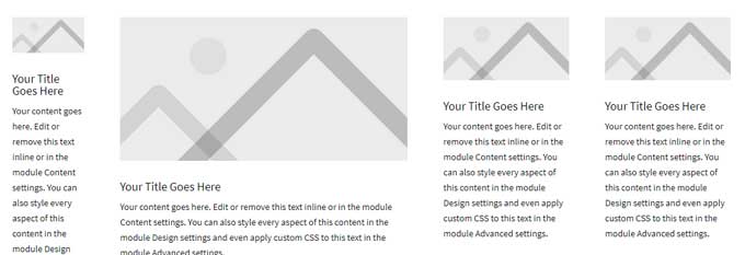
You can change the column structure to anything you like.
Step 1
Create a section with a row and choose how many columns you want. In my case its a 4 column structure.
Step 2
Open the row and then the first column and go to the advanced tab.
In the CSS class field fill in custom-column-1
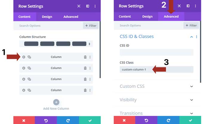
Open the second column and fill in the class custom-column-2
Do the same for the other columns but change the number.
Step 3
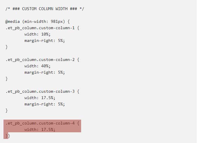
Go to Divi > Theme Options > CSS and place this snippet:
/* ### CUSTOM COLUMN WIDTH ### */

@media (min-width: 981px) {
.et_pb_column.custom-column-1 {
	width: 10%;
	margin-right: 5%;
}

.et_pb_column.custom-column-2 {
	width: 40%;
	margin-right: 5%;
}

.et_pb_column.custom-column-3 {
	width: 17.5%;
	margin-right: 5%;
}

.et_pb_column.custom-column-4 {
	width: 17.5%;
}}
Let me explain this snippet first and how you can adjust it for your columns.
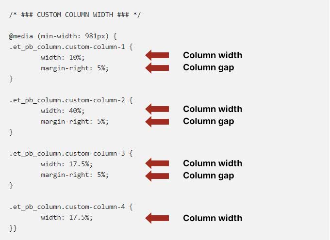
The highlighted area (bottom image) is a media query. The top highlighted part means that this snippet will work on devices with a minimum width of 981px. This is one of Divi’s breakpoints from tablet to desktop. So this code will work for desktop only. This is a good thing so it will remain responsive for mobile.
The bottom highlighted part is the closing tag for the media query. So all the CSS code inside these tags will work for devices with a minimum width of 981px.
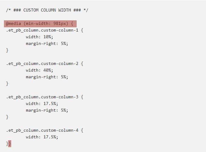
If you are using for example a 3 column structure then you can remove a one-column snippet. See the highlighted part (bottom image). Be careful to not remove the media query closing tag.
In case you are using more than 4 columns, let’s say 5 then you can copy the highlighted part and past it under the fourth column snippet but before the media query closing tag. And you need to change the number 4 to 5.
Each column has a width and a margin-right value. The margin value is the gap between the columns. The last column does not need to have this gap.
This part is important: the total amount of all column widths and margin-right values need to be 100%.
You can change the values as you like as long they are 100% combined.
And that is how you can create a custom column width in Divi. If you have any questions please let me know in the comments.

Thank You so much for this tutorial, works very well.
Your welcome
Hi, clear tutorial but I’m having problems. Each column of 3-column row has custom-column-x as you have indicated and the Custom CSS in Theme Options is set to
@media (min-width: 981px) {
.et_pb_column.custom-column-1 {
width: 10%;
margin-right: 5%;
}
.et_pb_column.custom-column-2 {
width: 10%;
margin-right: 5%;
}
.et_pb_column.custom-column-3 {
width: 65%;
margin-right: 5%;
}}
But the columns stubbornly remain equal sized as they were on creation.
Hi Howard,
Did you try to clear your browser cache? And if you have any caching plugins active then you have to clear those caches as well.