


In web design, creating flexible and responsive layouts is crucial for delivering a seamless user experience across various devices. Columns play a fundamental role in organizing content and structuring web pages. However, the concept of nested columns takes this a step further, allowing for even more complex and flexible designs.
This article will explore what nested columns are, their practical applications, benefits, challenges, and how to implement them effectively in your web design projects.
Table of Contents
Understanding Columns in Web Design
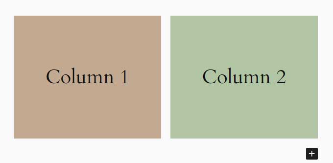
Columns are vertical divisions of a web page that help organize content and create a structured layout. They are essential for making web pages more readable and visually appealing. Typically implemented using HTML and CSS, columns can be simple or complex, depending on the design requirements.
For instance, a basic column layout might divide a page into two or three sections, each containing different types of content. This division helps in separating information logically, making it easier for users to navigate and understand the page.
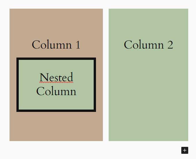
What is a Nested Column?
A nested column is essentially a column within another column. This concept allows for more intricate designs by embedding one or more columns inside a parent column. Nested columns enable web designers to create multi-layered layouts that are both visually appealing and highly functional.
For example, you might have a main column that contains two sub-columns. Within one of these sub-columns, you can further nest additional columns to create a more detailed structure. This nesting capability is particularly useful for complex layouts where different sections of content need to be grouped and aligned in specific ways.
Practical Applications of Nested Columns in Web Design
Nested columns are particularly beneficial in responsive web design, where layouts need to adapt to various screen sizes and orientations. By using nested columns, designers can create layouts that adjust seamlessly, ensuring a consistent user experience across devices.
For instance, using CSS Grid or Flexbox, you can create nested columns that reflow and rearrange themselves based on the screen size. This flexibility allows for more creative and functional designs, such as multi-tiered navigation menus, complex forms, and detailed content sections.
Benefits of Using Nested Columns in Web Design
The use of nested columns in web design offers several benefits:
- Enhanced Layout Flexibility: Nested columns provide the flexibility to create complex and adaptive layouts that can adjust to different screen sizes and orientations.
- Improved Content Organization: By nesting columns, designers can group related content together, making the page more organized and easier to navigate.
- Better User Interface and Experience: Nested columns contribute to a cleaner and more professional-looking design, enhancing the overall user experience.
These benefits make nested columns a valuable tool for web designers aiming to create responsive and visually appealing websites.
Challenges and Considerations
While nested columns offer many advantages, they also come with challenges:
- Increased Complexity: Managing and maintaining nested columns can be more complex compared to simple column layouts. It requires careful planning and a good understanding of CSS Grid and Flexbox.
- Browser Compatibility Issues: Not all browsers handle nested columns in the same way, which can lead to inconsistencies in how the layout is displayed.
- Performance Concerns: Complex nested layouts can sometimes impact the performance of a website, especially on lower-end devices.
To overcome these challenges, it’s important to follow best practices, such as keeping the nested structure as simple as possible and testing the layout across different browsers and devices.
How to Create Nested Columns in Web Design
Creating nested columns involves using CSS Grid or Flexbox to structure the layout. Here’s a step-by-step guide to help you get started:
Using CSS Grid:
<div class="grid-container">
  <div class="parent-column">
    <div class="nested-column-1">
      <div class="nested-column-1-1"></div>
      <div class="nested-column-1-2"></div>
    </div>
    <div class="nested-column-2"></div>
  </div>
</div>
.grid-container {
  display: grid;
  grid-template-columns: 1fr;
}
.parent-column {
  display: grid;
  grid-template-columns: 1fr 1fr;
}
.nested-column-1 {
  display: grid;
  grid-template-columns: 1fr 1fr;
}
Using Flexbox:
<div class="flex-container">
  <div class="parent-column">
    <div class="nested-column-1">
      <div class="nested-column-1-1"></div>
      <div class="nested-column-1-2"></div>
    </div>
    <div class="nested-column-2"></div>
  </div>
</div>
.flex-container {
  display: flex;
  flex-direction: column;
}
.parent-column {
  display: flex;
  flex-direction: row;
}
.nested-column-1 {
  display: flex;
  flex-direction: row;
These examples illustrate how to create nested columns using CSS Grid and Flexbox. Adjust the properties as needed to fit your specific design requirements.
Case Studies and Examples
To demonstrate the effectiveness of nested columns, let’s look at some real-world examples:
Example 1: E-commerce Website
An online store uses nested columns to create a detailed product grid, with images, descriptions, and prices neatly organized.

This is an example of one of my designs, you can view a live demo here.
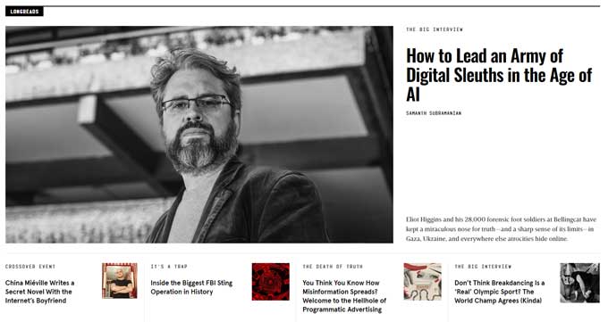
Example 2: News Website
A news site utilizes nested columns to arrange articles, images, and advertisements in a visually appealing layout that adapts to different screen sizes.
Example 3: Portfolio Website
A designer’s portfolio showcases projects using nested columns, allowing for a clean and professional presentation.

These case studies highlight how nested columns can enhance the functionality and aesthetics of a website, providing valuable insights for web designers.
Conclusion
Nested columns are a powerful tool in web design, offering flexibility and improved content organization. By understanding and implementing nested columns, you can create more complex and responsive layouts that enhance the user experience. As you explore and experiment with nested columns, you’ll discover their potential to transform your web design projects.
