


Are you a Divi user struggling to keep your content aligned vertically, no matter the length of your design elements? Vertical alignment is a cornerstone of polished web design.
With Flexbox we can achieve consistent and elegant vertical alignment within Divi.
In this instructional guide, I’ll cover how you can use Flexbox within Divi and walk you through the process of using this to perfectly align your content. I’ll cover everything from setting up the Flex container to dealing with responsive design challenges and troubleshooting common issues.
Let’s dive in and start flexing our design muscles with Divi and Flexbox!
Table of Contents
Understanding Flexbox in Divi
Before we get our hands dirty, let’s understand what Flexbox is and how it integrates with Divi. Flexbox is a CSS layout model that allows you to design complex layouts with predictable alignment of items in a container. In Divi, Flexbox can be used within sections, columns, and modules to control the layout.
Flexbox is particularly adept at handling vertical alignment, which is notoriously difficult to achieve with traditional CSS. By utilizing Flexbox properties, you can maintain proper alignment and distribution of whitespace, even as the length of your content changes.
Creating the layout example
In my example, I have created a row with 3 columns, in each column I placed a blurb module.
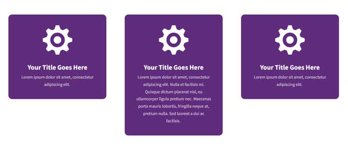
And this is what we like to accomplish.
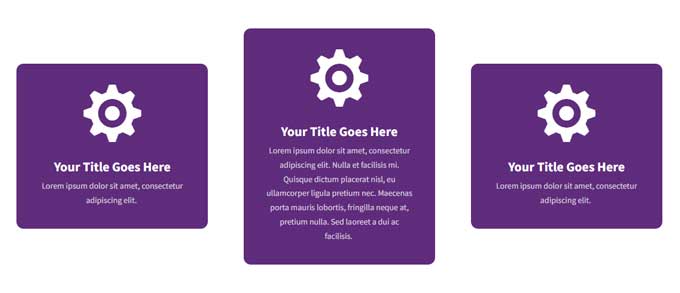
In the next steps, I will cover how you can accomplish this with Flexbox.
Aligning Content Vertically
The first step to using Flexbox is to set up a Flex container. This container will hold the elements you wish to align vertically. Here’s how to create a Flex container within Divi:
Step 1: Open the Divi Builder
Navigate to the page where you want to create your Flex container and open the Divi Builder.
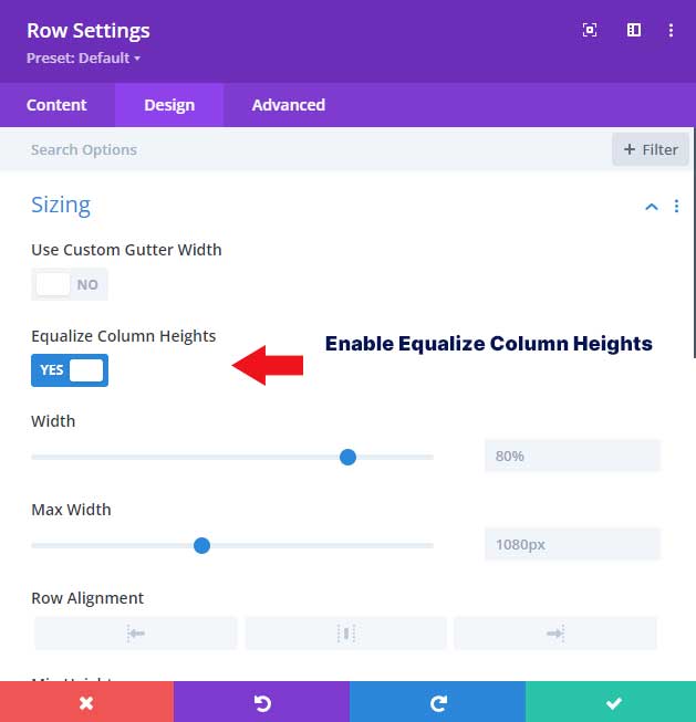
Step 2: Open the Row
Open the row and go to the Design tab. Under Sizing enable the option equalize column heights.
This option will give the Row the flex property.
Step 3: Add CSS
From here go to the Advanced tab. Under Custom CSS switch to the Module Elements tab. Then add the following CSS snippet in the Main Element field:
align-items: center;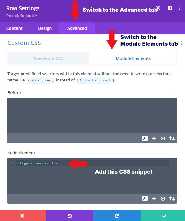
Troubleshooting Common Issues
It can take some practice to master Flexbox with Divi, so don’t get discouraged if you run into some issues. Here are some common problems and how to troubleshoot them:
Make sure that the option equalize column heights is enabled
In this example, we did not at Flexbox with CSS but we enabled the option equalize column heights. This will add the flex property to the Row.
Conclusion
By using Flexbox you can easily align content in Divi. If you like to learn more about Flexbox I can recommend this guide from CSS-Tricks.
There are many other ways you can use Flexbox to enhance your designs within Divi. Some ideas include using Flexbox to create equal-height columns, creating grids, and even creating responsive layouts that adapt to different screen sizes. The possibilities are endless with this powerful tool.
Don’t be afraid to experiment and try out different combinations of properties to achieve the desired result.
