


One of the coolest things you can do with Divi is create a custom header that not only looks amazing but also perfectly aligns with your brand’s identity. In this guide, we’re going to walk you through everything you need to know to craft a stunning custom header in Divi. Whether you’re a seasoned pro or a newbie, we’ve got you covered. Let’s get started!
Table of Contents
- Step-by-Step Guide to Creating a Custom Divi Header
- Step 1: Add Global Header
- Step 2: Section Settings
- Step 3: First Row
- Step 4: Social Media Module
- Step 5: Text Module Middle Column
- Step 6: Text Module Right Column
- Step 7: Second Row
- Step 8: Image Module
- Step 9: Menu Module
- Step 10: Button Module
- Step 11: Tablet & Mobile Row
- Step 12: Menu module for tablet and mobile
- Step 13: Button Module for Tablet and Mobile
- Step 14: Add Custom CSS Code
- Step 15: Add jQuery Code
- Conclusion
Step-by-Step Guide to Creating a Custom Divi Header
In this tutorial, I provide a detailed, step-by-step guide to creating a custom Divi header. From initial setup to final touches, every step is explained with clear instructions and screenshots.
Before I jump into the step-by-step process, let’s take a sneak peek at the final result.
This is the header we are going to create. It features a top bar with three columns: social media icons on the left, a tagline in the middle, and some text links on the right. Below the top bar, you’ll find our logo on the left, the menu in the middle, and a call-to-action button on the right.
Prefer watching over reading? Check out my comprehensive YouTube video tutorial below. In this video, I walk you through the entire process, making it easy to follow along and implement the steps on your own site.
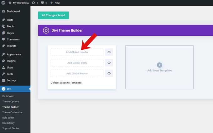
Step 1: Add Global Header
Go to Divi > Theme Builder and click on Add Global Header.
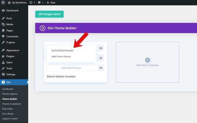
Then click on Build Global Header.
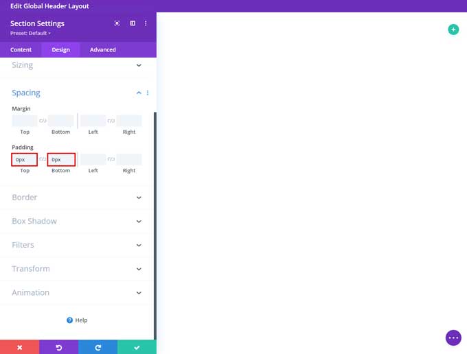
Step 2: Section Settings
Open the section and go to the Design tab.
Spacing
Set the top and bottom padding to 0px.
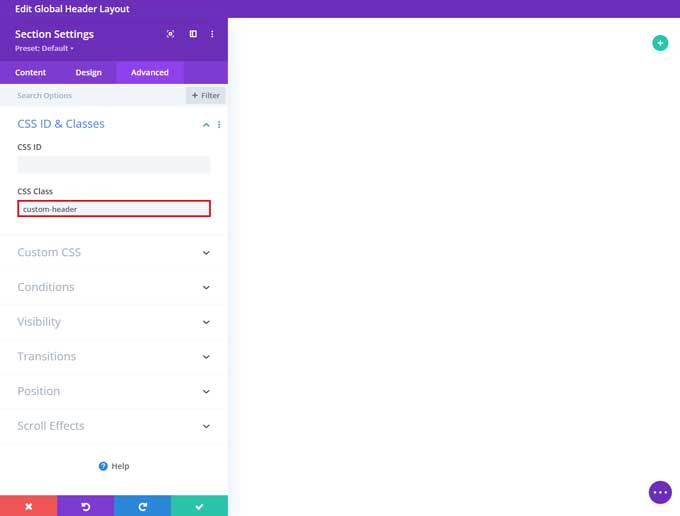
Go to the Advanced tab and under CSS Class place custom-header
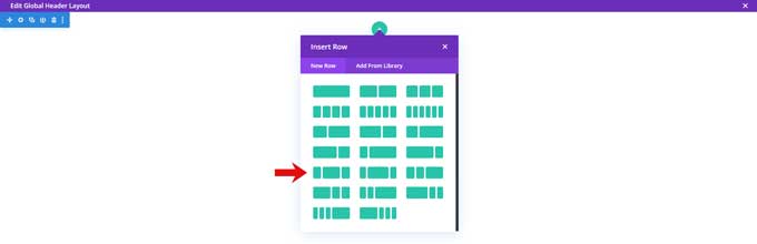
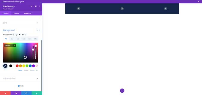
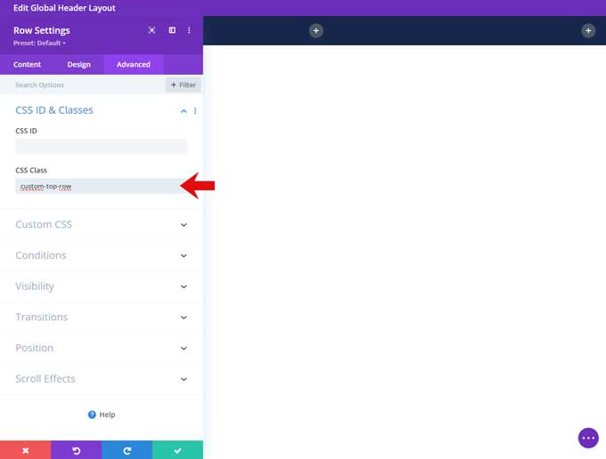
Step 3: First Row
Add a new row for this Section and choose the 1/4 – 1/2 – 1/4 layout.
Open this row and under Background set a color. I use color code #16264a.
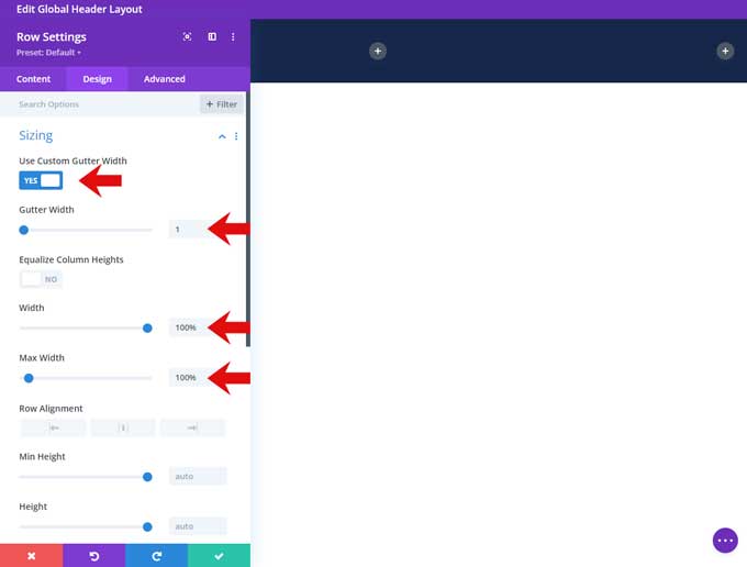
Go to the Design tab.
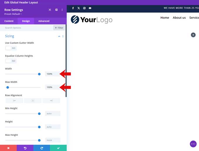
Sizing
Enable “Use Custom Gutter Width” and set it to 0.
Set the Width and Max-Width to 100%.
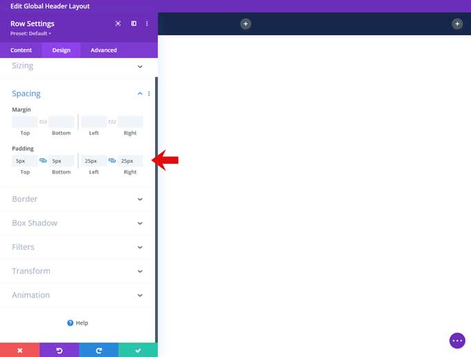
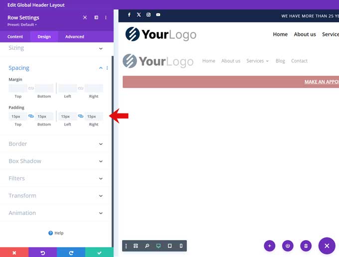
Spacing
Set the top and bottom padding to 5px.
Set the left and right padding to 25px.
Go to the Advanced tab and under CSS Class place custom-top-row
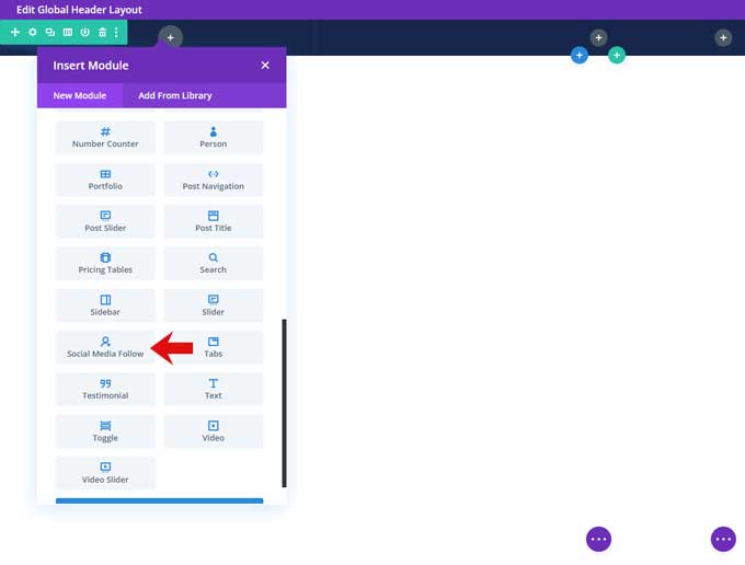
Step 4: Social Media Module
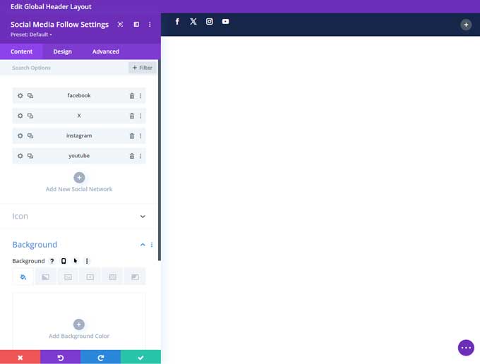
Place a social media follow module in the first column.
Open this module and place your social media networks here.
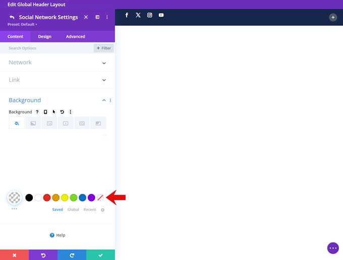
Then open each social media network and make the background color transparent.
Go back to the social media module settings and switch to the Design tab.
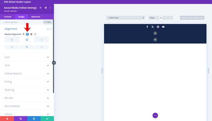
Alignment
Center the alignment for tablet and mobile.
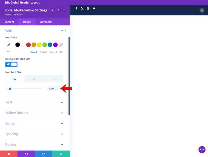
Icon
Enable “Use Custom Icon Size” and set the size to 13px.
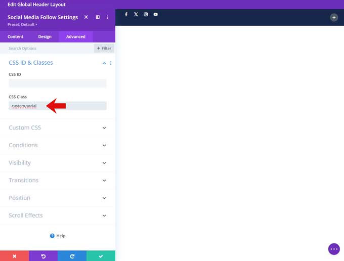
Go to the Advanced tab and place the class custom-social
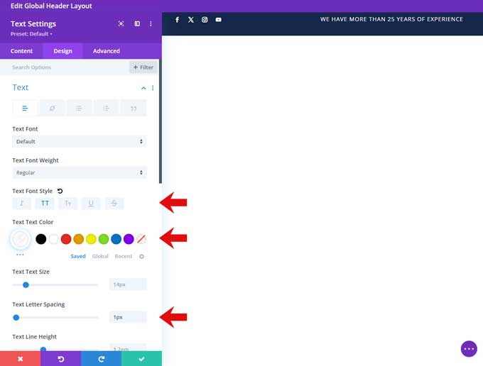
Step 5: Text Module Middle Column
Place a text module in the middle column.
In the text field place your text.
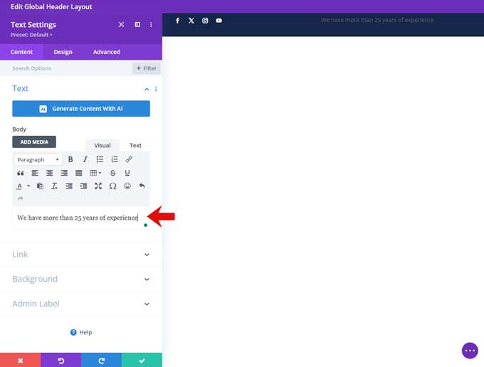
Go to the Design tab.
Text
Set the text font style to Uppercase.
Set the text color to white.
Set the text letter spacing to 1px.
Set the text alignment to the center.
Step 6: Text Module Right Column
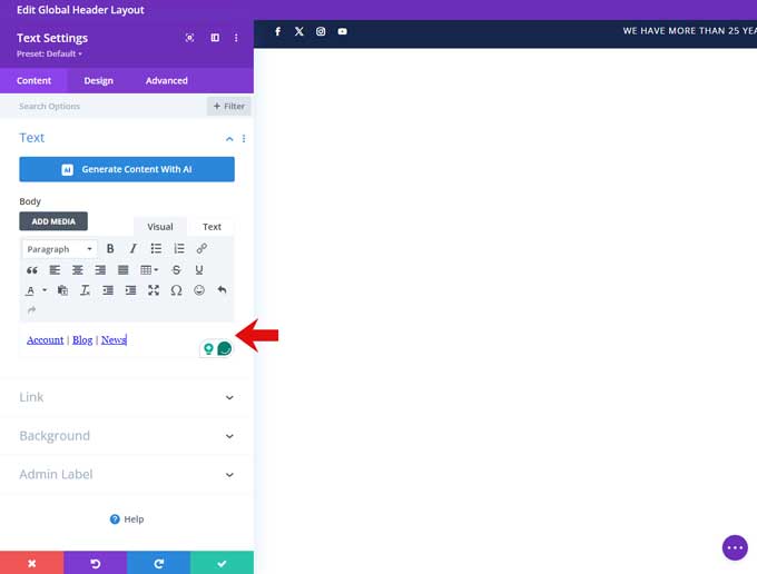
Place a text module in the right column.
Place your text links in the body field.
To create a vertical line hold ALT, then press 1, 2, and 4.
Go to the Design tab.
Text
Set the text color to white.
Set the text alignment to right.
Set the alignment to center for tablet and mobile.
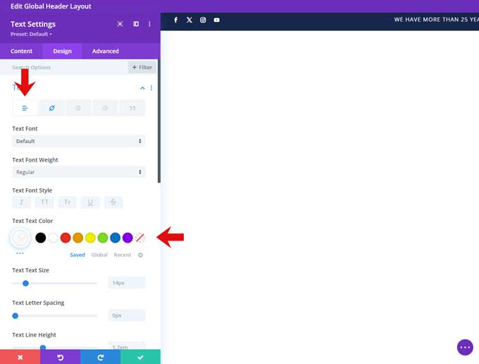
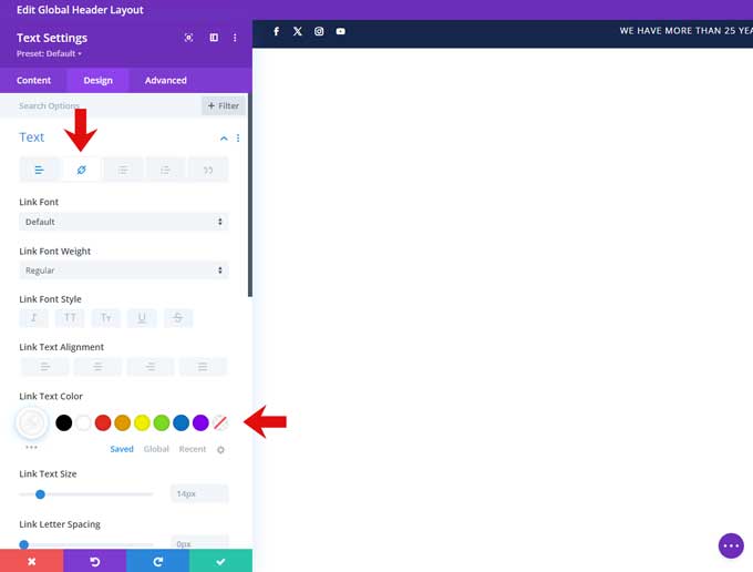
Switch to the Link tab and set the link color to white.
Step 7: Second Row
Add another row for this Section and choose the 1/4 – 1/2 – 1/4 layout.
Open this row and under Background set the color to white.
Go to the Design tab.
Sizing
Enable “Use Custom Gutter Width” and set it to 0.
Set the Width and Max-Width to 100%.
Spacing
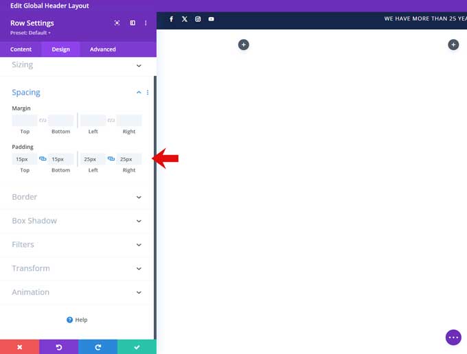
Set the top and bottom padding to 15px.
Set the left and right padding to 25px.
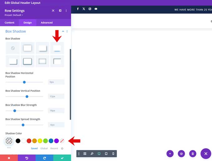
Box Shadow
Under Box shadow select the third option.
And make the shadow color rgba(0,0,0,0.1)
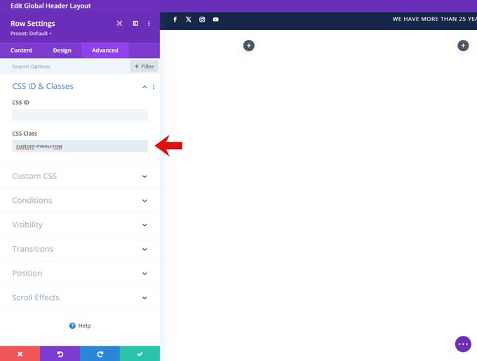
Go to the Advanced tab and under CSS Class place custom-menu-row
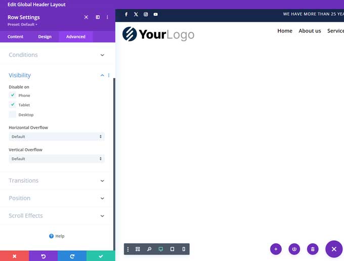
Visibility
Under visibility check disable on phone and tablet.
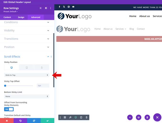
Scroll Effects
Set the sticky position to “Stick to Top”. For tablet and mobile, I set this to “Do Not Stick”
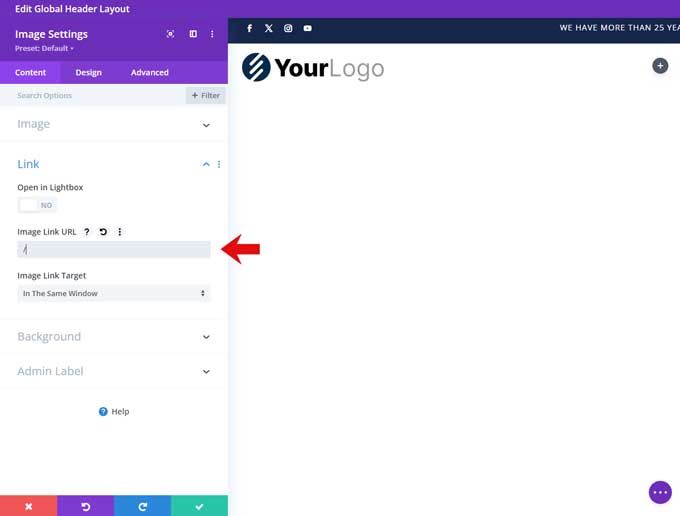
Step 8: Image Module
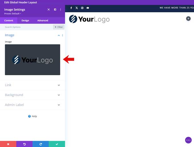
Place an image module in the first column of the second row.
Open this module and place your logo in it.
Open the Link tab and place / in the link field. This will redirect the logo to your home page.
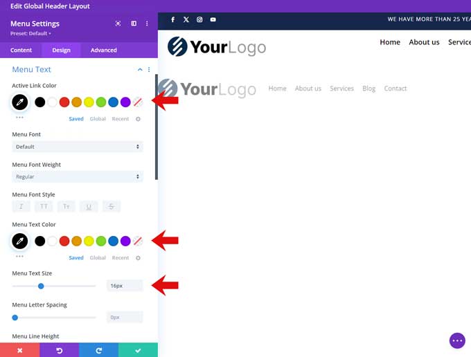
Step 9: Menu Module
Place a menu module in the middle column.
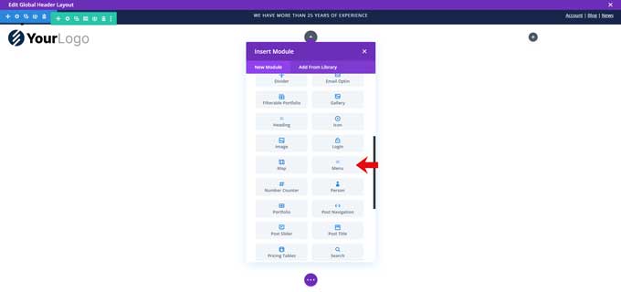
Assign your menu.

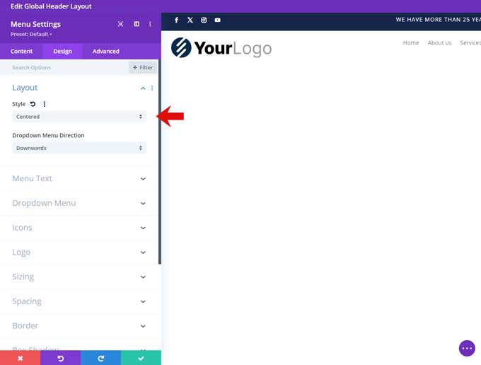
Go to the Design tab.
Layout
Under style choose Centered.
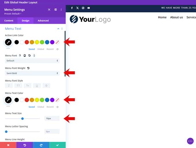
Text
Set the active and menu text color to black.
Set the font weight to semi-bold.
set the font size to 18px.
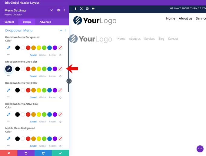
Dropdown menu
Set the dropdown menu line color to #910d0d
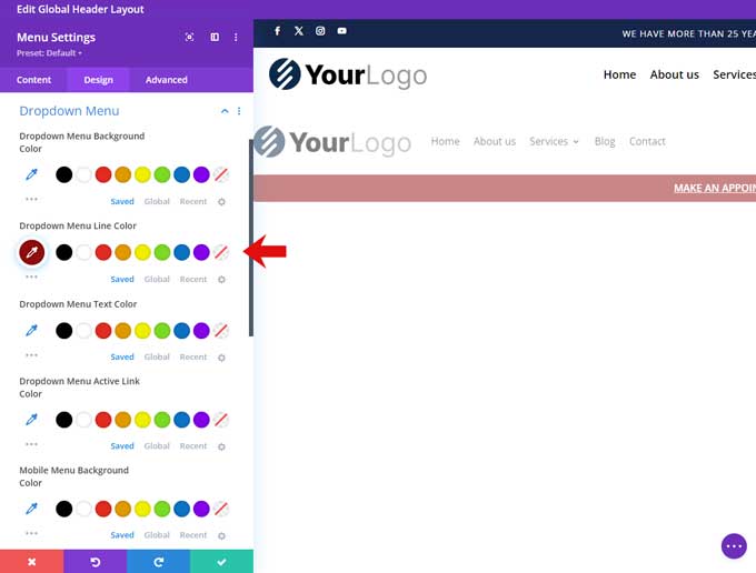
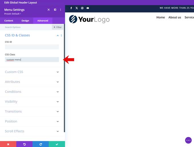
Go to the Advanced tab and under CSS Class place custom-menu.
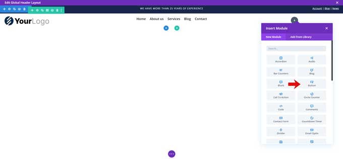
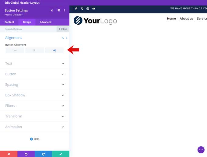
Step 10: Button Module
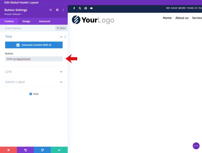
Place a button module in the right column.
Place a title for your button.
Go to the Design tab.
Alignment
Under alignment choose right.
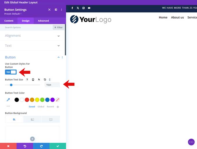
Button
Enable “Use Custom Styles For Button”.
Set the font size to 16px.
Set the button text color to white.
Set the background color to #910d0d.
Set the border width to 0px.
Set the button font-weight to semi-bold.
Set the button font style to uppercase.
Disable the show button icon.
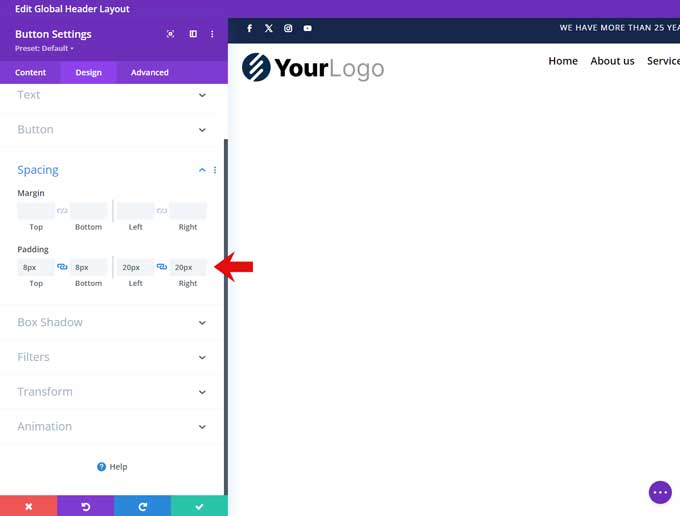
Spacing
Set the top and bottom padding to 8px.
Set the left and right padding to 20px.
Step 11: Tablet & Mobile Row
Add a new row and use a 1 column structure.
Open the row settings and go to the Design tab, under sizing set the width and max-width to 100%.
Spacing
Set the top, bottom, left, and right padding to 15px.
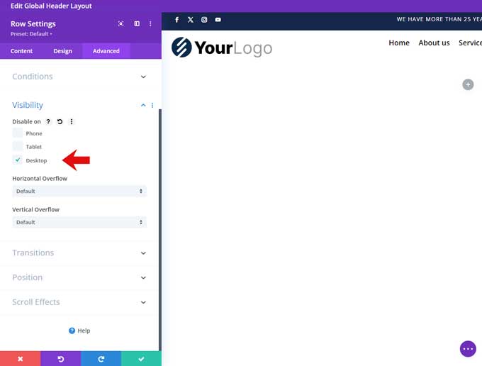
Go to the advanced tab and under Visibility check Desktop.
Step 12: Menu module for tablet and mobile
Add a menu module to this row.
Content
Assign your menu.
Logo
Place your logo here.
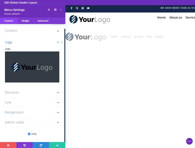
Go to the Design tab.
Menu Text
Set the active and menu text colors.
Set the font size to 16px.
Dropdown Menu
Set the dropdown menu line color.
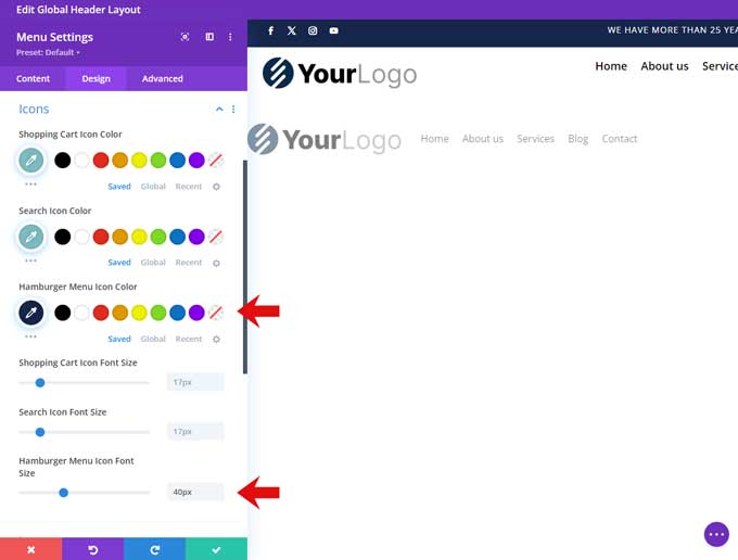
Icons
Set the hamburger menu icon color.
Set the hamburger icon size to 40px.
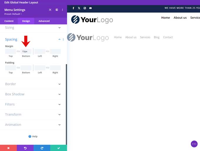
Spacing
Set the bottom margin to 15px.
Step 13: Button Module for Tablet and Mobile
Duplicate the button module we created earlier and drag it below the menu for tablet and mobile.
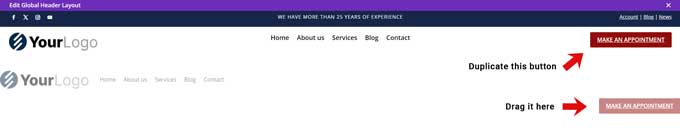
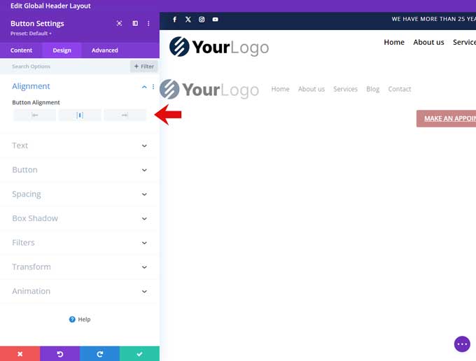
Open this button module and we are going to change the alignment.
Alignment
Change the alignment to center.
Go to the Advanced tab
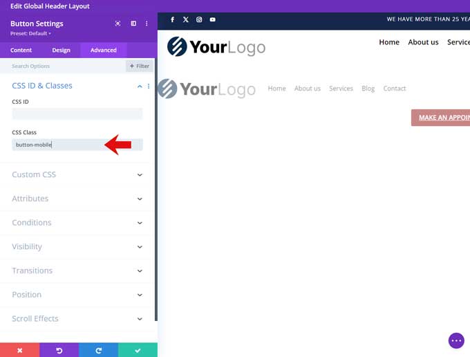
Go to the Advanced tab and under CSS Class place button-mobile
Step 14: Add Custom CSS Code
Now we only have to place some CSS and jQuery code.
Go to Divi > Theme Options > CSS
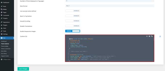
And place the following in there:
@media screen and (min-width: 981px) {
.custom-menu-row,
.custom-top-row {
  display: flex;
  align-items: center;
  justify-content: flex-end;
}

/* #### Dropdown Menu #### */

.custom-menu li li a {
  border-bottom: 1px solid #e5e5e5; /* #### Dropdown border bottom #### */
  font-weight: 600 !important; /* #### Dropdown font weight #### */
  font-size: 15px !important; /* #### Dropdown font size #### */
}

.custom-menu li li:last-child a {
  border-bottom: 0px solid #e5e5e5; /* #### Dropdown border bottom #### */
}

.custom-menu ul.sub-menu {
  padding: 0px 0 0 0 !important;
  border-top-width: 2px; /* #### Dropdown border top width #### */
}

.custom-menu ul.sub-menu ul {
  padding: 0px !important;
}

.custom-menu li li ul {
  top: -2px !important;;
}

.custom-menu  li li {
  padding: 0px !important;
}

.custom-menu li li a {
  padding: 6px 20px;
  width: 240px !important;
}}

.custom-social li  {
  margin-bottom: 0px;
}

.button-mobile {
	width: 100%;
}

@media screen and (max-width: 980px) {
.custom-top-row .et_pb_column {
  margin-bottom: 0px !important;
}}

/* #### Collaping Mobile Menu #### */

ul.et_mobile_menu li.menu-item-has-children .mobile-toggle-icon::after,
.et-db #et-boc .et-l ul.et_mobile_menu li.menu-item-has-children .mobile-toggle-icon::after {
	color: #ffffff; /* Icon color */
	background: #16264a; /* Icon background color */
	font-size: 22px; /* Icon size */
	top: 10px;
	position: relative;
	font-family: "ETModules";
	content: '\33';
	border-radius: 4px;
	padding: 1px 2px 1px 0px;
}

.et_mobile_menu .menu-item-has-children>a {
    font-weight: 400 !important;
}

ul.et_mobile_menu li.menu-item-has-children.mobile-toggle-open>.mobile-toggle-icon::after,
.et-db #et-boc .et-l ul.et_mobile_menu li.menu-item-has-children.mobile-toggle-open>.mobile-toggle-icon::after {
	content: '\32';
}

ul.et_mobile_menu li.menu-item-has-children .mobile-toggle-icon,
ul.et_mobile_menu li.page_item_has_children .mobile-toggle-icon,
.et-db #et-boc .et-l ul.et_mobile_menu li.menu-item-has-children .mobile-toggle-icon,
.et-db #et-boc .et-l ul.et_mobile_menu li.page_item_has_children .mobile-toggle-icon {
	width: 44px;
	height: 100%;
	padding: 0px !important;
	max-height: 44px;
	border: none;
	position: absolute;
	right: 0px;
	top: 0px;
	z-index: 999;
	background-color: transparent;
}

ul.et_mobile_menu>li.menu-item-has-children,
ul.et_mobile_menu>li.page_item_has_children,
ul.et_mobile_menu>li.menu-item-has-children .sub-menu li.menu-item-has-children,
.et-db #et-boc .et-l ul.et_mobile_menu>li.menu-item-has-children,
.et-db #et-boc .et-l ul.et_mobile_menu>li.page_item_has_children,
.et-db #et-boc .et-l ul.et_mobile_menu>li.menu-item-has-children .sub-menu li.menu-item-has-children {
	position: relative;
}

.et_mobile_menu .menu-item-has-children>a,
.et-db #et-boc .et-l .et_mobile_menu .menu-item-has-children>a {
	background-color: transparent;
}

ul.et_mobile_menu .menu-item-has-children .sub-menu,
#main-header ul.et_mobile_menu .menu-item-has-children .sub-menu,
.et-db #et-boc .et-l ul.et_mobile_menu .menu-item-has-children .sub-menu,
.et-db #main-header ul.et_mobile_menu .menu-item-has-children .sub-menu {
	display: none !important;
	visibility: hidden !important;
}

ul.et_mobile_menu .menu-item-has-children .sub-menu.visible,
#main-header ul.et_mobile_menu .menu-item-has-children .sub-menu.visible,
.et-db #et-boc .et-l ul.et_mobile_menu .menu-item-has-children .sub-menu.visible,
.et-db #main-header ul.et_mobile_menu .menu-item-has-children .sub-menu.visible {
	display: block !important;
	visibility: visible !important;
}

ul.et_mobile_menu li.menu-item-has-children .mobile-toggle-icon,
.et-db #et-boc .et-l ul.et_mobile_menu li.menu-item-has-children .mobile-toggle-icon {
	text-align: center;
	opacity: 1;
}
Step 15: Add jQuery Code
For the collapsing mobile menu we need to add some jQuery code.
Go to Divi > Theme Options > Integration > Add code to the < head > of your blog
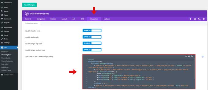
Place the following in here:
<script>
jQuery(function($) {
    $(document).ready(function() {
        $("body ul.et_mobile_menu li.menu-item-has-children, body ul.et_mobile_menu  li.page_item_has_children").append('<a href="#" class="mobile-toggle-icon"></a>');
        $('ul.et_mobile_menu li.menu-item-has-children .mobile-toggle-icon, ul.et_mobile_menu li.page_item_has_children .mobile-toggle-icon').click(function(event) {
            event.preventDefault();
            $(this).parent('li').toggleClass('mobile-toggle-open');
            $(this).parent('li').find('ul.children').first().toggleClass('visible');
            $(this).parent('li').find('ul.sub-menu').first().toggleClass('visible');
        });
        iconFINAL = 'P';
        $('body ul.et_mobile_menu li.menu-item-has-children, body ul.et_mobile_menu li.page_item_has_children').attr('data-icon', iconFINAL);
        $('.mobile-toggle-icon').on('mouseover', function() {
            $(this).parent().addClass('active-toggle');
        }).on('mouseout', function() {
            $(this).parent().removeClass('active-toggle');
        })
    });
});
</script>

Great job! Is there any way to make it hide on scroll or it’s too much? 🙂
I have been waiting for such a tutorial for so long. Thank you so much!!!!!
Elegantly done, Mark!
Thank you for sharing this. I look forward to implementing some of this in future client projects.
I was waiting for this lesson for so long. Thank you.
Great tutorial, one of my team has followed it found it so useful and easy to follow. Thanks.
Is there a simple way to make the injected header disappear on scroll so just the fixed header stays?
Hi William,
unfortunately I don’t have a quick fix for that.
Will definitely have to give this a go. Thanks for the tutorial.
Thank you Mark! Great tutorial! I did follow your tutorial, and I created as described but it doesn’t place the header above the Divi’s main header, it placed it on the top of the main header. Any Idea what I am doing wrong?
Hi Diana,
Did you placed the ID top-header in the section? It needs to be placed in the ID field not the CSS field
Hi Mark,
Thank you for your help, I do appreciate it.
Yes, it is placed the ID filed. I can email you images before I place the code and after.
Is there a way to make the custom menu as my 3. menu?
I already got a Main menu and a top menu, but im trying to make a third menu above the top menu? 🙂
You can place a fullwidth menu module in the custom header and assign it to your third menu.
Mark,
Great tutorial, but for some odd reason I am having issues with this. When I put it in place there is a large gap at the top of the menu so it pushes the entire menu down to about double the size. I have adjusted it and it will not adjust
To give a bit more information. When I inspect the page it appears that something is adding 154px padding to the top of the header and then fixing the position of the main header at 262px. I have looked at everything that I can think of and cannot find where this is being added.
Do you have an URL then I can take a look
Seems great, but what if I want to add the layout on top of the secondary menu? This places it between both menus…
You can try with a different hook. On the Elegant Themes website you will find all the hooks avalaible: https://www.elegantthemes.com/documentation/developers/hooks/divi-template-hooks/
This was super helpful for our team. Thanks Mark!
Thanks for this simple and useful tutorial. I’m using Divi over a year and I love it.
Great tutorial, at last I have created a different header for a Divi website, freedom to design. Thank You!