


Remember the mid-2000s? Flip phones were still a thing, MySpace was in its prime, and a new web design trend was taking over: Frutiger Aero. This aesthetic, named after the Swiss typeface designer Adrian Frutiger (even though he had nothing to do with it directly), brought a fresh, polished look to our digital lives. In this article, we’re going to dive into the world of Frutiger Aero, exploring its origins, key features, and lasting impact on web design.
Table of Contents
Origins of Frutiger Aero
So, what exactly inspired Frutiger Aero? The name itself pays homage to Adrian Frutiger, a legendary typeface designer known for his clean and readable fonts. But the style? That came from a blend of early 2000s tech advances and a collective desire for a more polished, user-friendly digital experience.
Think shiny, three-dimensional buttons, vivid colors, and smooth, rounded edges. This was a time when designers were pushing the boundaries of what was possible on screens, thanks to new software and better hardware.
Key Characteristics of Frutiger Aero
Let’s break down the elements that made Frutiger Aero stand out:
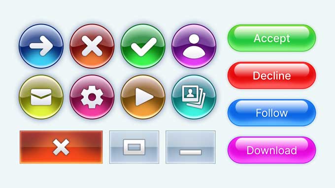
- Smooth, Rounded Edges: Forget sharp corners. Everything had a soft, rounded look that felt approachable and user-friendly.
- Glossy, 3D Effects: Gradients, shadows, and highlights were used to give buttons and icons a three-dimensional, almost touchable quality.
- Vivid Colors: Bright, saturated colors made elements pop off the screen, adding a sense of fun and energy.
- Semi-Transparency: Translucent overlays and elements added depth and complexity without overwhelming the user.
- Nature-Inspired Elements: Leaves, water droplets, and sunlight effects brought a touch of the natural world into the digital space, creating a harmonious and inviting vibe.
Examples of Frutiger Aero
If you were online during the mid-2000s, you definitely saw Frutiger Aero in action. Early adopters of this style included some big names:
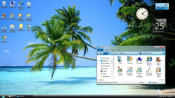
Windows Vista
- Start Menu and Taskbar: The operating system’s Start Menu and Taskbar featured glossy, transparent elements with soft gradients, giving a futuristic and polished look.
- Windows Sidebar: The Sidebar gadgets had a 3D appearance with reflections and shadows, contributing to the overall sleek design.
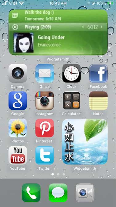
Early iPhone Interfaces
- App Icons and UI Elements: The original iPhone interfaces had a glossy, button-like appearance for app icons and UI elements, reflecting the Frutiger Aero style’s influence.
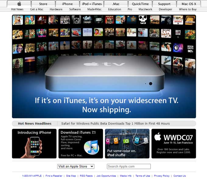
Websites of the Mid-2000s
- Apple.com (circa 2007): Apple’s website during this period showcased glossy buttons, reflections, and a clean, futuristic layout.
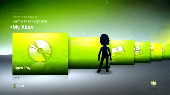
Gaming Interfaces
- Xbox 360 Dashboard: The Xbox 360’s interface included sleek, transparent panels and a glossy finish, aligning with the Frutiger Aero design language.
Adobe CS3 and CS4 Icons
- Software Icons: Adobe’s Creative Suite 3 and 4 icons featured gradients, shadows, and a polished look that was very much in line with the Frutiger Aero style.
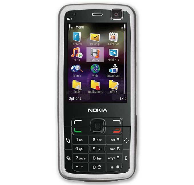
Nokia Nseries Phones
- User Interface: Nokia’s Nseries phones had UI elements that incorporated gradients, glossy effects, and a modern, clean design, resonating with the Frutiger Aero trend.
Impact on User Experience
Why did people love Frutiger Aero? For one, it was visually appealing. The glossy, vibrant elements made websites feel more dynamic and engaging. Rounded corners and three-dimensional effects also contributed to a more intuitive and user-friendly interface. And even though the trend has evolved, its influence can still be seen in modern design principles.
Designing with Frutiger Aero Today
Believe it or not, you can still incorporate elements of Frutiger Aero into your web designs today. Here’s how:
- Modern Applications: Use smooth, rounded edges and vibrant colors to create a friendly and inviting interface.
- Tools and Techniques: There are plenty of design tools that can help you achieve the glossy, three-dimensional look of Frutiger Aero. Photoshop and Sketch, for instance, have great gradient and shadow options.
- Balancing Retro and Modern: Combine the retro elements of Frutiger Aero with modern design principles, like minimalism and responsive design, to create a fresh yet familiar look.
Conclusion
Frutiger Aero was more than just a design trend; it was a movement that brought a new level of polish and sophistication to web design. Its smooth, glossy, and vibrant elements set the stage for future design trends and continue to inspire designers today. Whether you’re a fan of retro aesthetics or just looking for some design inspiration, Frutiger Aero has something to offer.
We’d love to hear your thoughts! Have you ever used Frutiger Aero elements in your designs? Share your experiences in the comments below.
