


In this tutorial, I will show you how to create a flip card hover effect using the Divi blurb module.
This will add an engaging and visually appealing feature to any website for different uses.
Table of Contents
Preview of the finishing result
After finishing this tutorial, you will have created a flip card hover effect using the Divi blurb module.
You can view a live demo of what we are going to build here:
See the DemoIn the demo, when you hover over a Divi blurb module, it flips to reveal the background image and a button.
Without further ado let’s get started with the tutorial.
Creating the Divi blurb hover flip card
I’ll guide you through the steps to create this hover effect for your Divi blurb.
Step 1: settings for the row and column
We begin by setting up a row and selecting a structure with three columns.
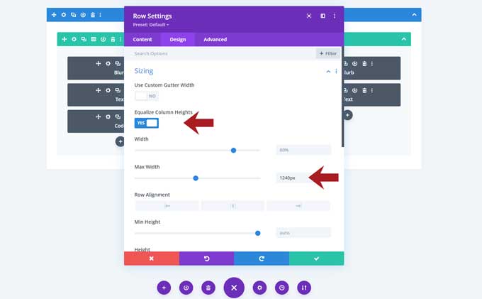
Row settings
In the Design tab use the following settings:
Sizing
- Enable the option Equalize Column Heights
- Max-width: 1240px
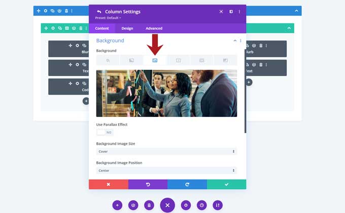
Column settings
Open the first column, under the Content tab go to Background, and place a background image here.
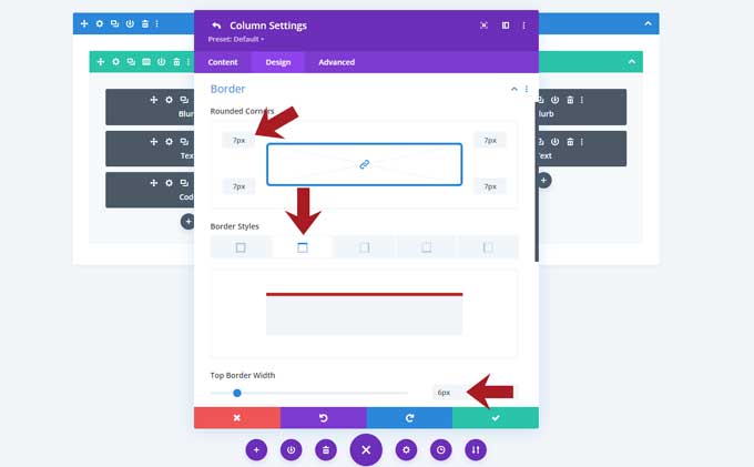
Design tab
Then go to the Design tab and use the following settings:
Border
- Set a rounded border of 7px
- Use a top border of 6px width and set a border color
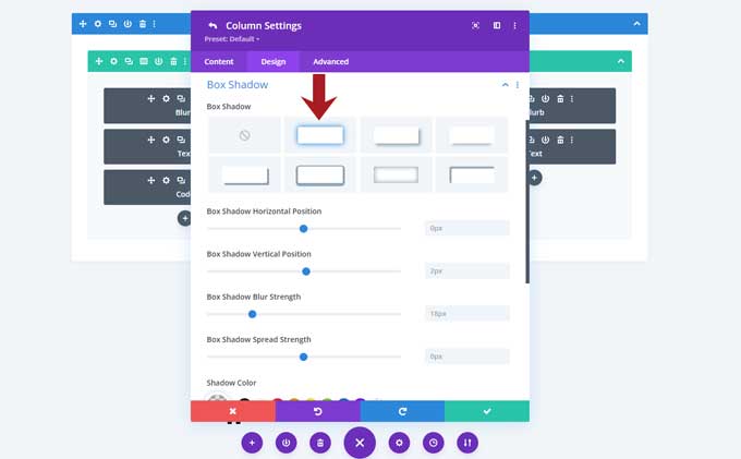
Box Shadow
I used the second default option, for the shadow color I use rgba(0,0,0,0.1).
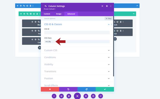
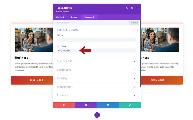
Now go to the Advanced tab and under CSS ID & Classes > CSS Class place this class in it: mh_flip
You can leave the other two columns for now, we will duplicate those later.
Step 2: blurb module
Place a Divi Blurb module in the first column.
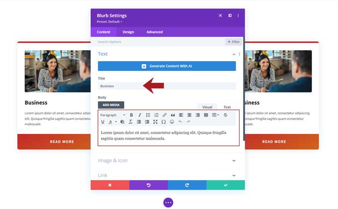
Content Tab
In the Content tab fill in a title and description.
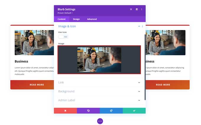
Scroll a bit lower and place an image in the Image & Icon tab.
Design tab
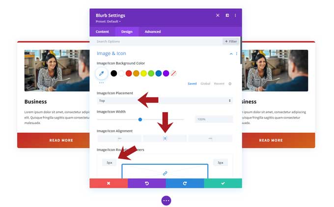
In the Design tab use the following settings:
Image & Icon
- Image/Icon Placement: Top
- Image /Icon Placement: Center
- Image/Icon Rounded Corners: 5px
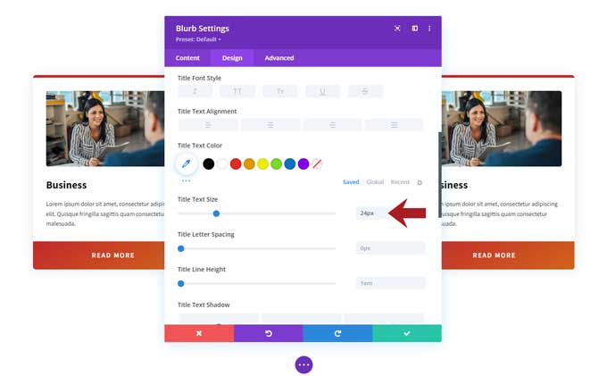
Title Text
- Title Text Size: 24px
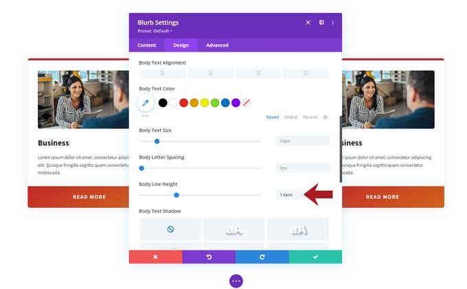
Body Text
- Body Line Height: 1.6em
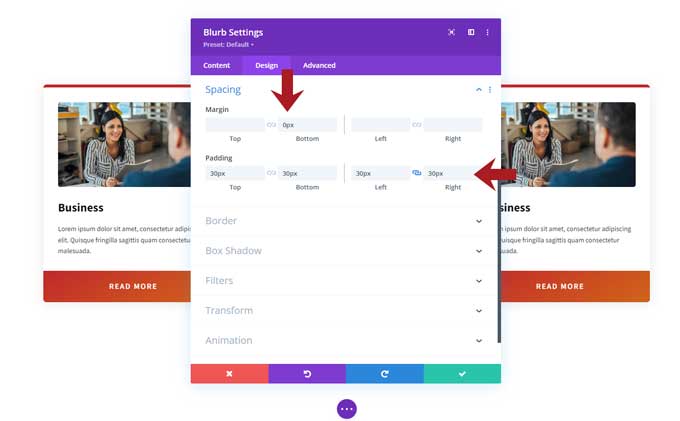
Spacing
- Margin-bottom: 0px
- Padding-left: 30px
- Padding-right: 30px
- Padding-bottom: 30px
- Padding-top: 30px
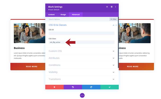
Advanced tab
In the Advanced tab and under CSS ID & Classes > CSS Class place this class in it: mh_flip_active
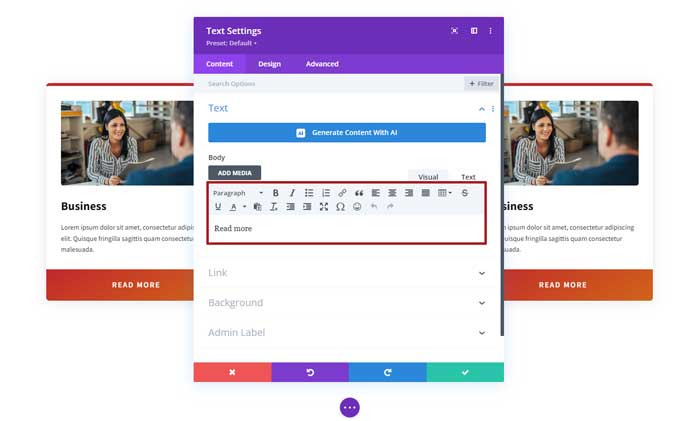
Step 3: text module
Under the blurb module place a text module.
Place the text Read More in the body field.
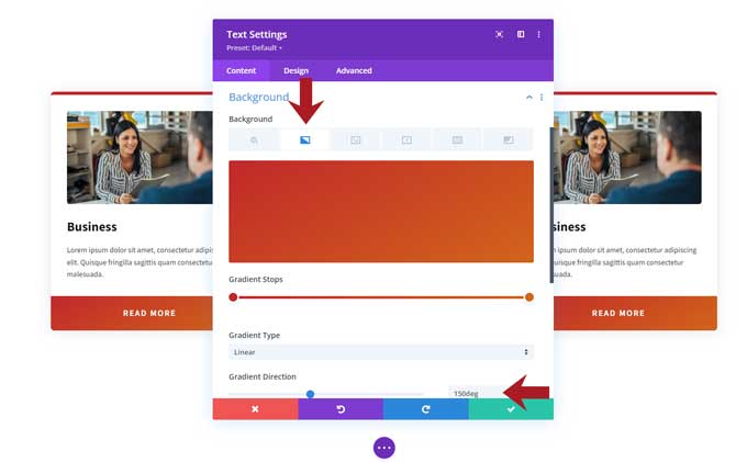
Background
- Go to the gradient tab to select your color
- Gradient Direction: 150deg
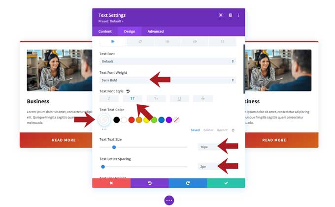
Design tab
In the Design tab use the following settings:
Text
- Text Font Weight: Semi Bold
- Text Font Style: Uppercase
- Text Color: White
- Text Size: 16px
- Text Letter Spacing: 2px
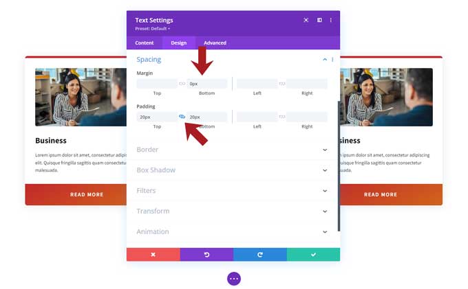
Spacing
- Margin-bottom: 0px
- Padding-top: 20px
- Padding-bottom: 20px
Advanced tab
Go to the Advanced tab and place the following class: mh_flip_meta.
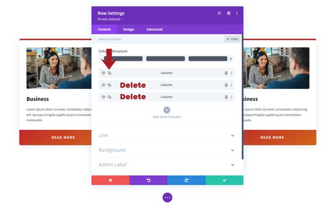
Step 4: duplicate column
Open your row and delete columns 2 and 3.
Then duplicate the first column 2 times.
Step 5: CSS code
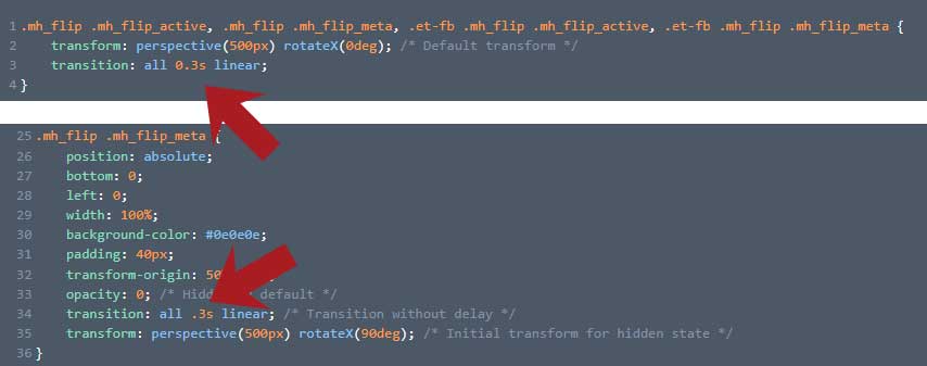
Go to Divi > Theme Options > CSS and place the following CSS code in here.
.mh_flip .mh_flip_active, .mh_flip .mh_flip_meta, .et-fb .mh_flip .mh_flip_active, .et-fb .mh_flip .mh_flip_meta {
    transform: perspective(500px) rotateX(0deg); /* Default transform */
    transition: all 0.3s linear;
}

.mh_flip .mh_flip_active {
    display: flex;
    flex-wrap: wrap;
    align-items: center;
    width: 100%;
    height: 100%;
    background-color: #fff;
    padding: 40px 50px;
    top: 0;
    left: 0;
    transform-origin: 50% 0%;
    height: calc(100% - -1px);
}

.mh_flip:hover .mh_flip_active {
    transform: perspective(500px) rotateX(-90deg);
    transition-delay: 0s;
}

.mh_flip .mh_flip_meta {
    position: absolute;
    bottom: 0;
    left: 0;
    width: 100%;
    background-color: #0e0e0e;
    padding: 40px;
    transform-origin: 50% 100%;
    opacity: 0; /* Hidden by default */
    transition: all .3s linear; /* Transition without delay */
    transform: perspective(500px) rotateX(90deg); /* Initial transform for hidden state */
}

.mh_flip:hover .mh_flip_meta {
    opacity: 1; /* Visible on hover */
    transform: perspective(500px) rotateX(0deg); /* Rotate to visible state on hover */
    transition-delay: 0.2s; /* Delay the start of transition to sync with .mh_flip_active */
}

.et-fb .mh_flip .mh_flip_active, .et-fb .mh_flip:hover .mh_flip_active, .et-fb .mh_flip .mh_flip_meta {
    height: unset;
    opacity: 1 !important; /* Ensure it's visible */
}

.et-fb .mh_flip:hover .mh_flip_active {
    transform: perspective(500px) rotateX(0deg);
}
Advanced techniques
Here are some advanced techniques to have more control over the flip cards.
Adjust the speed of the flip card
To change how quickly the flip card transitions, adjust the values in “transition: all 0.3s linear.”
For a faster transition, change the “0.3s” to “0.1s.”
In case you want a slower transition, you can change it to 0.5s
You need to change this value in two spots: line 3 and line 34.
Adjust the flip card direction
To change the flip card’s direction, simply add this CSS code below the original one.
/* Change flip card direction */
.mh_flip .mh_flip_active, .mh_flip .mh_flip_meta, .et-fb .mh_flip .mh_flip_active, .et-fb .mh_flip .mh_flip_meta {
    transform: perspective(500px) rotateX(0deg); /* Default transform for both elements */
    transition: all 0.3s linear; /* Default transition for both elements */
}

.mh_flip .mh_flip_active {
    /* Other properties remain unchanged */
    transform-origin: 50% 0%;
}

.mh_flip:hover .mh_flip_active {
    transform: perspective(500px) rotateY(-90deg); /* Changed flip active to rotateY for horizontal flip */
    transition: all 0.3s linear 0s; /* Adjust duration here as well */
}

.mh_flip .mh_flip_meta {
    position: absolute;
    bottom: 0;
    left: 0;
    width: 100%;
    background-color: #0e0e0e;
    padding: 40px;
    transform-origin: 50% 100%;
    opacity: 0; /* Hidden by default */
    transform: perspective(500px) rotateX(90deg); /* Retain vertical flip */
    transition: all 0.3s linear 0s;
}

.mh_flip:hover .mh_flip_meta {
    opacity: 1; /* Visible on hover */
    transform: perspective(500px) rotateX(0deg); /* Retain vertical flip */
    /* No additional transition-delay needed here because it's set in the default state */
}

.et-fb .mh_flip .mh_flip_active, .et-fb .mh_flip:hover .mh_flip_active, .et-fb .mh_flip .mh_flip_meta {
    /* Other properties remain unchanged */
}

.et-fb .mh_flip:hover .mh_flip_active {
    transform: perspective(500px) rotateY(0deg); /* Changed from rotateX to rotateY */
}
Conclusion
In this tutorial, you have learned how to create a flip card hover effect using the Divi blurb module. You can now use this technique to add an eye-catching feature to your website and make it stand out from the rest.
Feel free to experiment with different settings and advanced techniques to customize the flip card even further.
If you have any questions or suggestions, leave a comment below.

So, these are really cool on a computer, but given that majority of traffic is on phones, and there is no hover event on a phone, then there is no way for a phone user to see the flipped state of the card…. or am I mistaken?
Does it make sense to do these fancy effects like flip card if it does not translate over to mobile?
Hi John,
On mobile, the first click opens the flip card with its animation, and then you can click the “read more” button.