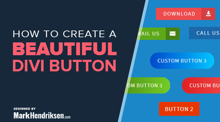
Today I’m sharing a step by step tutorial for 3 custom Divi buttons with a nice hover effect. You can create the buttons with this step by step tutorial.
You can view the buttons in action on this demo website.
Custom button 1
Place a Button module and use these settings:
Content tab
Fill in a button text and a link
Design tab
Text color: Light
Use Custom Styles for Button: Yes
Button Text Size: 18px
Button Background Color: #ef4b4c
Button Border Width: 0
Button Border Color: rgba(255,255,255,0)
Button Border Radius: 0px
Button Letter Spacing: 2px
Font Style: Uppercase
Show Button Icon: yes
Button Icon: Choose your icon
Only Show Icon On Hover for Button: No
Button Hover Background Color: #d53f41
Custom Padding: Right: 65px, Left 25px
Box Shadow:
Box Shadow Horizontal Position: 0px
Box Shadow Vertical Position: 2px
Box Shadow Blur Strength: 18px
Box Shadow Spread Strength: 0px
Shadow Color: rgba(0,0,0,0.3)
Advanced tab
CSS Class: custom_button_1
Place the following CSS code in your child theme, you can follow this guide on how to make a child theme or in Divi > Theme options > Custom CSS
.custom_button_1:after {
	background-color: #d53f41; /* Change this color to your own */
	padding: 5px 12px;
	top: 0;
	right: 0;
	bottom: 0;
	border-left: 1px solid #c0232e; /* Change this color to your own */
}
Change the color codes for your own color scheme.
Custom button 2
Place a Button module and use these settings:
Content tab
Fill in a button text and a link
Design tab
Text color: Light
Use Custom Styles for Button: Yes
Button Background Color: e83600
Button Border Width: 0
Button Letter Spacing: 1px
Font Style: Uppercase
Show Button Icon: yes
Button Icon: Choose your icon
Only Show Icon On Hover for Button: Yes
Box Shadow:
Box Shadow Horizontal Position: 0px
Box Shadow Vertical Position: 2px
Box Shadow Blur Strength: 18px
Box Shadow Spread Strength: 0px
Shadow Color: rgba(0,0,0,0.3)
Advanced tab
In the CSS Class field you can use one of these 4 classes depends on the hover effect you want to achieve.
For the first button hover effect as on the demo use:
custom_button_2_up
For the second button hover effect as on the demo use:
custom_button_2_left
For the third button hover effect as on the demo use:
custom_button_2_down
For the fourth button hover effect as on the demo use:
custom_button_2_rightPlace the following CSS in Divi – Theme options – Custom CSS if you are using the class custom_button_2_up
/* CUSTOM BUTTON 2 UP */

.custom_button_2_up {
	overflow: hidden;
	-webkit-backface-visibility: hidden;
	-moz-backface-visibility: hidden;
	backface-visibility: hidden;
}

.custom_button_2_up:hover {
	padding: .3em 1em !important;
}

.custom_button_2_up:after {
	left: 0 !important;
	top: -100%;
	margin-left: 0em !important;
	position: absolute;
	height: 100%;
	width: 100%;
	-webkit-transition: all 0.3s;
	-moz-transition: all 0.3s;
	transition: all 0.3s;
	background-color: #e09900; /* Change this color to your own */
	text-align: center;
}

body #page-container .custom_button_2_up:hover:after {
	line-height: 1.6em;
	font-size: 30px!important;
}

.custom_button_2_up:hover:after {
	top: 0;
	left: 0;
}
Place the following CSS in Divi – Theme options – Custom CSS if you are using the class custom_button_2_left
/* CUSTOM BUTTON 2 LEFT */

.custom_button_2_left {
	overflow: hidden;
	-webkit-backface-visibility: hidden;
	-moz-backface-visibility: hidden;
	backface-visibility: hidden;
}

.custom_button_2_left:hover {
	padding: .3em 1em !important;
}

.custom_button_2_left:after {
	left: -100% !important;
	top: 0%;
	margin-left: 0em !important;
	position: absolute;
	height: 100%;
	width: 100%;
	-webkit-transition: all 0.3s;
	-moz-transition: all 0.3s;
	transition: all 0.3s;
	background-color: #e09900; /* Change this color to your own */
	text-align: center;
}

body #page-container .custom_button_2_left:hover:after {
	line-height: 1.6em;
	font-size: 30px!important;
}

.custom_button_2_left:hover:after {
	top: 0;
	left: 0 !important;
}
Place the following CSS in Divi – Theme options – Custom CSS if you are using the class custom_button_2_down
/* CUSTOM BUTTON 2 DOWN */

.custom_button_2_down {
	overflow: hidden;
	-webkit-backface-visibility: hidden;
	-moz-backface-visibility: hidden;
	backface-visibility: hidden;
}

.custom_button_2_down:hover {
	padding: .3em 1em !important;
}

.custom_button_2_down:after {
	left: 0 !important;
	bottom: -100%;
	margin-left: 0em !important;
	position: absolute;
	height: 100%;
	width: 100%;
	-webkit-transition: all 0.3s;
	-moz-transition: all 0.3s;
	transition: all 0.3s;
	background-color: #e09900; /* Change this color to your own */
	text-align: center;
}

body #page-container .custom_button_2_down:hover:after {
	line-height: 1.6em;
	padding-top: 0px;
	font-size: 30px!important;
}

.custom_button_2_down:hover:after {
	bottom: 0% !important;
	left: 0;
}
Place the following CSS in Divi – Theme options – Custom CSS if you are using the class custom_button_2_right
/* CUSTOM BUTTON 2 RIGHT */

.custom_button_2_right {
	overflow: hidden;
	-webkit-backface-visibility: hidden;
	-moz-backface-visibility: hidden;
	backface-visibility: hidden;
}

.custom_button_2_right:hover {
	padding: .3em 1em !important;
}

.custom_button_2_right:after {
	right: -100% !important;
	top: 0%;
	margin-left: 0em !important;
	position: absolute;
	height: 100%;
	width: 100%;
	-webkit-transition: all 0.3s;
	-moz-transition: all 0.3s;
	transition: all 0.3s;
	background-color: #e09900; /* Change this color to your own */
	text-align: center;
}

body #page-container .custom_button_2_right:hover:after {
	line-height: 1.6em;
	font-size: 30px!important;
}

.custom_button_2_right:hover:after {
	top: 0;
	right: 0 !important;
}
Custom button 3
Place a Button module and use these settings:
Content tab
Fill in a button text and a link
Design tab
Text color: Light
Use Custom Styles for Button: Yes
Button Text Size: 18px
Button Border Width: 0
Button Border Radius: 25px
Button Letter Spacing: 1px
Font Style: Uppercase
Custom Padding: Top: 12px, Right: 25px, Bottom: 12px, Left 25px;
Box Shadow:
Box Shadow Horizontal Position: 0px
Box Shadow Vertical Position: 2px
Box Shadow Blur Strength: 35px
Box Shadow Spread Strength: 0px
Shadow Color: rgba(0,0,0,0.3)
Advanced tab
CSS Class: custom_button_3Place the following CSS in Divi – Theme options – Custom CSS
.et_pb_module a.custom_button_3 {
    background-color: #0149CC; /* Change this color to your own */
    background-image: linear-gradient(to right,#0149CC,#00C6FF,#0149CC); /* Change this color to your own */
    display: inline-block !important;
    cursor: pointer;
    position: relative;
    transition: color 0.35s ease, background-position 0.3s ease-in-out,
    background-color 0.35s ease, box-shadow 0.3s ease-in-out;
    z-index: 1;
    overflow: hidden;
    background-size: 200% 100%;
    background-position: 0 0;
}

.et_pb_module a.custom_button_3:hover {
    box-shadow: -0.25em 0.25em 2.25em rgba(0,0,0,0.35);
    background-position: 100% 100%;
}
To change the background color of the button, you have to change the color codes of:
background-color:
background-image:
Did you know that you can also create a button with a Divi shortode? This can be handy in some cases, for example if you want to add a button to your blurb module. Check out my tutorial Divi shortcode button to create a button with a shortcode.


Mark, can you help me? My button (style 3) doesn’t work: https://instantsiker.hu/
Did you add the CSS class and placed the custom CSS in Divi > Theme options ?
Yes, I did.
thank u its verry good !
How can I set all the buttons to be the set width?
Hi Kristine,
If you go to the buttons advanced tab > Custom CSS > Main element
And place the following CSS:
width:50% !important;
You can cjabge the %number to whatever you like
I can’t use a button module. Is it possible to just use CSS for everything?
Hi,
Are you not you working with Divi?
Yes, I am. But I want to modify a button that’s used with a plugin. The plugin works with shortcodes so the only way to modify the button and create something as satisfying as the buttons you created is to use the plugin button class and include all the code as CSS. I can’t insert a button module. Hence the complication.
Ahh ok I see, the CSS code in my examples will not be enough you have to write some more CSS to make it work.
Unfortunately I don’t have full button CSS snippets ready. Otherwise I would give them to you.
I would love to incorporate the custom_button_3 in to my new website, but I’m not sure how to do this for the submit button in a Divi Contact Form or (like jrockoford) within a plugin.
Can you help?
Hi Jeff,
Try this CSS snippet instead of the given one:
.custom_button_3 .et_pb_button {
background-color: #0149CC; /* Change this color to your own */
background-image: linear-gradient(to right,#0149CC,#00C6FF,#0149CC); /* Change this color to your own */
display: inline-block !important;
cursor: pointer;
position: relative;
transition: color 0.35s ease, background-position 0.3s ease-in-out,
background-color 0.35s ease, box-shadow 0.3s ease-in-out;
z-index: 1;
overflow: hidden;
background-size: 200% 100%;
background-position: 0 0;
}
.custom_button_3 .et_pb_button:hover {
box-shadow: -0.25em 0.25em 2.25em rgba(0,0,0,0.35);
background-position: 100% 100%;
}