


In this tutorial, you will be learning on how to create an image grid with a rollover effect. You can follow this step-by-step guide to accomplish this or you can use the JSON file and upload this section to your Divi library.
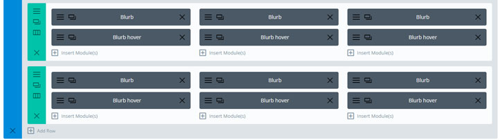
This image grid is created out of blurbs. Each service is made out of 2 blurbs. One is visible and the other one is only visible when you mouse over it.
Step-by-step guide
Step 1
Download the image pack I used for this tutorial and unzip it. You can use the same images as I did for this tutorial. If you are going to use your own images that it is good practice to reduce the size and compress the images, on how to do this you can follow this tutorial best Divi image sizes for your website.
If you just want to use this section and not build it from scratch you can just use the JSON file in the download pack. You will still need to add the CSS part manually (later in this tutorial).
To upload the file do as follows:
Go to Divi > Divi Library. Click on the import/export options.
Click on Import and upload the Image grid with rollover.json.
Now you can use this section on any page with the import from library function.
Step 2
Create a section and use these settings:
Content
Background: Upload the image section_with_overlay
Use Parallax Effect: Yes
Parallax Method: CSS
Step 3
Create a row choose a 3-column layout and use these settings:
Content
Background: Upload the image row_bg
Use Parallax Effect: Yes
Parallax Method: CSS
Design
Use Custom Width: Yes
Unit: %
Use Custom Gutter Width: Yes
Gutter Width: 1
Custom Padding: 0 0 0 0
Advanced
CSS Class: blurbs_grid
Step 4
Add a blurb module in the first column and use these settings:
Content
Title: fill in your title in my case Service 1
Background: in the color tab use rgba(0,0,0,0.58)
Design
Title Text Alignment: center
Title Text Size: 26px
Title Text Color: #ffffff
Custom Padding: Top 75px Bottom: 75px
Border Styles: All borders (first option)
Border-Width: 2px
Border-color: #ffffff
Advanced
CSS Class: blurb_active
Step 5
Add another blurb module under the previous and use these settings:
Content
Title: fill in your title in my case Service 1
Content: see below (replace # with a link)
Background: in the image tab upload service_image_1
Design
Title Text Alignment: center
Title Text Size: 26px
Title Text Color: #ffffff
Title Text Shadow: choose bottom left
Title Text Shadow Color: #000000
Custom Padding: Top 75px Bottom: 75px
Border Styles: All borders (first option)
Border-Width: 2px
Border-color: #ffffff
Advanced
CSS Class: blurb_hover
Step 6
Copy these two blurbs and place them in the other two columns.
Replace the images and titles
Duplicate this row.Step 7
Add this CSS code in Divi > Theme options > Custom CSS
I have added some comments in the CSS where you can change the button color.
/* ##### IMAGE GRID WITH ROLLOVER ##### */

.blurbs_grid .et_pb_column_1_3 .et_pb_blurb_content {
  	display: flex;
  	justify-content: center;
  	flex-direction: column;
  	height: 200px;
}

.blurbs_grid .et_pb_column_1_3 .blurb_hover,
.blurbs_grid .et_pb_column_1_3:hover .blurb_active {
	-webkit-transition: all .3s ease-out;
	-moz-transition: all 0.3s ease-out;
	-ms-transition: all 0.3s ease-out;
	-o-transition: all 0.3s ease-out;
	transition: all 0.3s ease-out;
}

.blurbs_block .et_pb_column_1_3:hover .blurb_active {
	visibility:hidden;
}

.blurbs_grid .et_pb_column_1_3 .blurb_hover {
	top:0;
	opacity:0;
	position:absolute;
	visibility:hidden;
	width: 100%;
}

.blurbs_grid .et_pb_column_1_3:hover .blurb_hover {
	visibility:visible;
	opacity:1;
}

.blurbs_grid .et_pb_column_1_3 .blurb_hover a {
	background-color: #ce8b2f; /* Background color of the button */
        color: #fff; /* Text color of the button */
        padding: 7px 15px;
        text-transform: uppercase;
        box-shadow: 0px 0px 35px 0px rgba(0, 0, 0, 0.25);
	margin-top:15px;
	display: inline-block;
}

.blurbs_grid .et_pb_column_1_3 .blurb_hover a:hover {
	background-color: #005ba3; /* Background color of the button when hover */
}

.blurbs_grid .et_pb_column_1_3 .blurb_hover .et_pb_blurb_container {
	margin-top: 52px;
}
Thanks! Very cool this! Would it be possible to have a grid of triangles (with three sides of each 60 degr) in stead of the square grid on top of the background image?
That would give a very nice effect. Unfortunately, I would not know how to do that with this grid
Thanks anyway!
The only way I can think of is an SVG with triangle elements. They can be manipulated by (similar) CSS. You could see SVG as an extension for CSS in case you need more complex paths.
Looks great. Will give it a go.
I am just getting into flex so a good opportunity.
Looks great on my computer, but changing to a tablet device results in the background image repeating itself on the upper row and lower row, instead of reflecting the “full” image of the overlay bg.
Any suggestions on how to make this design more responsive?
Thanks!
Hi Bryan,
That is correct.
Divi disables parallax images on mobile devices.
You can try to add this in your custom CSS:
.et_mobile_device .et_pb_section_parallax .et_pb_parallax_css {
background-attachment: fixed !important;
}
I love your design and have added it to a demo that I’m working on but for some reason when it gets to your section it doesn’t scroll smooth over it for some reason. Do you have any ideas on what could cause that?
Thanks in advance
Hi,
Could you provide me a link then I’ll have a look at it. You can also mail it to me (info@markhendriksen.com)
Hi Mark, This Looks Great!
Thanks.
I tried this without the read more button and then I get the title 2 times when I hover. But without the button I would not use 2 blurb module anyway. I would just use the over option on the background. Nice little example. Thx very much.
Thanks Ralf, when I created this tutorial the hover options in Divi did not yet exist. I would indeed made it differently now.
Download link no longer working, such a shame.
Hi Jeff,
Thanks for the heads up. I have updated the download link and it is working again.