


Have you ever noticed those big, bold, eye-catching fonts that seem to leap off the page? Those are block fonts, and they’re everywhere – from posters and logos to headlines and web design. Today, we’re diving into the world of block fonts to understand what they are, why they’re so popular, and how you can use them to make your designs stand out.
Table of Contents
What are Block Fonts?
Block fonts are exactly what they sound like: fonts that are bold, thick, and highly legible. They have a strong presence and are designed to grab attention.
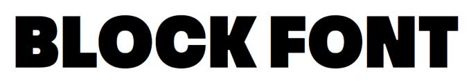
Historically, block fonts have been used in print media for headlines and advertisements because of their readability from a distance. Today, they’re a staple in digital design as well.
Types of Block Fonts
Block fonts come in various styles, each with its unique charm:
- Sans-serif Block Fonts: Clean and modern, perfect for a minimalist look.
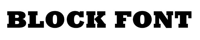
- Serif Block Fonts: Classic and elegant, adding a touch of sophistication.
- Modern Block Fonts: Edgy and contemporary, great for making a bold statement.
- Retro Block Fonts: Nostalgic and fun, ideal for vintage-themed designs.
Key Features of Block Fonts
Block fonts are known for their:
- Boldness and Legibility: Their thick lines make them easy to read.
- Versatility: They work well in various contexts, from print to digital.
- Aesthetic Impact: They add a striking visual element to any design.
Best Practices for Using Block Fonts
Here are some tips to make the most of block fonts in your designs:
- Pairing: Combine block fonts with more delicate fonts for a balanced look.
- Context: Use them for headlines, logos, and other elements that need to stand out.
- Avoid Overuse: Too many block fonts can overwhelm a design. Use them sparingly for maximum impact.
Popular Block Fonts and Examples
Some of the most popular block fonts include:
Impact: A classic choice for attention-grabbing text.

Futura Bold: Sleek and modern, perfect for clean designs.

Rockwell: A sturdy serif block font that adds a touch of tradition.
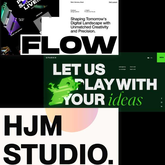
You can find these fonts and many more on websites like Google Fonts, Adobe Fonts, and Font Squirrel. Here’s a visual example to inspire you:
How to Choose the Right Block Font
Choosing the right block font involves considering several factors:
- Brand Identity: Ensure the font aligns with your brand’s personality.
- Readability: Test the font at different sizes to ensure it remains legible.
- Purpose: Match the font to the context of your design – is it for a headline, a logo, or something else?
Tools like Adobe Typekit and Google Fonts can help you test and select the perfect block font for your needs.
Conclusion
Block fonts are a powerful tool in any designer’s arsenal. Their boldness and versatility make them perfect for creating eye-catching designs that stand out. So, go ahead and experiment with different block fonts to find the ones that best suit your projects. Happy designing!
Additional Resources
For more information on block fonts, check out these resources:
By following these tips and exploring the wide range of block fonts available, you’ll be well on your way to creating stunning, impactful designs.
