


Divi 5 has finally added native Flexbox support, and it’s a game changer for layout control in the Divi Builder.
In this article, we’ll walk through what Flexbox is, how it’s implemented in Divi 5, and show several practical examples — from simple column alignment to real-world layout scenarios.
What Is Flexbox?
Flexbox, or Flexible Box Layout, is a powerful CSS layout model that allows items within a container to automatically adjust and distribute space. It’s perfect for:
- Aligning items horizontally or vertically
- Creating responsive layouts
- Evenly spacing elements
- Wrapping content across lines
With Divi 5, you can now apply Flexbox directly within the Visual Builder — no need for custom CSS.
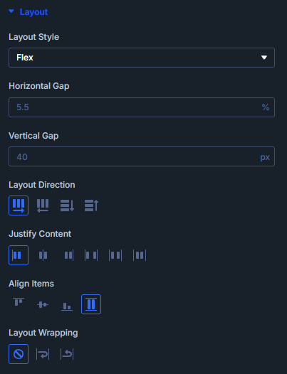
Getting Started with Flexbox in Divi 5
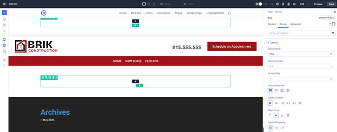
You’ll find the Flexbox settings under the Design tab of Rows and Columns.
- Open the Row or Column settings.
- Go to the Design tab → Layout.
- Enable the Layout Style toggle and choose Flex.
- New Flexbox options will appear, including:
- Layout Direction (Row/Column)
- Horizontal & Vertical Gaps
- Justify Content
- Align Items
- Layout Wrapping
Let’s look at some practical examples.
Example 1: 3-Column Layout
The Setup:
- A row with 3 columns, each containing a Text Module.
- Row and columns have background colors to show structure.
Steps:
- Set the Row to Flex in the Design tab.
- Adjust the Horizontal Gap to control space between columns.
- Switch Layout Direction to Column to enable Vertical Gap.
- Open a Column, enable Flex, and use Justify Content and Align Items to position the text.
- On the Row level, use Align Items to control vertical alignment across columns.
Result: Precise control over spacing and vertical alignment — no custom CSS needed.

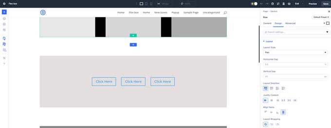
Example 2: Aligning Buttons Horizontally
The Setup:
- A one-column row with three button modules stacked vertically.
Steps:
- Set the Row and then the Column to Flex.
- Change Layout Direction to Row.
- Use Justify Content to center the buttons or space them evenly.
Result: Buttons appear side-by-side, perfectly aligned.
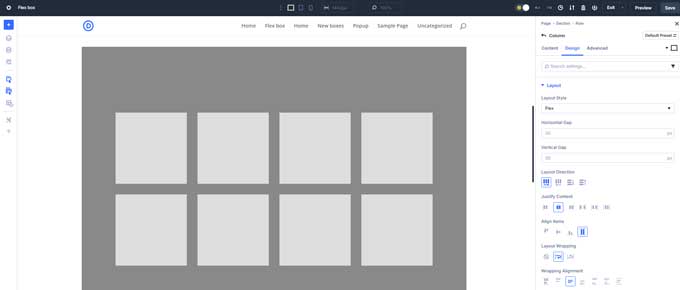
Example 3: Flex Wrapping
The Setup:
- A one-column row with eight text modules, each 200×200 pixels.
Steps:
- Set the Row and Column to Flex.
- Change Direction to Row. All boxes line up in one long line.
- Enable Layout Wrapping.
- Use Wrap Alignment and Align Items to center and position the wrapped boxes.
Result: The boxes wrap onto new lines and remain evenly spaced and centered.
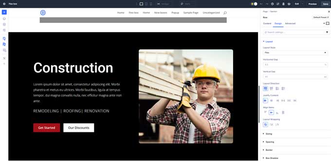
Live Example 1: Text + Image Layout
The Setup:
- Section with Text on the left, Image on the right, and two buttons under the text.
Steps:
For buttons:
- Enable Flex on the row and text column.
- Buttons align side by side automatically.
- Use Horizontal Gap to adjust spacing.
For centering layout:
- On the row level, set Align Items to Center.
Result: Text and image are perfectly centered, and the buttons are aligned.
Live Example 2: Header with Logo and Call to Action
The Setup:
- Left column: Logo
- Right column: Text + Button
Steps:
- Set the Row to Flex and Align Items to Center.
- Set the Second Column to Flex.
- Set Layout Direction to Row.
- Use:
- Justify Content → End
- Align Items → Center
- Horizontal Gap → 10
Result: A professional, centered header with aligned logo and CTA.
Final Thoughts
Flexbox in Divi 5 brings modern layout flexibility directly into the Visual Builder. Whether you’re building a hero section, pricing tables, or responsive buttons — Flex gives you precise control without writing a single line of CSS.
Key Takeaways:
- Enable Flex on both the parent and child elements.
- Use Layout Direction, Justify Content, and Align Items for full control.
- Use Wrapping when you have multiple elements in one line.
- Flex works great for buttons, cards, text/image layouts, and headers.

Awesome and straight forward