


If you’re using Divi 5, you now have access to one of CSS’s most powerful tools for responsive design: the clamp() function. In this tutorial, we’ll walk through how Divi 5 uses clamp() natively, how to inspect and customize it, and how to create global variables that make your responsive workflow faster and more consistent.
What is CSS clamp()?
The clamp() function allows you to define a responsive value that adjusts between a minimum and maximum range based on the viewport width. The syntax looks like this:
font-size: clamp(1rem, 2vw, 2rem);
In this example:
- 1rem is the minimum value
- 2vw is the preferred (fluid) value
- 2rem is the maximum value
This means your font size will grow and shrink with the screen size, but never go below 1rem or above 2rem.
How to Use clamp() in Divi 5
Under any font size setting in the Visual Builder, you can now select clamp() directly from the dropdown.
- Click into a module’s Design > Text > Text Size settings.
- Open the dropdown next to the unit (e.g., px, em) and choose Clamp.
- You’ll then be able to set: Minimum value (e.g., 2rem), Preferred fluid value (e.g., 6vw), Maximum value (e.g., 50px).
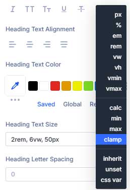
Divi will apply your chosen clamp() formula directly, giving you fine-tuned control without needing custom code.
Creating Global Variables with clamp()
Divi 5 also lets you define global variables with clamp() values, making it easy to reuse consistent sizing across your site.
To create a global variable:
- Click the global variable icon in the design settings.
- Go to the Numbers tab and click Add Global Number.
- Name your variable (e.g.,
h1). - In the value field, select Clamp and enter your values.
- Click Save Variables.
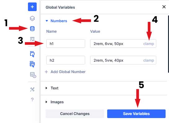
Now, when you adjust the font size for any module, you can select your h1 variable to apply consistent sizing. If you ever want to change it, just update the variable and all linked modules will update too.
Conclusion
The clamp() function in Divi 5 gives you elegant, code-free control over responsive typography and layout spacing. Whether you’re customizing manually or using global variables, clamp() simplifies your workflow and ensures consistency across breakpoints.
Want to see it in action? Watch the full video tutorial here.
Have questions? Drop a comment below. Thanks for reading!
