


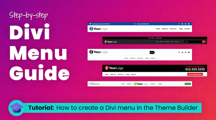
Are you looking for a comprehensive guide to creating the perfect Divi menu?
A website with an effective design is essential if you want your customers to stick around. Without great navigation, this isn’t possible. One of the most popular tools that help build amazing Divi menus and make them more user-friendly is building a menu in the Theme Builder. It offers plenty of options when it comes to menu styling, organizing complex menus, and adding customizations that make it look amazing!
With the Theme Builder, you don’t just get some basic settings but can also customize every little detail in your Divi menu including fonts, colors, and more – giving you complete control over the aesthetics of your site’s main menu. Plus, no coding experience is required, so anyone can take advantage of these features for their own sites!
Table of Contents
- The default Divi menu and the Theme Builder
- Creating a Menu Using the Theme Builder (Step-by-Step Guide)
- Advanced styling for your Divi menu
The default Divi menu and the Theme Builder
The menu is a default feature in the Divi theme that allows you to easily create and manage navigation menus on your website. In addition to the default menu, Divi also offers a more advanced option called the Theme Builder menu. This option provides even more control and customization options for your website’s navigation.
The default Divi menu
When you have installed the Divi Theme you have a basic menu.

You can customize this menu in Divi > Theme Customizer > Header & Navigation
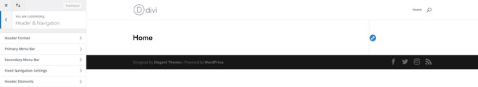
From here you can expand the different tabs and style your menu.
I am not going too deep on how to style the default menu because, since the release of the Theme Builder, we can create headers and menus in a more comprehensive way.
Benefits of using the default menu
- Options for both horizontal and vertical menus.
- Quicker to setup
The Theme Builder
Since the release of the Theme Builder by Elegant Themes we can now create custom menus. The Divi global header in the Theme Builder is a feature that allows you to create a single header design for your entire website. This header will appear consistently across all your pages, giving your site a uniform and professional look.
The Theme Builder is a special tool in the Divi theme, which helps users customize the appearance and layout of their websites with ease. The global header is an important part of this customization process as it helps create a consistent branding and navigation experience for the visitors.
To create a global header, you can use the Divi Builder to design the header layout, incorporating elements such as logos, navigation menus, social media icons, search bars, and more. Once the global header is designed and saved, it will automatically be applied to all your website pages, ensuring a cohesive look and feel throughout.
However, the global header can also be modified on a per-page basis, allowing for specific header designs to be applied when needed. This is useful for situations where a different header style or information is required, such as on landing pages, e-commerce product pages, or specialized content.
Benefits of using the Theme Builder
- More styling options
- Different menus for different pages
Creating a Menu Using the Theme Builder (Step-by-Step Guide)
I will go through the process of designing a custom menu for your website using Theme Builder. I will provide simple explanations and detailed instructions, making it easy for you to follow along and build your own menu.
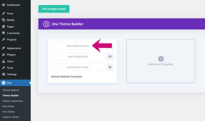
Step 1: Access the Theme Builder
Go to Divi > Theme Builder and click on Add Global Header.
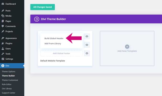
Then choose the option Build Global Header.
The Divi builder will load inside the Theme Builder and we can start building the menu.
Step 2: Add the Divi menu module
First, start by adding a row inside your section.

You can choose any column structure you like but for this tutorial, I will go with a one-column structure.
After adding the row click on the grey + symbol for adding a module. Search for the menu module.
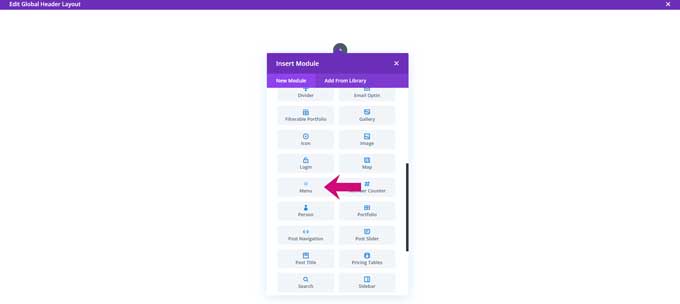
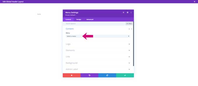
In the menu module settings, choose a menu that you want to display. If you do not see any menus from the dropdown then you have to create one first.
You can create a menu in Appearance > Menus (don’t forget to make this your primary menu) and add menu items to this menu.
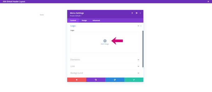
Under Logo, you can upload your logo image for this menu.
Step 3: Customize the menu
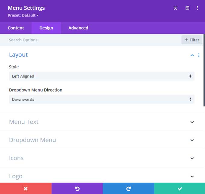
Now that you have added a menu, you can start customizing the menu layout. Under the Design tab, you will find all the options to change the appearance of the menu.
Under Layout, you can adjust the alignment of the menu.
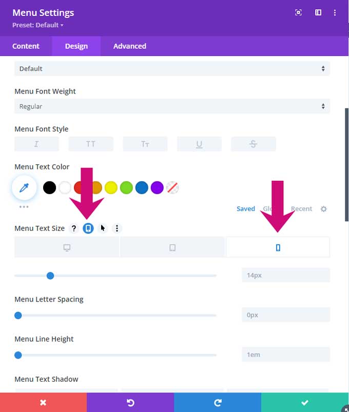
Modify Text and Fonts
Under the text tab, you will find all the menu text settings. You can choose from a wide variety of font styles, sizes, and colors to ensure that your menu looks professional and polished.
Dropdown menu
Under the dropdown menu tab, you can change the colors for the dropdown menu.
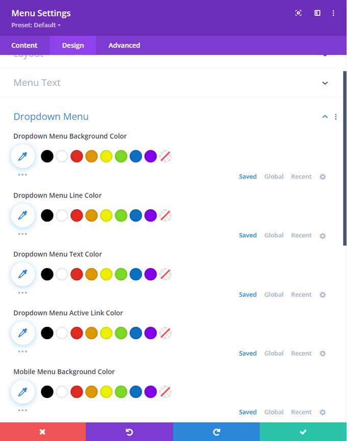
Divi Mobile menu
You can find the colors for the Divi mobile menu also under the dropdown tab.
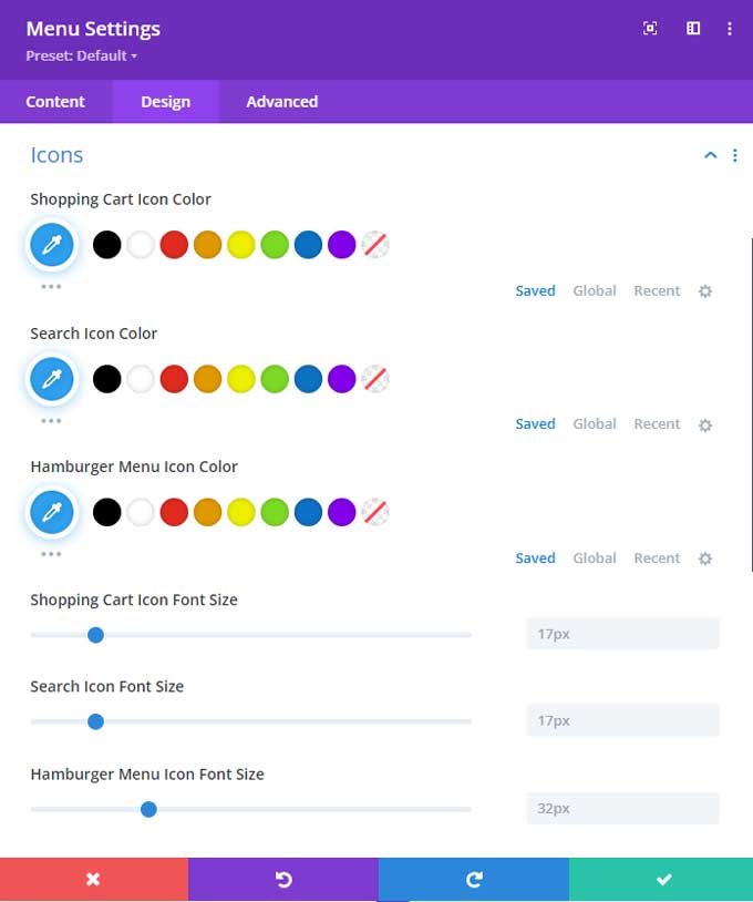
Under Icons, you can change the shopping cart icon (if you are using WooCommerce), the search icon, and the mobile hamburger menu icon.
Adjust Styling and Responsiveness
Customize the appearance of your menu even further by adjusting its styling for mobile devices. You can do that by hovering over the title and additional options will appear. From here you can click on the Responsive icon and then on the mobile or tablet tab.
Advanced styling for your Divi menu
Take advantage of Divi’s advanced features like hover effects, dropdown styles, and mobile menu customization to make your navigation experience seamless for your visitors. Experiment with different combinations of these options to find the style that suits your brand and speaks to your target audience.
You can explore my other tutorials for styling the Divi menu further.
How to create a mega menu in Divi
Mega menus make it easier for users to quickly scan and access sections on a website’s navigation. In my tutorial “How to create a Divi mega menu“, we’re going to show you how to create one from scratch with Divi — no coding experience necessary!
How to style the Divi mobile menu
As a web designer, you know that responsive design is essential for creating exceptional mobile experiences. It’s even more important to have an intuitive and user-friendly mobile navigation menu.
Styling the Divi mobile menu can be tricky – since it doesn’t always look how you want it to out of the box. That’s why in this tutorial I’m going to go over some tips and tricks on how to get your Divi website looking its best across any device!
Stay tuned as we discuss ways to tweak the settings, customize buttons and layout options, plus lots of other helpful guidance when it comes to making your mobile menus as intuitive and stylish as possible.
How to create a collapsing mobile menu
Have you ever wanted to create a sleek, responsive mobile menu in Divi? With so many navigation elements competing for screen space on mobile devices, it’s essential that your menu stands out.
I’ll cover how to quickly create a stylish collapsing mobile menu in Divi from scratch with just a little bit of custom code.
After following along with these steps, you’ll be able to easily customize your own unique collapsing menus for any of your project’s needs!
Divi mobile menu breakpoint
One area where Divi can sometimes fall short is with its mobile menu breakpoint. Out of the box, the Divi mobile menu breakpoint tends to be too short for smaller desktop sizes, making a website difficult to navigate on smaller desktops.
Fortunately, though, it’s easy enough to change this breakpoint if you know what you’re doing—just follow these simple steps and have your Divi site optimized for perfect formatting in no time!
How to add the text “Menu” next to the Divi hamburger menu
Do you want to add the text “Menu” next to your hamburger icon? You’ve come to the right place! In this blog tutorial “Divi Hamburger Menu“, I’ll walk you through how to quickly customize the Divi mobile menu with just a few clicks – so that your website visitors can easily identify what that hamburger menu is.
How to create a sticky Divi header
For any website, the header is one of the first things visitors see. That’s why it can pay off to make it more memorable by creating a “sticky” Divi header that stays in place as viewers scroll down your page.
Not only does this style add visual flair, but it also serves an important practical purpose—making sure visitors have easy access to navigation buttons, no matter how far they’ve scrolled down.
In this tutorial, I explain exactly how you can use Divi to create a functional Divi sticky header for any website!
How to create a transparent Divi header
If you’re looking to add a touch of elegance and sophistication to your website, a Divi transparent header might just do the trick.
In this tutorial, I will be covering different methods on how to create a Divi transparent header.
Conclusion
Congratulations on learning to build a Divi menu of your own! The Theme Builder and Divi menu module is an incredibly useful way to build a custom menu.
If you need some inspiration for building a menu then take a look at my Divi Header Layout Pack.
If you have any questions just ask me in the comments section below.