


Did you know that 52% of internet traffic is coming from mobile devices? It is therefore very important to optimize your website for mobile. And it all starts with a great looking mobile menu.
You can customize your mobile Divi menu with CSS. Or you can do this with the plugin Divi Mobile from Divi Engine. This will give you tons of styling options for your mobile menu.
In this tutorial, I will be using this Divi plugin to customize the mobile menu. View the demo page on mobile or use your inspector tool and display it on the mobile view.
Step By Step Tutorial
By default, the sub-menu links are nested under the parent menu link (see the left image). As you can see in the image you will get a very long mobile menu.
With the mobile menu plugin, we can place those nested menu items under the parent menu item. And when you click on the parent menu item the sub-menu items will collapse out.
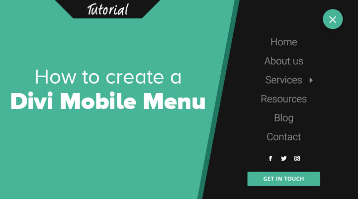
Another great feature of this plugin is that you can add any Divi module into the mobile menu. For example, I have placed social media and a button module under the mobile menu.

To follow this tutorial, you need to have the Divi Mobile plugin to be installed.
Step 1: Installing the Mobile Menu Plugin
To follow this tutorial, you need to have Divi and the Divi Mobile plugin to be installed.
Install and activate the plugin on your website.
Step 2: Mobile Menu Settings
Now that the plugin is installed you can go to Divi > Theme Customizer.
Under Divi Mobile you will find all the settings.

You can expand each toggle and find the settings that I have used for each tab.
You can expand each toggle and find the settings that I have used for each tab.
Menu Style and Settings

In this tab, you can choose which of your menus need to be the mobile menu. In case you have multiple menus. You will also find settings that will affect how your mobile menu will appear.
Another great feature is that you can change the mobile menu breakpoint. By default, this breakpoint starts at 980px.
Custom Header
The mobile menu that I am using is the default Divi header. But you can create here a custom mobile header if you want too.
Choose Burger Menu

Inject Layouts

Inject layouts is are a great feature of this plugin. You can create a layout and then insert this layout above or below the mobile menu.
It works as follow.
Go to Divi > Divi Library and create a layout by pressing the “Add New” button.
Give your layout a name and choose for Layout in the Layout Type field.
For my mobile menu I have created a social and a text module. I styled the text module as a button. I choose for a text module instead of a button module because the style of the button module often do not apply in dropdown menus.
For me it looks like this.

When you have created your layout you can inject it in the mobile menu from the Inject Layouts tab.
Menu Appearance

Sub-Menu Appearance

Let me know in the comments how you have styled your mobile menu.